- Home
- :
- All Communities
- :
- Products
- :
- ArcGIS Online
- :
- ArcGIS Online Ideas
- :
- Labelling Axes in AGOL Chart Widget
- Subscribe to RSS Feed
- Mark as New
- Mark as Read
- Bookmark
- Follow this Idea
- Printer Friendly Page
- Mark as New
- Bookmark
- Subscribe
- Mute
- Subscribe to RSS Feed
- Permalink
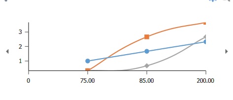
The way the current chart widget is set up, there is no way to include labels for the axes in the line or bar charts, such as the example below:
Yes, there is an option to include a description of the chart and you could put that information there. But this reduces the readability of the chart as users have to go hunting for it, or they may not read that information because they expect the axes to be labeled.
And while I'm wishing for things, could we also have a legend in the chart widget, where you can set the labels? Yes, I know if you hover over the line it will tell you the name of the column it comes from (as in the example above) but that is not always to most useful way of naming something.
I also want a pony.
Yes! I knew someone else would have this request. I was working with a user today trying to get a profile labeled and it seems totally obvious that this would be a feature in the widget. Voted this up.
What my user is trying to do is do a profile based on contours. So they draw a line over the contours and it returns the chart but because they can't custom label either axis, the chart isn't super useful to anyone but the immediate user.
I am configuring charts in the pop-up right now and came here specifically to ask for this. It could be optional and I would like to see a legend option where we could set colors of the different attributes we want to display! Check the Map Viewer and this isn't integrated yet, seems like a good place to add this!!
You must be a registered user to add a comment. If you've already registered, sign in. Otherwise, register and sign in.