Turn on suggestions
Auto-suggest helps you quickly narrow down your search results by suggesting possible matches as you type.
Cancel
- Home
- :
- All Communities
- :
- Products
- :
- ArcGIS Online
- :
- ArcGIS Online Ideas
- :
- ArcGIS Online Chart Customization
Options
- Subscribe to RSS Feed
- Mark as New
- Mark as Read
- Bookmark
- Follow this Idea
- Printer Friendly Page
ArcGIS Online Chart Customization
Follow this Idea
19273
37
07-27-2012 06:39 AM
Status:
Under Consideration
- Mark as New
- Bookmark
- Subscribe
- Mute
- Subscribe to RSS Feed
- Permalink
Hi,
I would like to be able to change the colors of the pie chart sections to match our data's symbology. This would be useful when trying to correspond Dot Density symbology with the chart results.
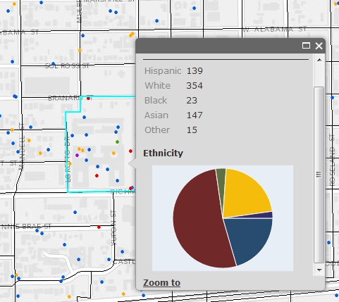
I would like to be able to change the colors of the pie chart sections to match our data's symbology. This would be useful when trying to correspond Dot Density symbology with the chart results.
- « Previous
-
- 1
- 2
- 3
- 4
- Next »
37 Comments
Hi,
we considered to report election results of the german "Bundestagswahl/Bayernwahl" with AGOL maps.
Without custom colors for the various parties these pie charts are simply unusable.
Generally speaking, charts without custom colors are unusable at all.
Cheers, Jochen
we considered to report election results of the german "Bundestagswahl/Bayernwahl" with AGOL maps.
Without custom colors for the various parties these pie charts are simply unusable.
Generally speaking, charts without custom colors are unusable at all.
Cheers, Jochen
di you get any answer for this?
i have the same problem .
i have the same problem .
Yes, this seems to deserve some attention. The AGOL's pop-up piechart colors should match the colors of the features which it is representing. An analogy might be an auto generated legend which doesn't match the symbology found in the map body. All of us would likely find that problematic and confusing.
Agreed. The company where I work just purchased an ArcGIS Online for organizations account last month. It seems that every time we try to do something we find a new issue. Really, if you cannot change the colors to fit your map symbology, the chart popup is too confusing to be used.
I don't think this should be an "ArcGIS idea" but more a bug of a completely useless tool.
It's sad to say but I don't really think we will renew the subscription next year.
I don't think this should be an "ArcGIS idea" but more a bug of a completely useless tool.
It's sad to say but I don't really think we will renew the subscription next year.
Adding chart key would be an improvement so users wouldn't have to hover over each pie slice or bar to see what the value is.
More chart labels would also be a great help. Pie charts don't have any labels and bar charts currently only label 1 axis.
More chart labels would also be a great help. Pie charts don't have any labels and bar charts currently only label 1 axis.
This would be very nice to have some customization of charts in next AGOL update.
it will make the bar and pie chart useful if the user can specify the color and add a legend for those chart. the bar chart and column chart only have one color ---blue! what should I say? please complete the function in the final release.
I agree - customizing the chart´s colors would be quite useful. If a particular color describes a particular category in the map & its legend, it might be confusing for the user if the same categorie is being visualized by a different color within the charts (which is currently the case).
same problem! created choropleth maps (which show dominant values) in agol and wanted to use popup-charts to show percentage of other categories...but without the proper colouring they're rather useless! it would be really useful if it were possible to choose at least some greyscale-colouring for the charts which wouldn't directly disagree with the map-colours! since this customization only requires a slight changing of the colour-settings in the underlying java-script (from the dojo-charting toolkit) and could therefore easily be done, I'd regard that as a really reasonable improvement...!
cheers,
chrigel
cheers,
chrigel
If people stop using the charts because the colors can't be customized, then that is a problem that needs to be fixed. If the chart colors don't match the map, it is very confusing for the reader.
You must be a registered user to add a comment. If you've already registered, sign in. Otherwise, register and sign in.