- Home
- :
- All Communities
- :
- Products
- :
- ArcGIS Online
- :
- ArcGIS Online Ideas
- :
- 4x design: make UI discoverable
- Subscribe to RSS Feed
- Mark as New
- Mark as Read
- Bookmark
- Follow this Idea
- Printer Friendly Page
- Mark as New
- Bookmark
- Subscribe
- Mute
- Subscribe to RSS Feed
- Permalink
I'll add to this as I begin to use 4x.
1) 3d/2d button is a cryptic icon. Solution: Use 3D / 2D button like Google. Click it to go 3D and it says 3D. Click again, it goes 2D and says 2D.
To us a globe and projected map make sense but I don't think it is as obvious for the public. To compound this, the icons are all flat, no color, no texture, as with the whole new Web 3.0 monochrome flat UI look. Not as intuitive or as easy to read even though it's in fashion.
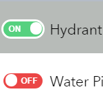
I have observed hundreds of users from all levels of computer experience not intuitively see that the layer list checkboxes control layer visibility; particularly in regards to sublayers and how the parent Group must be on as well.
I think this UI in this WWF / Innovate custom widget Grouped for WAB solves it. Instead of an 'eye' icon use On/Off (localized to a language). Also for a group one it could have a bolder outline or be a little larger, and if you clicked a sublayer with the parent off; maybe a prompt could happen or the parent Group checkbox (on button) could jiggle or something. Anyhow I was impressed at this design and I think it's very discoverable and looks really nice.
You must be a registered user to add a comment. If you've already registered, sign in. Otherwise, register and sign in.