- Home
- :
- All Communities
- :
- Products
- :
- ArcGIS Network Analyst
- :
- ArcGIS Network Analyst Questions
- :
- Network Analysis Service Areas yield different geo...
- Subscribe to RSS Feed
- Mark Topic as New
- Mark Topic as Read
- Float this Topic for Current User
- Bookmark
- Subscribe
- Mute
- Printer Friendly Page
Network Analysis Service Areas yield different geometries from previous version
- Mark as New
- Bookmark
- Subscribe
- Mute
- Subscribe to RSS Feed
- Permalink
I created service areas about a year ago for an analysis. I recently ran the same Network Analysis Service Area model with the same facility points and base network, and noticed that my output polygons are not identical to the ones I generated a year ago. None of the underlying data has changed. Can someone help or explain why my output geometries are different. The only thing I can think of that has changed is that I upgraded from ArcGIS 10.3 to ArcGIS 10.7 in the past year. Could it be that the Network Analysis tool has been modified to function for the different version?
Solved! Go to Solution.
Accepted Solutions
- Mark as New
- Bookmark
- Subscribe
- Mute
- Subscribe to RSS Feed
- Permalink
Hello Olivia (are you the Olivia Lau I went to grad school with?).
Between 10.3 and 10.7, an improved Service Area polygon generation algorithm was implemented. This new algorithm makes the polygons look more bubbly or cloudy and less spikey. It improves performance and reduces the likelihood of getting the weird random spikes you would sometimes see with the older version.
If you didn't change anything on the network dataset, I'm not sure why you would see the new polygons, though. Generally you have to open the network dataset properties and set the "Use Service Area Index" checkbox on the "Optimizations" page. However, given what you've described, the switchover to the newer algorithm seems like the most likely cause.
- Mark as New
- Bookmark
- Subscribe
- Mute
- Subscribe to RSS Feed
- Permalink
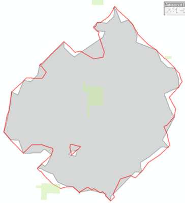
Hi Melinda! It is Olivia from grad school. Comparing the outputs, the edges from the 10.7 polygon (red line) do appear more smooth. Your explanation does make sense. I just didn't want to go down a rabbit hole trying to replicate something I can no longer do. So great to hear from you, and thanks so much for responding so quickly.
- Mark as New
- Bookmark
- Subscribe
- Mute
- Subscribe to RSS Feed
- Permalink
Nice to hear from you, too, Olivia. Small world, heh.
Hmm, actually the red polygon does not look like the typical Service Area Index type polygon output. It definitely looks a little smoother, as if you're using a larger polygon trim value. It's hard to say, though. 10.3 to 10.7 is a pretty big jump, and changes made in the intervening years to the polygon generation algorithm or to the underlying TIN engine used to generate the older style polygons could easily explain the difference. Since the polygons shown in your image look generally similar, I wouldn't worry too much about these small differences, though.
My general recommendation is to turn on the Use Service Area Index optimization to get better Service Area polygons. Even better: Upgrade to ArcGIS Pro.
- Mark as New
- Bookmark
- Subscribe
- Mute
- Subscribe to RSS Feed
- Permalink
The polygons are pretty similar, but because I am using the geometries with demographic data, I'm picking up more people with the 10.7 generated polygons. I'll make a footnote describing the discrepancy.
I totally support your recommendation to make the leap to ArcGIS Pro. I'm so use to working in ArcMap that it is more efficient at times than it is to wrap my head around finding tools and features in the UI of Pro. Hopefully, the next time I ask a question, it'll be a ArcGIS Pro one. 😉
