- Home
- :
- All Communities
- :
- Products
- :
- Mapping and Charting Solutions
- :
- Mapping and Charting Questions
- :
- Imported Excel spreadsheet displayed in PDF map wi...
- Subscribe to RSS Feed
- Mark Topic as New
- Mark Topic as Read
- Float this Topic for Current User
- Bookmark
- Subscribe
- Mute
- Printer Friendly Page
Imported Excel spreadsheet displayed in PDF map with graphic issues
- Mark as New
- Bookmark
- Subscribe
- Mute
- Subscribe to RSS Feed
- Permalink
I am inserting excel spreadsheets into my large-format map using Insert -> Object -> Microsoft Excel Worksheet option, then cut-pasting the data and formatting it inside Excel. When I export the finished map, the font and lines of the uniformly-formatted spreadsheets vary in boldness (see example below). I am exporting into PDF at 400dpi (any more, and I am afraid the file size will become too massive). The map is intended for printing and sending to other parties. Any advice on how to rectify this situation?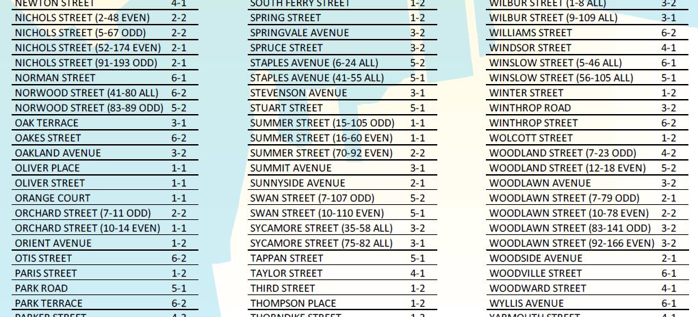
Solved! Go to Solution.
Accepted Solutions
- Mark as New
- Bookmark
- Subscribe
- Mute
- Subscribe to RSS Feed
- Permalink
Dan is right, my guess is that what you are seeing is a DPI issue on display only. Once LCD monitors start implementing "retina" like resolution (we can thank Apple for leading the way on upping higher resolutions on mobile devices), we'll see that the varying thickness/lineweights on screen is just an issue of a lines deciding which pixels to display and the resolution is the concern on the monitor. Even at 1080 vertical pixels on your screen (if it is even that high), it is not nearly enough to see at "print quality".
- Mark as New
- Bookmark
- Subscribe
- Mute
- Subscribe to RSS Feed
- Permalink
To my eye, it appears that the background color is making the font appear more bold than it actually is and I doubt that it can be rectified unless you wanted to have a uniform background color which would obliterate what lies underneath
- Mark as New
- Bookmark
- Subscribe
- Mute
- Subscribe to RSS Feed
- Permalink
Here's some more text that is over a fairly uniform background (the background is set to fade out towards the edges, but it's clear that the first column has a different pattern of text "boldening" and fading than the next two, as they come from two different spreadsheets). 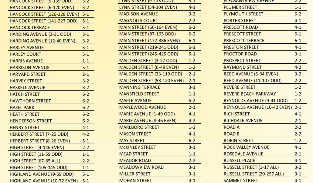
- Mark as New
- Bookmark
- Subscribe
- Mute
- Subscribe to RSS Feed
- Permalink
Print it...what does it look like...my eyes are still seeing background associated with certain letters...
- Mark as New
- Bookmark
- Subscribe
- Mute
- Subscribe to RSS Feed
- Permalink
I see the variations but I second the "print it" suggestion.
There often seems to be a lack of "clearness" when viewing graphics items or even vector items in the layout view in ESRI and in the pdfs.
- Mark as New
- Bookmark
- Subscribe
- Mute
- Subscribe to RSS Feed
- Permalink
Dan is right, my guess is that what you are seeing is a DPI issue on display only. Once LCD monitors start implementing "retina" like resolution (we can thank Apple for leading the way on upping higher resolutions on mobile devices), we'll see that the varying thickness/lineweights on screen is just an issue of a lines deciding which pixels to display and the resolution is the concern on the monitor. Even at 1080 vertical pixels on your screen (if it is even that high), it is not nearly enough to see at "print quality".
- Mark as New
- Bookmark
- Subscribe
- Mute
- Subscribe to RSS Feed
- Permalink
It turned out to indeed be an issue of my LCD screen! When I printed the pdf in all its 36x48" glory, the lines looked identical to each other. The background, on the other hand, was doing weird in-bands stuff, so I will be switching it to a uniform background after all. It looked so nice on my screen! Thanks everyone for your feedback.