- Home
- :
- All Communities
- :
- Products
- :
- Mapping and Charting Solutions
- :
- Mapping and Charting Questions
- :
- Duplicated symbols not visible on layout view appe...
- Subscribe to RSS Feed
- Mark Topic as New
- Mark Topic as Read
- Float this Topic for Current User
- Bookmark
- Subscribe
- Mute
- Printer Friendly Page
Duplicated symbols not visible on layout view appearing on exported map
- Mark as New
- Bookmark
- Subscribe
- Mute
- Subscribe to RSS Feed
- Permalink
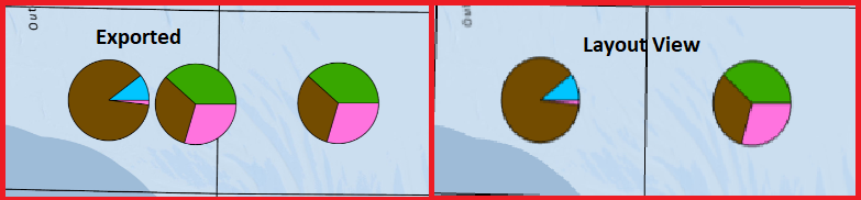
I have created a layer that joins ICES rectangle polygons, with a table that contains fisheries data. I am using the new chart symbology to create these areas as pie charts to show landings by species. In the layout view within the software it displays correctly, and having refreshed the drawing a few times still displays correctly. When I export the map roughly half of the pie charts are duplicated and offset to the left of the original. I have utilised chart symbology in the past with no issues. The change this time around is using a join between two feature classes.
Please see the attached image which shows on the left, the exported view and on the right, the layout view.
I can find very little to no resources online about this specific issue. I was hoping somebody else may have come across it or something similar and might know of a solution.
Thanks!
Solved! Go to Solution.
Accepted Solutions
- Mark as New
- Bookmark
- Subscribe
- Mute
- Subscribe to RSS Feed
- Permalink
Yes, this is the solution
- Mark as New
- Bookmark
- Subscribe
- Mute
- Subscribe to RSS Feed
- Permalink
Did you every solve it? I had the exact same problem and for me, switching off the 'Prevent chart overlap' option under 'Leader lines' in the symbology pane seemed to fix it.
- Mark as New
- Bookmark
- Subscribe
- Mute
- Subscribe to RSS Feed
- Permalink
Yes, this is the solution