- Home
- :
- All Communities
- :
- Products
- :
- ArcGIS Living Atlas of the World
- :
- Living Atlas Blog
- :
- Explore air quality in the US with content from Li...
Explore air quality in the US with content from Living Atlas
- Subscribe to RSS Feed
- Mark as New
- Mark as Read
- Bookmark
- Subscribe
- Printer Friendly Page
- Report Inappropriate Content
Air quality impacts us all.
The air we breathe is full of particles that come from factories, cars, construction sites, and many other sources. These particles can get into our lungs and even our bloodstream to cause serious health issues. Organizations such as the Environmental Protection Agency (EPA) and NASA provide information about the air we breathe in order to provide a data-driven approach for regulations and guidelines.
ArcGIS Living Atlas of the World contains a wide range of layers, maps, and stories that help communicate what air quality in the US was like in the past, and how it is currently.
There are many different ways to explore air quality with content from ArcGIS Living Atlas of the World. A few of those ways are:
- Current Air Quality
- Air Quality Index (AQI) by the Environmental Protection Agency (EPA) and AirNow
- "The AQI is divided into six categories. Each category corresponds to a different level of health concern. Each category also has a specific color. The color makes it easy for people to quickly determine whether air quality is reaching unhealthy levels in their communities." - AirNow
- Find all EPA layers, maps, and applications in Living Atlas by clicking here.
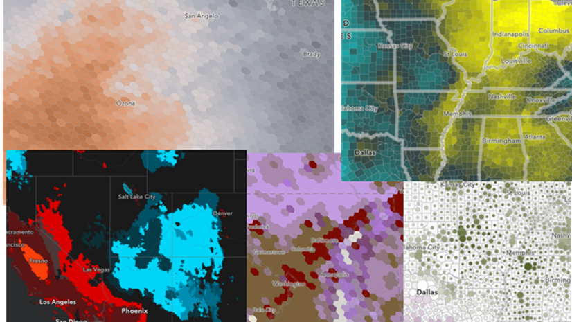
- Current PM 2.5 concentrations
- The OpenAQ Community reports recent PM 2.5 concentrations
- Every day activities such as driving, burning coal for electricity, wildfires, running factories, even cooking and cleaning, release particles into the air. Besides being an irritant, small particles of 2.5 micrometers or less (PM2.5) are a health hazard since they can get deep into the respiratory system and damage the delicate tissues.
- Smoke Forecasts
- National Weather Service 48 hour forecast
- Forecasts of smoke can help us protect vulnerable populations from potential health risks.
- Historical PM 2.5 concentrations
- NASA's Socioeconomic Data and Applications Center (SEDAC)
- 1998-2016 PM 2.5 values were analyzed over space and time at the state, county, congressional district, and 50 km hex bin levels in order to investigate trends and statistical hot spots.
- To see the full collection of maps and see how air quality is changing in your area, visit this gallery or all historical air quality content in Living Atlas.
- To learn more about the methodology behind the analysis, view the blog post about these layers.
To learn more about air quality in the United States and the content listed above, check out this story map.
You must be a registered user to add a comment. If you've already registered, sign in. Otherwise, register and sign in.