- Home
- :
- All Communities
- :
- Products
- :
- ArcGIS Insights
- :
- ArcGIS Insights Questions
- :
- Re: Line Graph Multiple Series
- Subscribe to RSS Feed
- Mark Topic as New
- Mark Topic as Read
- Float this Topic for Current User
- Bookmark
- Subscribe
- Mute
- Printer Friendly Page
- Mark as New
- Bookmark
- Subscribe
- Mute
- Subscribe to RSS Feed
- Permalink
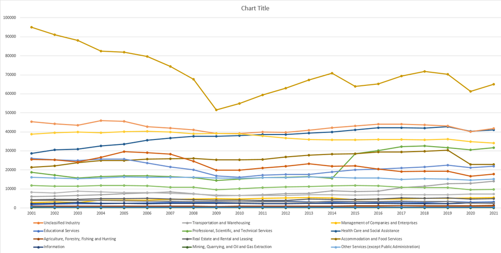
I am attempting to create a line chart from a dataset where I would have multiple series (lines) in the chart. I can do this in excel by customizing the data ranges and designating exactly what I want the x and y axis to be, and what the series should draw from. See the chart below that I produce in excel:
In this example I am able to create a number of series (categories) and display the year and the total number of jobs on the different axes.
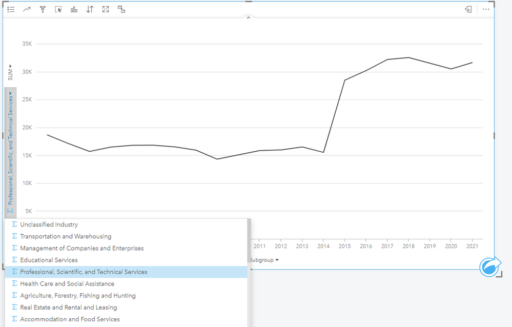
However, in Insights, I seem to be constrained to only show one series at a time with a drop down menu on the left hand side to choose to look at a different series one at a time. How can I display multiple series all at once in Insights?
Solved! Go to Solution.
Accepted Solutions
- Mark as New
- Bookmark
- Subscribe
- Mute
- Subscribe to RSS Feed
- Permalink
David,
Perfect thanks. The industry category data you currently have is organized in wide format. That is to say you have industry category variables (Transportation/Management/Educational/etc.) in separate columns. To create the multi-series line chart you need to convert these categories to tall format. This is often referred to as pivoting the data and you have multiple options to achieve this.
Depending on the number of categories, you can do this somewhat easily in Excel or you can use the scripting console within Insights and use either Python or R. I've attached a document that details this process (excuse any formatting issues, I'm in the process of converting this to a blog post but wanted to go ahead and send to you).
You want your final table to look something like this. This would allow you to chart Number Variable (y axis) by Year (x axis) and symbolize by Industry Category.
| Industry Category | Year | Number Variable |
Unclassified Industry | 2019 | 45 |
| Unclassified Industry | 2020 | 50 |
| Unclassified Industry | 2021 | 54 |
| Transportation and Warehousing | 2019 | 24 |
| Transportation and Warehousing | 2020 | 30 |
| Transportation and Warehousing | 2021 | 65 |
| Educational Services | 2019 | 40 |
| Educational Services | 2020 | 38 |
| Educational Services | 2021 | 42 |
Let me know if this helps.
Scott
- Mark as New
- Bookmark
- Subscribe
- Mute
- Subscribe to RSS Feed
- Permalink
David,
I think this is likely due to the structure (ie, Wide vs Tall) of your data. Can you send a screenshot of how your table is arranged?
Scott
- Mark as New
- Bookmark
- Subscribe
- Mute
- Subscribe to RSS Feed
- Permalink
Hi Scott,
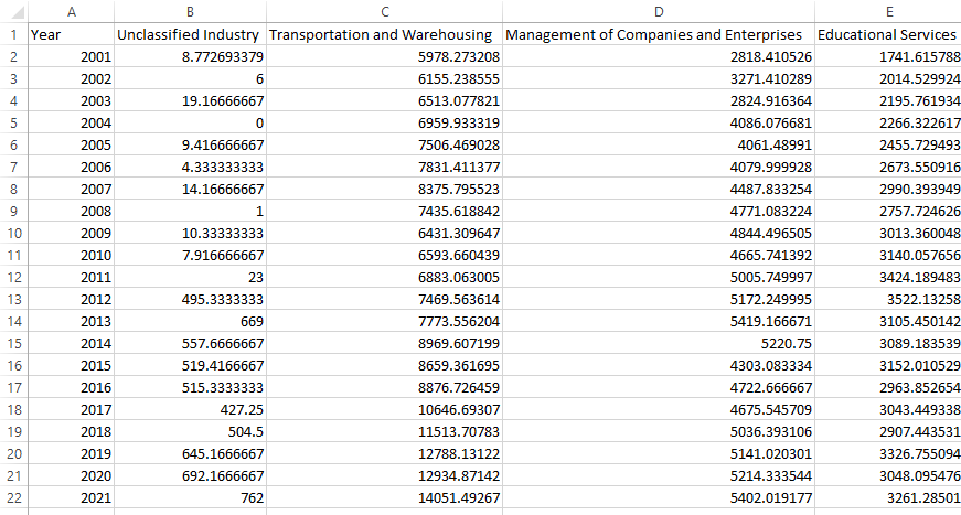
Here is a screen shot of the spreadsheet, just a section of it (there are more columns, ie, the series I am looking to have all on the chart all at the same time):
- Mark as New
- Bookmark
- Subscribe
- Mute
- Subscribe to RSS Feed
- Permalink
David,
Perfect thanks. The industry category data you currently have is organized in wide format. That is to say you have industry category variables (Transportation/Management/Educational/etc.) in separate columns. To create the multi-series line chart you need to convert these categories to tall format. This is often referred to as pivoting the data and you have multiple options to achieve this.
Depending on the number of categories, you can do this somewhat easily in Excel or you can use the scripting console within Insights and use either Python or R. I've attached a document that details this process (excuse any formatting issues, I'm in the process of converting this to a blog post but wanted to go ahead and send to you).
You want your final table to look something like this. This would allow you to chart Number Variable (y axis) by Year (x axis) and symbolize by Industry Category.
| Industry Category | Year | Number Variable |
Unclassified Industry | 2019 | 45 |
| Unclassified Industry | 2020 | 50 |
| Unclassified Industry | 2021 | 54 |
| Transportation and Warehousing | 2019 | 24 |
| Transportation and Warehousing | 2020 | 30 |
| Transportation and Warehousing | 2021 | 65 |
| Educational Services | 2019 | 40 |
| Educational Services | 2020 | 38 |
| Educational Services | 2021 | 42 |
Let me know if this helps.
Scott
- Mark as New
- Bookmark
- Subscribe
- Mute
- Subscribe to RSS Feed
- Permalink
Thank you Scott for showing Wide v Tall tables! That worked right away for Insights!
- Mark as New
- Bookmark
- Subscribe
- Mute
- Subscribe to RSS Feed
- Permalink
Great, glad it was helpful.


