- Home
- :
- All Communities
- :
- Products
- :
- ArcGIS Hub
- :
- ArcGIS Hub Questions
- :
- Open Data - Thumbnail issues
- Subscribe to RSS Feed
- Mark Topic as New
- Mark Topic as Read
- Float this Topic for Current User
- Bookmark
- Subscribe
- Mute
- Printer Friendly Page
- Mark as New
- Bookmark
- Subscribe
- Mute
- Subscribe to RSS Feed
- Permalink
I have setup an OpenData site (currently private).
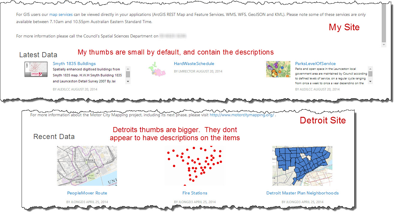
Issue 1 - Home Page - Latest Data thumbnails are too small
When comparing my site to the Detroit site, my Latest Data widget (Data List with max 3 items) the thumbs are a lot smaller and contain lengthy descriptions. It looks like the Detroit site does not have descriptions on its items (which I need to have).
Is there any way to just show the thumbnails, title and perhaps author/last modified?
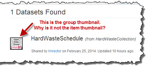
Issue 2 - Searching for a Dataset - Return Group Thumbnail
When I search for a dataset, it has the Group thumbnail as opposed to the actual items thumbnail.
Anyway to make this the item thumbnail?
Solved! Go to Solution.
Accepted Solutions
- Mark as New
- Bookmark
- Subscribe
- Mute
- Subscribe to RSS Feed
- Permalink
Issue 1 - Detroit are using the text widget to create the custom 3 block layout. That is how they chose their specific size. You are using the default Data Widget which has a fixed size. If you want the larger size you can create the custom widget and maintain the datasets. In the future we can consider a more configurable recent data widget.
Issue 2 - this was by design for a few reasons. Foremost was that we want to convey the source and authoritativeness of the dataset. This is one of the more important metrics for end-users in choosing a dataset, that they know & trust where it came from. Second the thumbnails are often not very indicative of the dataset itself and very often are replaced with some graphic that has nothing to do with the dataset at all. We wanted to focus the user on the data and the metadata. We have an update coming to search results that may allow for seeing the dataset map preview.
Thanks for the feedback - it's always very welcome. Let me know if you disagree with the design decisions above - and thinking from the "end citizen user experience". 
- Mark as New
- Bookmark
- Subscribe
- Mute
- Subscribe to RSS Feed
- Permalink
Issue 1 - Detroit are using the text widget to create the custom 3 block layout. That is how they chose their specific size. You are using the default Data Widget which has a fixed size. If you want the larger size you can create the custom widget and maintain the datasets. In the future we can consider a more configurable recent data widget.
Issue 2 - this was by design for a few reasons. Foremost was that we want to convey the source and authoritativeness of the dataset. This is one of the more important metrics for end-users in choosing a dataset, that they know & trust where it came from. Second the thumbnails are often not very indicative of the dataset itself and very often are replaced with some graphic that has nothing to do with the dataset at all. We wanted to focus the user on the data and the metadata. We have an update coming to search results that may allow for seeing the dataset map preview.
Thanks for the feedback - it's always very welcome. Let me know if you disagree with the design decisions above - and thinking from the "end citizen user experience".