- Home
- :
- All Communities
- :
- Products
- :
- ArcGIS Experience Builder
- :
- ArcGIS Experience Builder Questions
- :
- Re: Rotating Mobile Devices to Landscape Mode
- Subscribe to RSS Feed
- Mark Topic as New
- Mark Topic as Read
- Float this Topic for Current User
- Bookmark
- Subscribe
- Mute
- Printer Friendly Page
Rotating Mobile Devices to Landscape Mode
- Mark as New
- Bookmark
- Subscribe
- Mute
- Subscribe to RSS Feed
- Permalink
I have a dashboard that when looked in a mobile device, it looks squished in portrait mode. The dashboard was designed for desktop viewing. The client/user now wants to see the same dashboard but on mobile devices. I used Experience Builder (EB) to develop a shell where both the desktop and mobile versions of the dashboard can be seen. The problem now is if the user decides to turn the phone 90 degrees, the mobile dashboard is back to being squished because it was setup on portrait mode.
I cant seem to be able to add another page and rotate it to landscape mode. The screen size options are hardcoded to only portrait and there seems to be no option for custom sizes.
Is this something that is being looked at or are we stuck telling the customer not to turn their phone to landscape because there are limitations to this solution?
- Mark as New
- Bookmark
- Subscribe
- Mute
- Subscribe to RSS Feed
- Permalink
@BigLouC Since usually, the responsive limit depends on the screen resolution (a certain px value), there could be different behaviors, especially when users have varied devices.
There is a similar support issue, BUG-000146629 - they have trouble showing the designed responsive portrait interface in landscape mode.
- Mark as New
- Bookmark
- Subscribe
- Mute
- Subscribe to RSS Feed
- Permalink
Any update on this? I am still seeing this behavior and the original post was 2 years ago.
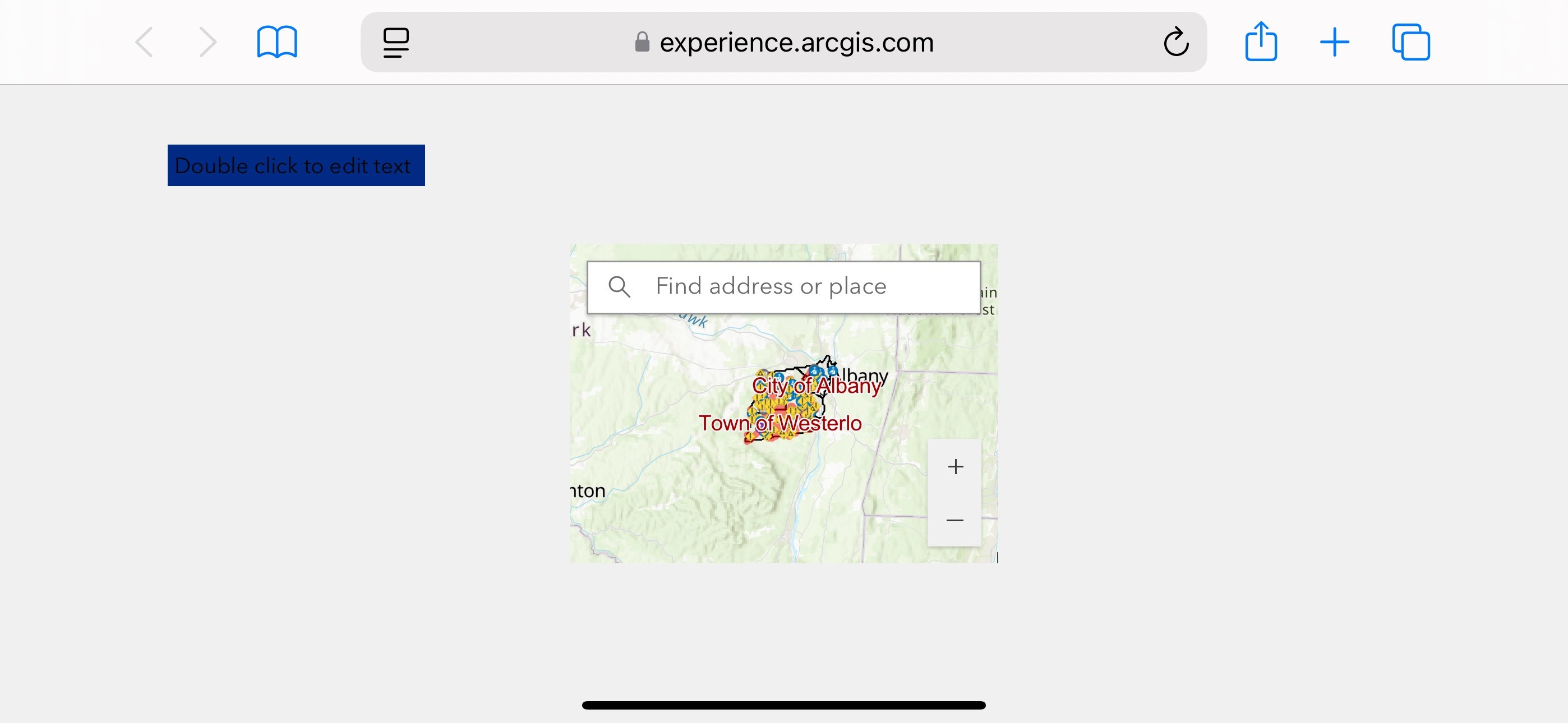
I have a simple EB app with a text box and a map widget.
It has been updated for both medium and small devices.
On desktop, the text box is purple, on medium it is blue and on small it is orange.
When I view the app on a tablet holding it in portrait mode it shows the blue text box. If I then rotate it to landscape it shows purple. Same on a small device, viewed in portrait mode text box is orange, rotated it is blue.
Here is the app
Images are attached showing the behavior.