- Home
- :
- All Communities
- :
- Products
- :
- ArcGIS Experience Builder
- :
- ArcGIS Experience Builder Questions
- :
- Map Layers Visibility Icon
- Subscribe to RSS Feed
- Mark Topic as New
- Mark Topic as Read
- Float this Topic for Current User
- Bookmark
- Subscribe
- Mute
- Printer Friendly Page
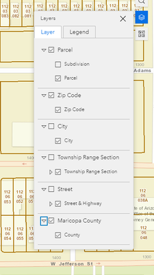
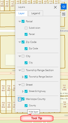
Map Layers Visibility Icon
- Mark as New
- Bookmark
- Subscribe
- Mute
- Subscribe to RSS Feed
- Permalink
Sure to fix that on a deployed EB Dev site just add these css rules to the index.html.
.esri-icon-non-visible::before {
  content: "\e610"!important;
}
.esri-icon-visible::before {
  content: "\e611"!important;
}
If you are using AGOL I am not sure that this is possible.
- Mark as New
- Bookmark
- Subscribe
- Mute
- Subscribe to RSS Feed
- Permalink
I'm using AGOL rather than anything I can customise like above. If it isn't possible to do then I'll submit this as an idea I think as it would definitely improve the experience I feel.
- Mark as New
- Bookmark
- Subscribe
- Mute
- Subscribe to RSS Feed
- Permalink
Hi Robert,
Thanks a million for that excellent tip!
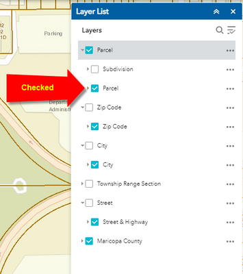
I like how it looks with the Eye Symbol replaced with the Tick boxes.
Can we take this one step closer to the Web AppBuilder version?
What symbol should I use to get the white checkmark against a blue background?
This makes it easier to see which layers have been turned on.
Best regards,
David Das
- Mark as New
- Bookmark
- Subscribe
- Mute
- Subscribe to RSS Feed
- Permalink
I guess you are looking for something a little more like this then:
.esri-icon-non-visible::before {
    content: "\e610"!important;
    color: #969696 !important;
}
.esri-icon-visible::before {
    content: "\e605"!important;
    background-color: #00b9d0;
    color: white!important;
}- Mark as New
- Bookmark
- Subscribe
- Mute
- Subscribe to RSS Feed
- Permalink
Hi Robert,
Yes, that did the trick.
This looks perfect.
You have a solution for everything!
I learned something new today from your clever code snippet how one can change the background and foreground color. I had no clue that this can be done.
I agree ESRI should give us the option to select these icons and set the colors while configuring the Layer/List Widget in the AGOL edition of the Experience Builder.
Best regards,
David Das
- Mark as New
- Bookmark
- Subscribe
- Mute
- Subscribe to RSS Feed
- Permalink
@CMcDonald have you already submitted this as an idea for AGOL?
My customers asked if I could change it, but we do not use the Developer editions and would rather be able to change it in the Experience Builder in AGOL.. The experience from our customers is that the blue and white checkboxes were more clear than the eyes, so if we would have some options in the icons that we use for layer visibility, that would be great!
- Mark as New
- Bookmark
- Subscribe
- Mute
- Subscribe to RSS Feed
- Permalink
I see someone has posted this as an idea, I've voted for it!
- Mark as New
- Bookmark
- Subscribe
- Mute
- Subscribe to RSS Feed
- Permalink
This feature has been provided by Experience Builder Map Layers widget in the 2023 AGOL June release. Thank you.


