- Home
- :
- All Communities
- :
- Products
- :
- ArcGIS Experience Builder
- :
- ArcGIS Experience Builder Questions
- :
- Re: Experience Builder screen size issues
- Subscribe to RSS Feed
- Mark Topic as New
- Mark Topic as Read
- Float this Topic for Current User
- Bookmark
- Subscribe
- Mute
- Printer Friendly Page
Experience Builder screen size issues
- Mark as New
- Bookmark
- Subscribe
- Mute
- Subscribe to RSS Feed
- Permalink
 Hi,
Hi,
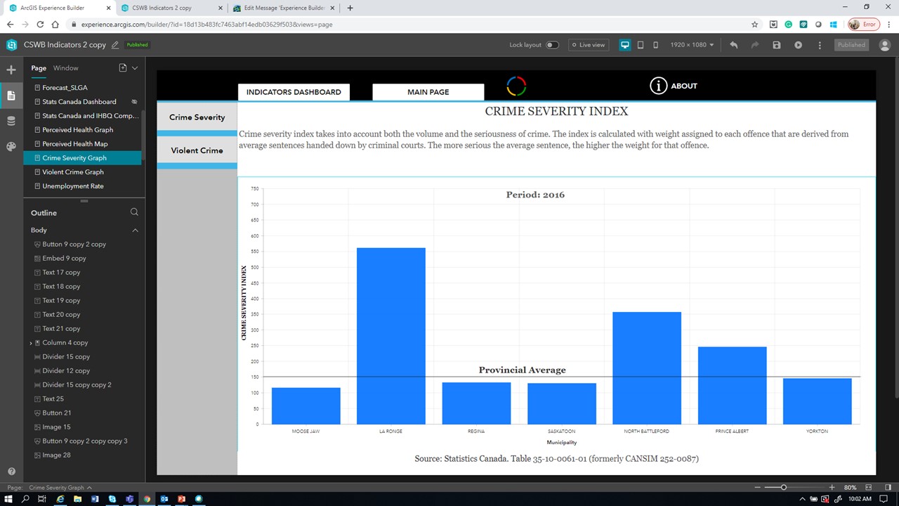
I have created a series of pages using experience builder. All the pages are set up in 1920x1080 , and they look fine when using the live view. However, when I hit preview all the elements inserted appear out of place.
The only way to make it look like the way it was created is by using the browser full-screen option. The monitor resolution is exactly the same as the experience builder (1920x1080).
Can somebody explain why this happens?
Regards
Jose Pablo
- Mark as New
- Bookmark
- Subscribe
- Mute
- Subscribe to RSS Feed
- Permalink
I'm having this issue too.
- Mark as New
- Bookmark
- Subscribe
- Mute
- Subscribe to RSS Feed
- Permalink
4 years later and I am having this issue 04/25/2024.
It's maddening. Has anyone discovered a work around, and is there any plan to fix it?
- Mark as New
- Bookmark
- Subscribe
- Mute
- Subscribe to RSS Feed
- Permalink
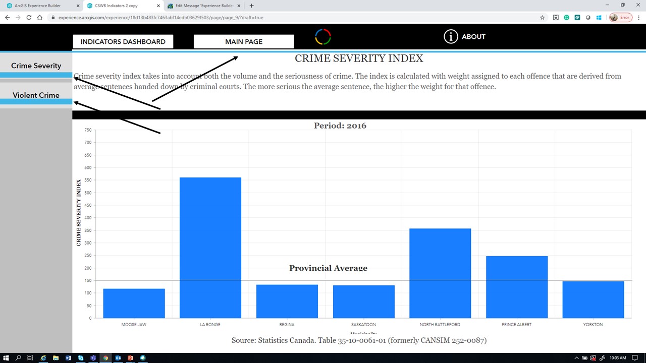
For anybody looking this is just an inherent issue with ExpB. It's designed for configuration across small, medium, and large devices, but not the variation in resolutions amongst those devices. If you build it in 1920 x 1080, it'll look terrible on something smaller. You can use percents, but it will not fix it like you hope. Similarly, percent values have no effect on text size, so if the box is too small to fit your text on a smaller screen, the text is simply cutoff rather than scaled. Huge oversight imo.
You can see in my screenshots I have positions and sizes in percent values that should adjust to match their position on different screen sizes.
The explanation is here, as dnord said: https://support.esri.com/en-us/knowledge-base/problem-the-arcgis-experience-builder-widget-size-and-... but the "fix" isn't really helpful. As folks have said, even using percent values results in positively mangled UIs.
If I'm wrong, somebody please, please correct me so I can fix my experiences.
- Mark as New
- Bookmark
- Subscribe
- Mute
- Subscribe to RSS Feed
- Permalink
Having the same issue. Since experience builder has been out, I have struggled with formatting widgets within my layout in a way that accommodates different monitor sizes. I don't change width and height values to pixels because I need my widgets to resize across different monitor sizes. However the way in which these widgets resize across different monitor sizes is a real limitation of experience builder. As mentioned in comments in this thread, a solution could possibly be the ability to reformat widget placement/size with different monitor sizes, as you are currently able to do for tablets and phones. Whatever the solution may be, it would be a welcomed fix.
- Mark as New
- Bookmark
- Subscribe
- Mute
- Subscribe to RSS Feed
- Permalink
hello, I'm getting similar results with a menu bar. When I resize my browser the items start to overlap. I tried switching between % and px which at first seemed to solve the issue, but when I used the button on my menu to switch to my second map view, the buttons in my menu widget meld into my map header.


- Mark as New
- Bookmark
- Subscribe
- Mute
- Subscribe to RSS Feed
- Permalink
I've noticed Experience Builder in ArcGIS Online/ESRI.com allows you to set screen size to "Auto", while there is no such option in Enterprise/Portal - at least not in 11.5. Does this "fix" the issue, assuming you can use the ArcGIS Online version? And will this functionality be ported to Enterprise, I wonder?

- Mark as New
- Bookmark
- Subscribe
- Mute
- Subscribe to RSS Feed
- Permalink
I just tried using this option myself and it does not seem to fix the problem. This is a frustrating issue, especially since the other widgets in the Experience Builder I'm updating seem to fit. They must've been added before this issue came about.
- « Previous
-
- 1
- 2
- Next »
- « Previous
-
- 1
- 2
- Next »