- Home
- :
- All Communities
- :
- Products
- :
- ArcGIS Experience Builder
- :
- ArcGIS Experience Builder Questions
- :
- Chart selection filtering oddly -ExpBuilder
- Subscribe to RSS Feed
- Mark Topic as New
- Mark Topic as Read
- Float this Topic for Current User
- Bookmark
- Subscribe
- Mute
- Printer Friendly Page
Chart selection filtering oddly -ExpBuilder
- Mark as New
- Bookmark
- Subscribe
- Mute
- Subscribe to RSS Feed
- Permalink
Hi all,
I'm creating an application with a lot of features thrown together, and one of those is to have my pie chart(s) select points on a map based on a category. I had this function work during my testing and learning phase prior to the Thanksgiving holiday, however today (11/28/2022), if I click on a wedge, the map responds by showing the next color wedge counterclockwise to the one I selected.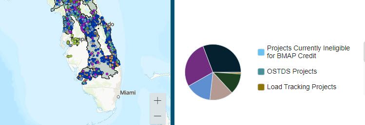
I've connected the chart widget to the map widget with an action trigger - the chart is set to filter the map based on a category. I've tried to colorize my map symbology with approximate colors I could use for the chart because we initially wanted more real estate for the pie chart and not have to use a legend twice.
I did not use a framework to record selection changes because we would still like to show the percentage of that category along with everything else. Besides, I tested using a framework and the problem persists - I click the dark blue wedge, it shows me the next category counterclockwise in the pie on the map.
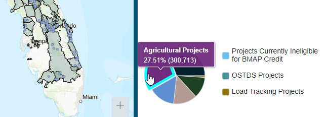
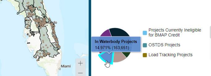
To rule out other connection error possibilities, I made a copy of this Exp. Builder and removed all of my other action trigger connections except for this one....and...
The wrong points are still being selected.
Appreciate your insight and was wondering if anyone was having similar problems.
Cheers,
~Stacy
- Mark as New
- Bookmark
- Subscribe
- Mute
- Subscribe to RSS Feed
- Permalink
Hey again,
This appears to still be an issue and it would be great if I could get some feedback before May 2023.
Cheers,~Stacy
- Mark as New
- Bookmark
- Subscribe
- Mute
- Subscribe to RSS Feed
- Permalink
Hey there, I experience the exact same issue.
- I have a map widget, chart widget and filter widget (not sure if the filter widget is relevant);
- I have set, in my chart widget, Action > Message Action > a trigger that when record selection changes, the map widget will be filtered; and
- I have categories of data in numbers like Cat 1, 2, 3, 4, 5, etc.
When I try to select Cat 1 in the chart widget, nothing is filtered on the map. When I select Cat 2, Cat 1's data are filtered and shown on the map. When I select Cat 3, Cat 2 is shown, etc.
- Mark as New
- Bookmark
- Subscribe
- Mute
- Subscribe to RSS Feed
- Permalink
I found that this issue is partially relevant to the filter widget.
At first, I have my filter widget set as 0 categories selected in the SQL Expression Builder. When I use the chart widget to select the categories, the issue happens. Yet, when I select all my categories in my filter widget and apply the filter, and subsequently when I use the chart widget to select the categories, everyone is right and the issue is gone.
So, as a remedial action, I think if there is a Filter widget in Stacy's map, you could try to pre-select all the options in the clauses of the SQL Expression Builder of the filter widget provided that you have one. Yet, this is a confirmed bug which ESRI should fix in the meantime.
- Mark as New
- Bookmark
- Subscribe
- Mute
- Subscribe to RSS Feed
- Permalink
Thanks for the potential work around, Chun_YinChan. I'll test it out to see if it will get what we need it to do until ESRI can spare tome to fix it.
Cheers!
~Stacy
- Mark as New
- Bookmark
- Subscribe
- Mute
- Subscribe to RSS Feed
- Permalink
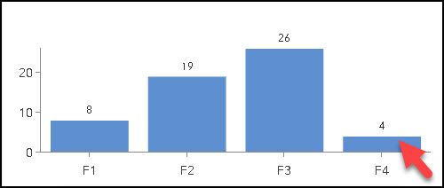
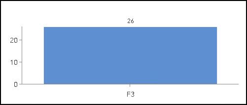
I'm having the same problem. In my chart, if I click on a column, the selected result is the previous column.
In this example, I clicked on the last column (F4 value)
The result selected column is the previous.
I tried the workaround suggested by @tcyd but the issue is still there.
It seems to be an index base issue in the code behind. I hope the ESRI will fix that soon.
- Mark as New
- Bookmark
- Subscribe
- Mute
- Subscribe to RSS Feed
- Permalink
I forgot to mention that I'm on Experience Builder 11.1 on ArcGIS Enterprise
- Mark as New
- Bookmark
- Subscribe
- Mute
- Subscribe to RSS Feed
- Permalink
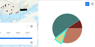
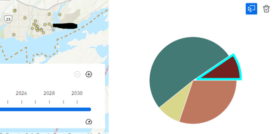
I'm noticing the same thing in one of my experience builder apps. When I click on the green or orange slices, the map filters the features as expected. When I click on the yellow or brown slices, the map displays the opposite features.

