- Home
- :
- All Communities
- :
- Products
- :
- ArcGIS Experience Builder
- :
- ArcGIS Experience Builder Questions
- :
- Ability to add error bars to chart
- Subscribe to RSS Feed
- Mark Topic as New
- Mark Topic as Read
- Float this Topic for Current User
- Bookmark
- Subscribe
- Mute
- Printer Friendly Page
Ability to add error bars to chart
- Mark as New
- Bookmark
- Subscribe
- Mute
- Subscribe to RSS Feed
- Permalink
Hello,
I'm just starting to explore Experience Builder and think it has a lot of potential and many applications to what we want to show. One of the areas I am exploring is trying to replicate Tableau dashboards and I think Experience Builder might be a possible substitute.
We use Tableau extensively in many of our story map reports and sometimes they do not function as well as I would like within the story map. So my thinking is if I could create something similar, or maybe even better, from within the Esri universe, then things will run smoother. Tableau has its place and works well on many levels, but I want to move away from relying on it for charts and graphs.
So that brings me to the point of this post. I was able to create a rudimentary bar graph in EB comparing area of forest land and area of timberland. The next step, and it is a big one for us, is being able to show sampling error bars. We have the SE data and it is attached to all of our data, we just need to show it.
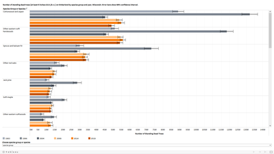
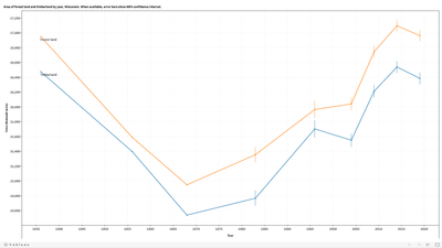
To give examples of what I'm trying to accomplish, here are two styles of Tableau dashboards showing number of standing dead trees by species group and year, and area of forest land and timberland by year. Both show error bars and are for Wisconsin. One is a bar graph and one is a line graph.
Thanks for your help!
Solved! Go to Solution.
Accepted Solutions
- Mark as New
- Bookmark
- Subscribe
- Mute
- Subscribe to RSS Feed
- Permalink
Hi Bryan,
Thanks a lot for bringing this idea. I think this is a meaningful feature. We would research and plan to do it.
Wei
- Mark as New
- Bookmark
- Subscribe
- Mute
- Subscribe to RSS Feed
- Permalink
Thank you very much Wei!
- Mark as New
- Bookmark
- Subscribe
- Mute
- Subscribe to RSS Feed
- Permalink
We too have a need for this feature, in the past and now. Last spring I ended up using the Google API to create the needed charts with error bars. It was fine in this case as we decided to not use maps, see 1 of the Dashboards here. We have bigger plans for the next Dashboard and error bars could be a critical factor as to whether or not we use Esri's Dashboard.
Has there been any progress in these developments?
Much thanks-
Kate
- Mark as New
- Bookmark
- Subscribe
- Mute
- Subscribe to RSS Feed
- Permalink
@Wei_Ying IS there any plan to add error bars capabilities to the chart widget? I am finding this from 4 years ago... I am hoping it is included on the road map this year.
- Mark as New
- Bookmark
- Subscribe
- Mute
- Subscribe to RSS Feed
- Permalink
Hi Team,
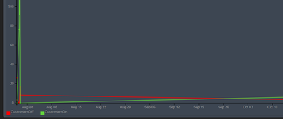
I am also looking for similar kind of functionality. In my case, I wanted to display a Time series using Chart widget (Chart type is Line chart) which will have dimension as StartDate (Date field). And out put I wanted to display two rows CustomersOn and CustomersOff (Number fields).
But category field doesn't shows Date fields.
Something like below I wanted to display.
Please let me know is this possible with current latest version 1.7 or in near feature it is going to implement.
Thanks,
Ashok
Ashok
- Mark as New
- Bookmark
- Subscribe
- Mute
- Subscribe to RSS Feed
- Permalink
But category field doesn't shows Date fields.
Regular date field is supported but date only and time only field has not been supported yet. Is your field date only maybe?


