- Home
- :
- All Communities
- :
- Products
- :
- ArcGIS Experience Builder
- :
- ArcGIS Experience Builder Ideas
- :
- Experience Builder- Screen Size Options Enhancemen...
- Subscribe to RSS Feed
- Mark as New
- Mark as Read
- Bookmark
- Follow this Idea
- Printer Friendly Page
Experience Builder- Screen Size Options Enhancement Request


- Mark as New
- Bookmark
- Subscribe
- Mute
- Subscribe to RSS Feed
- Permalink
ArcGIS Experience Builder Team,
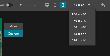
Please add relevant devices and their aspect ratio sizes in the dropdown list - similar to how Chrome's developer tools work. This will enhance the designer experience and account for actual device aspect ratios (such as iphone X, pixel 2, iphone 5.. etc) which are currently missing from the screen size options.
| Experience Builder | Chrome Dev Tools |
|---|---|
 |  |
Thanks,
Amanda

I am glad I found this post, I came to say that I would like to see the "switch orientation" button from Chrome Dev tools implemented as well.

To build on the prior two posts, I would like to see additional resolutions in the builder for non-standard screen sizes and ultrawide screen displays.
I currently have a handful of end-users that have a resolution size of 1280x720 and the Experience they are using does not translate well to that resolution.
Thanks!

Great idea.
Like Megan said, additional resolutions would be helpful. I personally have 1440p monitors and would like to be able to customize how experiences look when viewed at all resolutions.

I am using the Experience Builder Developer Edition to create an app to serve as a public information kiosk. The kiosks are very large and, critically, orientated vertically (portrait) instead of horizontally.
I just wanted to add my support for this idea - it is very difficult to design an application in 1920x1080 that will be displayed at 1080x1920.
You must be a registered user to add a comment. If you've already registered, sign in. Otherwise, register and sign in.