- Home
- :
- All Communities
- :
- Products
- :
- ArcGIS Experience Builder
- :
- ArcGIS Experience Builder Documents
- :
- What You Need to Know About this Beta
- Subscribe to RSS Feed
- Mark as New
- Mark as Read
- Bookmark
- Subscribe
- Printer Friendly Page
What You Need to Know About this Beta
What You Need to Know About this Beta
We are excited that you’re joining us for this beta release. Before we dive into the details of this beta, we want to provide you with some context on why we are really excited about Experience Builder.
Experience Builder is a unified build system that enables you to deliver modern 2D and 3D web experiences. An “experience” is a web app or web page that may include a page, section, widget, data source, theme, and layout. Although location is at its core design, there are many possibilities of the types of apps you can create with Experience Builder such as:
- an app that contains multiple pages and maps with a fixed menu that allows users to scroll content linearly,
- an app with no map that displays a company logo and widgets to query data in a list view, and/or
- an app with a header, title, survey, and a map that fits on one screen.
We have built Experience Builder to provide you with full control of creating the design and workflow for your app. This is possible by using drag-and-drop functionality to position your map, image, menu, and other widgets to build that unique experience for your app.
Now that you know what Experience Builder is about, let’s get into this beta release. Remember, this is a beta release and the features that are in this beta are just a portion of what will be in the final product later this year. So, you might be asking yourself, “What are the expectations of this beta?” Well, we are looking for you to try out the following:
- Use the templates and try them with your own data.
- Design an app based on your branding guidelines.
- Choose a theme and see how easy it is to style the app.
- Create an app that supports multiple screen sizes.
- Try out different layouts and provide us with feedback on your impressions of the UI.
- Add multiple map widgets with different data sources.
- Explore and let us know if there is something we are missing in the UI.
Interface
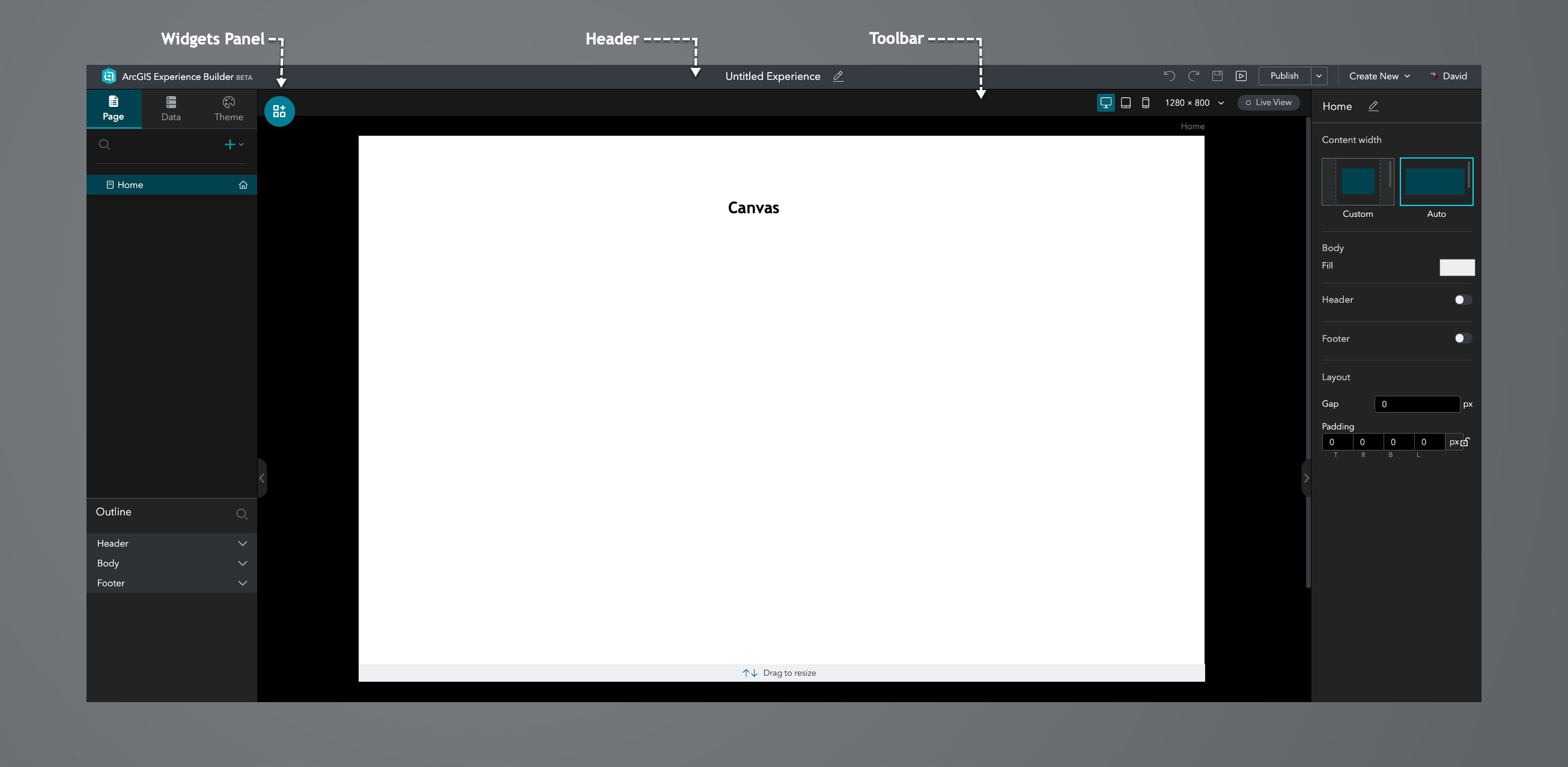
When you click to create an experience from a template, you will see that the UI is made up of the following:
Header
In the header section, you can do the following:
- Change the name of the application.
- Remove and repeat your last actions.
- Save changes, preview, and publish your application.
- Create a new experience and change the active logged-in user.
Page
A page is a document that is the foundation for the layout. It has three components: a header, body, and footer. A layout may contain a single page or multiple pages. The best approach when designing your layout is to put your content first and decide how it needs to be presented to your users. For content focused mainly on the map, we recommend using a full screen app page for this type of web app layout. For content that contains multiple images, text headings, maps, and requires vertical scrolling, the scrolling page layout is best suited for this web page layout.
Pages are listed under the Page tab. This is where you add and switch between pages, remove, duplicate, and rename the pages, while also organizing the pages hierarchically. You have the option to change the default homepage and hide any page from showing in the menu. Additionally, you can add links and folders to your page. Each page has a page setting, and in this panel, you can change the name of the page and select the width of your page to custom or auto. There are also options to select the body fill color, add a header and footer, and add gap and padding to your page.
The UI elements that exist for the current page are listed in the Outline panel. Widgets appear on the page in these three areas: header, body, and footer.
Data
Data is defined using data sources. Widgets can access data from private and public content on ArcGIS Online. This includes web maps, web scenes, feature layers, and URLs.
Theme
A theme defines the typography (e.g., font family and font size) and color for the text and background used in the header, body, and links in the app.
Toolbar
The toolbar provides tools that enable you to do the following:
- Insert and delete widgets, remove widgets from the current page and add to the pending list
- Position and overlay widgets
- Design your app layout for multiple screen sizes
- Select the canvas size for your layout
- Toggle between design and live view
Canvas
The canvas is where you design and build apps. There are two options to layout the widgets in your app, a full screen app page, and a scrolling page. Widgets are added to the canvas by dragging-and-dropping. There are red guidelines to help you position a widget with reference to other widgets on the canvas.
Widgets
Widgets are the building blocks of your apps. To add a widget, click and hold to drag the widget to the desired placement on the canvas. Widgets are configured on the right-side panel under Content, Style, and Action. Content defines the behavior, data, and other settings for the specific widget. Each widget has unique configurations, which we will illustrate below. Widgets are aligned and styled in the Style tab with settings including position, layout, background, border, border-radius, and box-shadow.
The size and position properties define how the widget is positioned on the page by width, height, and location. You can specify these values in pixels (px) or percent (%) to determine how your content is displayed. In addition, you can use the auto value as the default for these properties. Borders can be dashed, dotted, double, or solid with your color of choice and size. There are options to add corners to your widgets using border-radius and incorporate box shadows using properties, such as spread and blur radius. Widgets such as Map and List have the ability to add a trigger under the Action panel. For example, in the List widget, you can add an action such as pan to the map once a feature is selected in the list.
In the Widgets panel, there is a tab called Pending. This feature is very useful when you need to design your app for multiple screen sizes. For instance, there might be a design requirement where the map widget is implemented on large and medium screen sizes, but not on small screen sizes. In this case, you would just simply remove the map widget from the small screen size design and add it to the pending list.
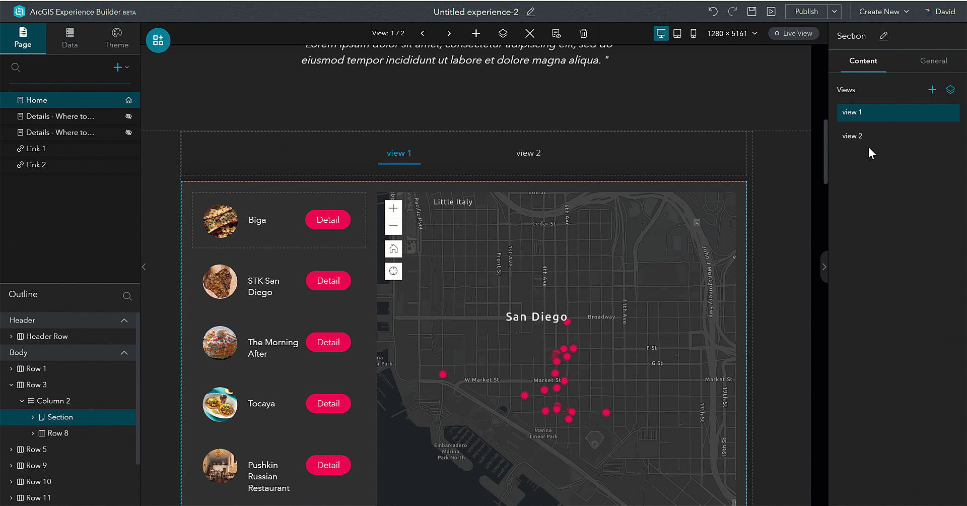
- Section - A section is a container for dynamic content; it works in coordination with the navigator widget and can be a combination of several widgets such as an image, text, column, and row. Sections can exist anywhere on a page and include multiple views. A good example of this is when you have two maps focused on the same location and would like to showcase their different features with text and images without having to load the maps in a separate page.
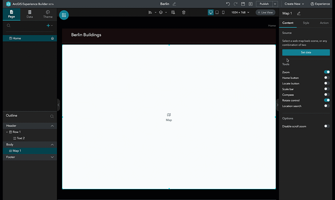
- Map - The map widget supports two options: a single map or the option to switch between two different maps. Multiple maps can be included in an app by adding more map widgets. A map contains a data source; this defines the source of data including web maps and web scenes. You can enable widgets such as including zoom, locate, scale bar, and find locations. These are positioned automatically on the map for you. This widget also supports triggers under the Action panel. For instance, with this feature, you can have two map widgets and synchronize them by simply adding a trigger for when the extent changes.
- Image - The image widget enables you to add static images from a local file, URL, and dynamic images from a data source. Dynamic images are a very useful feature, as it incorporates data binding. For example, if you have a feature layer that contains a field with URLs, and a user clicks on a point, the corresponding image will display. You can do this with text fields as well to show the name of the image using tooltips. There are additional options to change the frame (e.g., circle, diamond), background-color and add a border, corner, and shadow to the image.
- Text - Text can be static or dynamic in the text widget. We have included a text editor to allow you to change the font type, size, color, and other options related to the font. For dynamic text, you can set the data source to pull attribute information, create statistics, and expressions from a feature layer.
- Button - A button widget provides you the capability to add static or dynamic buttons to your app. These can be added from a URL, a page in your app, or a view. You can use a data source such as a feature layer to provide dynamic buttons in your app based on the selection of the feature on the map. There are different styles, sizes, and colors to choose from when designing your button.
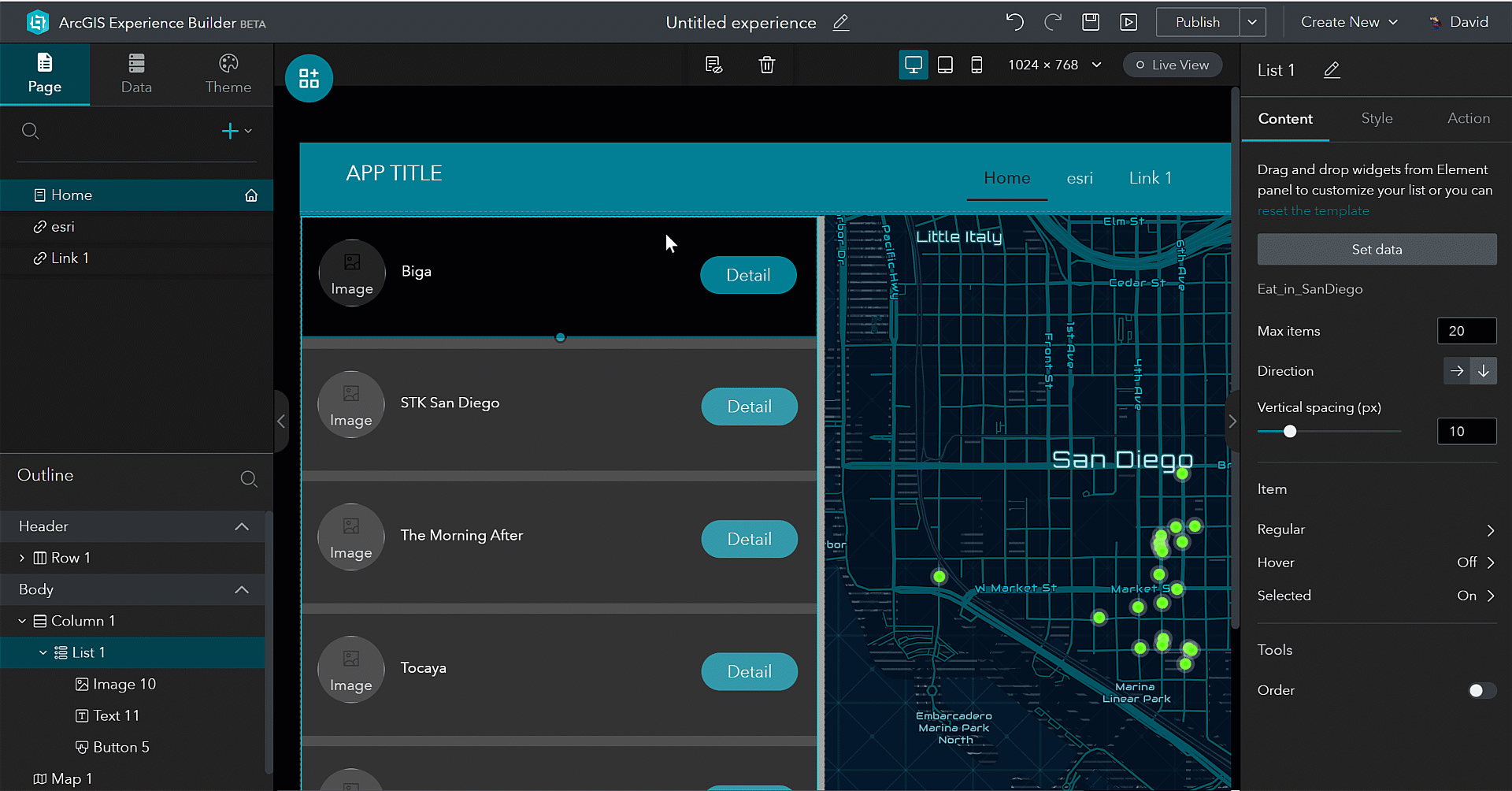
- List - The list widget enables you to create a card design for your app. Basically, a card design is a container for a few short descriptions of related pieces of information that provides a link to further details. We have included several templates to assist with building the layout. These templates include the image, button, and text widget as part of the design. Alternatively, you can choose a blank template and create your design. The source of data for the list is defined by a web map or web scene. You can set the following options for your list:
- Define the number of items you would like returned in the list
- Position the direction of the list (e.g., horizontal or vertical)
- Set the horizontal alignment to position the list in the center, right, or left
- Declare the vertical spacing between the cards
- Create styles for hover and selection for items in the list
- Sort the list by fields in the feature layer
- Create a trigger for the list based on a feature selection change and pan and zoom to the feature
- Embed - The embed widget allows you to embed a website from a URL or directly from HTML code.
- Menu - The menu widget organizes pages and is designed to help users get from one page to the next. You can change the direction of the menu, choose a style such as tabbed or pills, select a color for the background and active menu, and define the alignment.
- Navigator - The navigator widget is basically navigation for the section widget.
- Survey - The survey widget integrates with Survey123 for ArcGIS and allows you to create a new survey or use an existing survey in the widget.
- Layout Widget - The layout widget are containers for you to arrange other widgets.
Now that you a good understanding of the UI in Experience Builder, let's dive deeper and create an app.
.png "DavidMartinez")