- Home
- :
- All Communities
- :
- Products
- :
- ArcGIS Enterprise
- :
- ArcGIS Enterprise Portal Questions
- :
- Re: Way to change the pop-up order of overlapped p...
- Subscribe to RSS Feed
- Mark Topic as New
- Mark Topic as Read
- Float this Topic for Current User
- Bookmark
- Subscribe
- Mute
- Printer Friendly Page
Way to change the pop-up order of overlapped points in Portal for ArcGIS
- Mark as New
- Bookmark
- Subscribe
- Mute
- Subscribe to RSS Feed
- Permalink
- Report Inappropriate Content
For maps on ArcGIS Online or ArcGIS Portal, is there any way to decide the display order of multiple completely overlapped points?
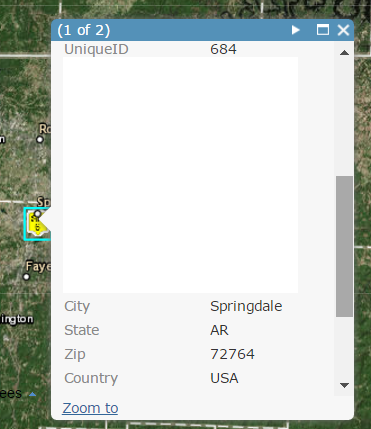
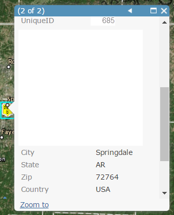
For example, two icons having the same Lat & Long in the same layer shown in the screenshots. It shows the point with UniqueID 684 is in the first pop-up window and the point with Unique ID 685 is in the second pop-up window, but the info in the second pop-up window is more useful for me. Is there any way to change the point with 685 to the first window (1 of 2) instead of (2 of 2) so that I don't need to tab through to get what I want?
What elements decide the pop-up order of overlapped points when esri designed the pop-up widget? The order of the data imported into the attribute table? The latest modified date of the data in the table? Or is the pop-up order decided just by random and there is no way to make a adjustment?


I tested the order of ObjectID, latest modified or uploaded date of the data but failed to find the common rule.
My former assumed logic is that pop up window of records with larger ObjectID or with the latest modified or uploaded date should be on the top.
Any help would be appreciated!
Thanks,
Shuhong
- Mark as New
- Bookmark
- Subscribe
- Mute
- Subscribe to RSS Feed
- Permalink
- Report Inappropriate Content
I would also like to be able to control which feature layer gets displayed first in a pop-up window with multiple feature layer returns. It would greatly enhance many existing Web Apps for my Organization. Not sure where I go to vote but I will definitely find it! Thanks 🙂
- Mark as New
- Bookmark
- Subscribe
- Mute
- Subscribe to RSS Feed
- Permalink
- Report Inappropriate Content
You can vote here: https://community.esri.com/ideas/6548
- Mark as New
- Bookmark
- Subscribe
- Mute
- Subscribe to RSS Feed
- Permalink
- Report Inappropriate Content
Here we are over 5 years since the question has been posted. On another topic concerning the same issue, it has been 8 years since the question was asked. Still no movement from ESRI. I would also like to configure the order of what information gets displayed in a pop-up. The first-come-first-serve methodology does not work in a real-world environment. I would prefer that my pop-up might take a second longer to come up in the order I specify than showing my information randomly.
- Mark as New
- Bookmark
- Subscribe
- Mute
- Subscribe to RSS Feed
- Permalink
- Report Inappropriate Content
I am also trying to solve this issue
- Mark as New
- Bookmark
- Subscribe
- Mute
- Subscribe to RSS Feed
- Permalink
- Report Inappropriate Content
It cannot be overstated how tremendously control over pop-up order would improve the user experience of web maps/apps.
ESRI, do not underestimate how much the abysmal usability across all your software damages your brand image. I think any user would agree that "ArcGIS" is synonymous with "difficult and confusing."
- « Previous
-
- 1
- 2
- Next »
- « Previous
-
- 1
- 2
- Next »