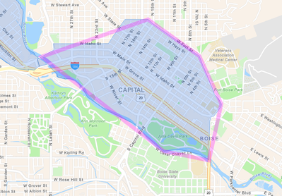
Using portal 10.7 dashboard builder. I am using the category selectors with polygons to spatially filter indicator widgets that uses points. When I select a polygon to filter, the polygons are highlighted, but the boundary is being generalized and is causing incorrect/inconsistent outputs in the point count.
Is this a projection issue? My data is published in NAD_1983_Transverse_Mercator, WKID:4269
Below is a screenshot of the polygon generalization in the dashboard.
