- Home
- :
- All Communities
- :
- Products
- :
- ArcGIS Enterprise
- :
- ArcGIS Enterprise Ideas
- :
- Change color of banners in AGOL and Enterprise
- Subscribe to RSS Feed
- Mark as New
- Mark as Read
- Bookmark
- Follow this Idea
- Printer Friendly Page
Change color of banners in AGOL and Enterprise
- Mark as New
- Bookmark
- Subscribe
- Mute
- Subscribe to RSS Feed
- Permalink
It would be really helpful to be able to change the banner color between AGOL and Enterprise - so it is easier to know in what world you are currently in!
@JamiePetersenhad a the same issue recently: Change Portal Content Banner color
and a workaround is suggested - but it would be nice just to change the color.
Another related question was:
@alexandramagalhaes with: How to change the font color of the font on the Enterprise Portal Home page
I work is so many environments I love the color change idea.
Do you mean something like the difference between:
https://hub.geoworx.co.nz/portal/home/organization.html
which uses a grey banner and:
https://geoworxnz.maps.arcgis.com/home/organization.html#overview
which is blue?
Several of my clients use this to denote, AGOL, pre-production and production...
As an alternative, the standard blue has been updated by some clients by editing CSS and/or HTML. That's not something I'd recommend as it will be replaced with each Enterprise upgrade, and you wouldn't get access into AGOL to make the change.
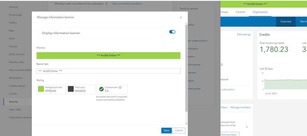
@Sarah_of_Lubbock I have found a work around that does the job. In ArcGIS Online, go to Organization -> Settings -> Security -> Information Banner. You can style something here to make it obvious!
@Scott_Tansley - it wouldn't let me open either of them. But it would just be nice for there to be an easy and quick visual que that would denote which environment you were in. Like a skinny banner on the side or something.
@JamiePetersen - thank you! I added this to our environments - and it is for sure helping! It would just be nice to have left that available as an updater or something. But our work is so small right now - anyone that would need to know about updates is probably just me XD - but here is to growing!
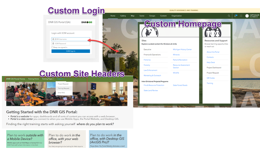
Yeah ESRI's header changes so much! It is either white (when in content), collapsed down (differently 10.9.1 in map viewer, map viewer classic or scene), cases where it could be blue.. or green as on our customized homepage... Site headers have a different look altogether... ESRI talks about their ecosystem so much, I wish they had a more cohesive UX behind their logos... yet often you also need default admin permissions to change things... here is something that we do to our Enterprise environment... tweak the login and completely customize the homepage. Banner, background watermarks, login text, and avoid their global navigation in sites... I want to be able to easily create a cohesive look and it is increasingly difficult to do with their new home page structure...
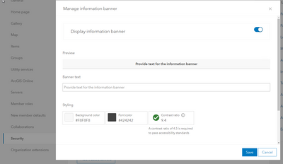
Thank you for your post! This is currently possible in Portal, similar to the workflow provided by @JamiePetersen in ArcGIS Online, by going to Security > Set Information Banner > Display Information banner > using the options to set the background and font color.
You must be a registered user to add a comment. If you've already registered, sign in. Otherwise, register and sign in.


