Hello Operations Dashboard for ArcGIS team
I saw Sandra Luken present at the Dev Summit where she showed a storymap passing URL parameters into the same dashboard, presenting different results for each slide. I’m trying to replicate something similar but think it might be beyond the capability of URL parameters.
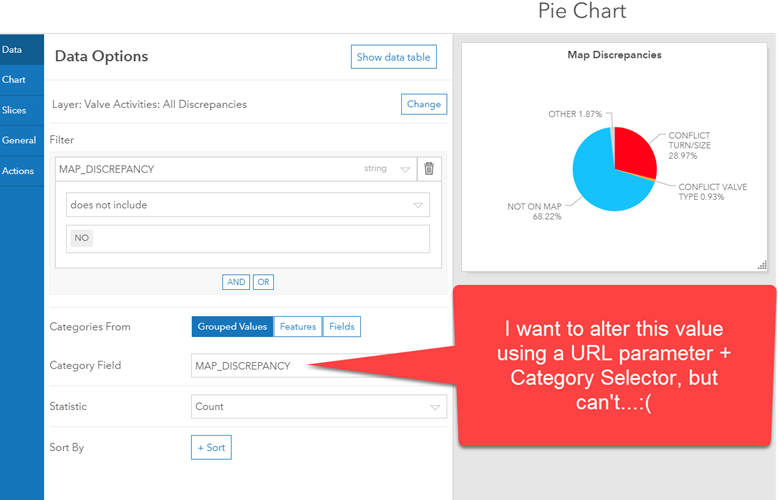
I have a pie chart with the data from grouped values. However, I want my two slides in my storymap to focus on two different category fields within my data. However a category selector only lets me filter data within each (already set) category, not define it – right?
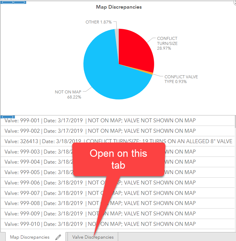
If correct then is there any way to open a dashboard with a particular stack of widgets to the front?
