- Home
- :
- All Communities
- :
- Products
- :
- ArcGIS Dashboards
- :
- ArcGIS Dashboards Questions
- :
- Re: Trend line in Dashboard
- Subscribe to RSS Feed
- Mark Topic as New
- Mark Topic as Read
- Float this Topic for Current User
- Bookmark
- Subscribe
- Mute
- Printer Friendly Page
Trend line in Dashboard
- Mark as New
- Bookmark
- Subscribe
- Mute
- Subscribe to RSS Feed
- Permalink
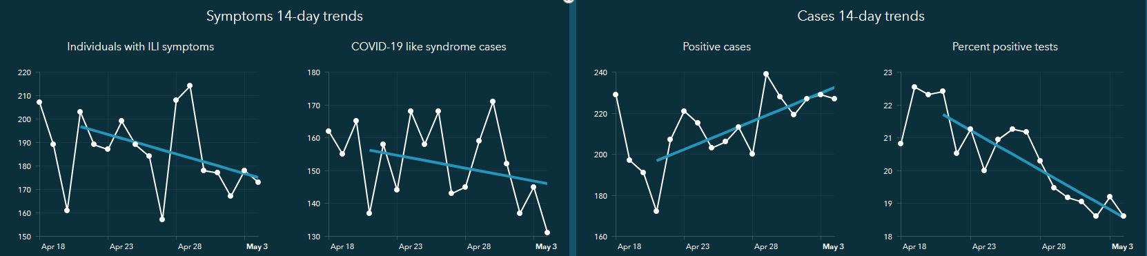
I just saw the new Coronavirus Recovery Dashboard.
How are those trend lines in the Coronavirus Recovery Dashboard created? I downloaded the solution, but it is truly tailored for public health not emergency management and I don't have access to all that data. But I do have several line graphs in other Dashboard applications that could be enhanced by a trend line.
Is that feature available to all of us?
- Mark as New
- Bookmark
- Subscribe
- Mute
- Subscribe to RSS Feed
- Permalink
Hi Charlie,
Yes the Pro project that is included in the solution has a task that walks your through how to calculate the trend lines. You can do this for any time series data you have it is not limited to the metrics that are pre-configured in the solution. There is a task that describes how you can add additional fields to the layers provided and calculate your own trend lines. We also document how to configure the dashboard for the custom metrics and trends you add to the layers.
Tabulate recovery metrics - Coronavirus Recovery Dashboard | ArcGIS Solutions
Configure recovery dashboard - Coronavirus Recovery Dashboard | ArcGIS Solutions
- Mark as New
- Bookmark
- Subscribe
- Mute
- Subscribe to RSS Feed
- Permalink
Chris
I wanted to thank you for the response. I was able to use the GIS Solutions links you provided to generate a trend line for my data. However, this does come with an extra step of data entry on my part. Is there any "trends" in the future to have the same ability to generate these lines automatically the way you can in ArcPro?
Charlie
- Mark as New
- Bookmark
- Subscribe
- Mute
- Subscribe to RSS Feed
- Permalink
I know it's been a couple years for this post, but I am also looking to do a trend line in a chart element in a Dashboard. It looks like the Coronavirus Dashboard has been moved to mature support so I can't download it anymore. Is there any other way to do a trend line??