- Home
- :
- All Communities
- :
- Products
- :
- ArcGIS Dashboards
- :
- ArcGIS Dashboards Questions
- :
- Re: Outage Dashboard - Time range outages
- Subscribe to RSS Feed
- Mark Topic as New
- Mark Topic as Read
- Float this Topic for Current User
- Bookmark
- Subscribe
- Mute
- Printer Friendly Page
Outage Dashboard - Time range outages
- Mark as New
- Bookmark
- Subscribe
- Mute
- Subscribe to RSS Feed
- Permalink
I am trying to configure an Outage Dashboard for a Utility company. I have a set of data of customer outages (one outage is basically for now a customer id, location information, an outage start and an outage end datetime field.
I would like a dashboard that shows a map of the outages that are open right now (no end datetime), and also a graph that shows the count of affected customers over time.
Is this possible?
#Outage #time management
- Mark as New
- Bookmark
- Subscribe
- Mute
- Subscribe to RSS Feed
- Permalink
Yes you can. There are a few things to keep in mind. As far as I can tell, you cannot filter the layer for empty values in the field inside Dashboard. You can however, duplicate the layer in the web map and filter the layer there for empty values (sorry for the Spanish interface):

In your dashboard you can configure to show the count of that layer.

In addition you can also create a corresponding symbology that symbolizes the time an outage is open by applying symbology based on an Arcade expression (see: Use Arcade Expressions to Map Your Ideas | ArcGIS Blog ). in this case I used this expression:
var start_date = $feature.FechaHora;
var end_date = $feature.EndDate;
var result = "Not Set";
if (IsEmpty(end_date)) {
// No end date set, so outage is open
// calculate time open (use appropiate unit, for instance minutes)
var current_date = Now();
var days_open = DateDiff(current_date, start_date, "days");
if (days_open < 1) {
result = "Less than a day"
} else if (days_open < 7) {
result = "Less than a week"
} else if (days_open < 30) {
result = "Less than a month"
} else {
result = "More than a month"
}
} else {
// outage is closed, assign a single value
result = "Closed";
}
return result;It will create different classes of time that an outage is open and you can apply an appropriate symbology to it in order to visualize those outages that have been open for a longer time, will be visualized with a more pronounced (size, color) symbol.
- Mark as New
- Bookmark
- Subscribe
- Mute
- Subscribe to RSS Feed
- Permalink
Okay, Thank you
This will get me part of the way with the visualisation.
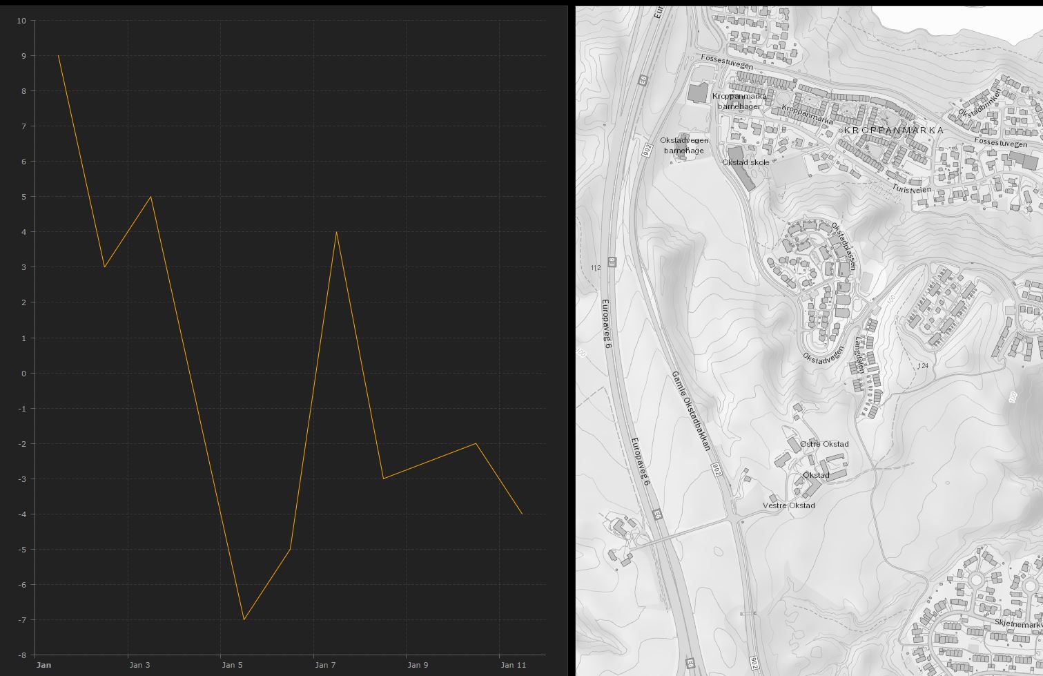
I was also looking for a Graph, like this with customers out count:
But it seems i can only do this with a one field date, and not with a time range...
- Mark as New
- Bookmark
- Subscribe
- Mute
- Subscribe to RSS Feed
- Permalink
What do the negative values in the graph represent?
Unfortunately, currently any field based on Arcade expression is not recognized by Dashboard and cannot be used in the widgets.
- Mark as New
- Bookmark
- Subscribe
- Mute
- Subscribe to RSS Feed
- Permalink
Ok, sorry, this was a snap from another Dashboard. I guess there would be no negative values in an Outage plot 
But I think you understood the question?
I have one incident creating 6 customers out of power from 1 AM to 2 AM
And then i have another incident creating 4 other Customers out from 1AM to 3 AM
Then i would see the plot with 10 Customers count from 1 AM and going down to 4 Customers at 2 AM, and then to 0 at 3 AM...
- Mark as New
- Bookmark
- Subscribe
- Mute
- Subscribe to RSS Feed
- Permalink
I think I understand what you are trying to achieve... a graph that visualizes the open outages at a given time. Interesting use case, but I don't think you can do this at this moment. You can create a graph that shows the number of outages reported per unit (for instance hours), but it won't take an outage into account at a later moment if that outage is still open.

Perhaps configure time on the layer (start and end time) and animate time could give an indication, but won't create the graph though.