- Home
- :
- All Communities
- :
- Products
- :
- ArcGIS Dashboards
- :
- ArcGIS Dashboards Questions
- :
- Multiple Choice Survey Question into Serial Chart
- Subscribe to RSS Feed
- Mark Topic as New
- Mark Topic as Read
- Float this Topic for Current User
- Bookmark
- Subscribe
- Mute
- Printer Friendly Page
Multiple Choice Survey Question into Serial Chart
- Mark as New
- Bookmark
- Subscribe
- Mute
- Subscribe to RSS Feed
- Permalink
Hello,
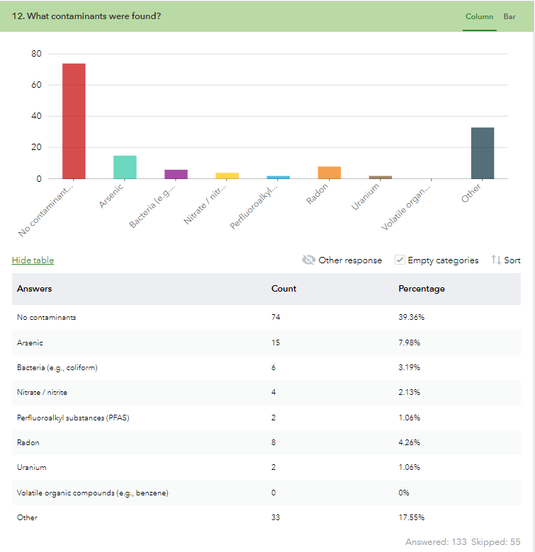
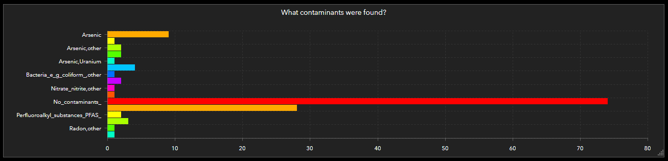
I am trying to put data from a survey question into a dashboard via a serial chart, however the question I want to insert is multiple choice. When I view the data in the survey itself you can see it displayed correctly (how I want it to look in the dashboard) however, when I put it in the dashboard it creates a separate "bar" for anyone who selected more than one choice. Is there a way I can combine the bars so it displays like in the survey?
Also, is there a way to rename the fields in a serial chart to get rid of the underscores?
Thanks. Pictures attached for reference.
- Mark as New
- Bookmark
- Subscribe
- Mute
- Subscribe to RSS Feed
- Permalink
The dashboard chart isn't parsing the comma-separated values like the survey page, and does not have access to the labels of each value in the list.
The only way to get the dashboard to look like the survey page will be to use a Data Expression. The example expressions are particularly helpful. In fact, one of the expressions is already made with this kind of situation in mind. Though it produces a pie chart, the concept could as easily be used for a serial chart as well.
Kendall County GIS
- Mark as New
- Bookmark
- Subscribe
- Mute
- Subscribe to RSS Feed
- Permalink
When you configure your chart based on a data expression, how do you configure actions based on that chart?
e.g. I have a serial chart that uses a data expression, I want users to be able to select a bar from the chart and filter the other items in the dashboard.
- Mark as New
- Bookmark
- Subscribe
- Mute
- Subscribe to RSS Feed
- Permalink
Austin,
Were you able to figure out how to configure actions based of selection within chart?
- Mark as New
- Bookmark
- Subscribe
- Mute
- Subscribe to RSS Feed
- Permalink
I was able to create something that works really well after combining a few community posts if anyone comes across this in the future. This counts the number of times a multiple choice option was selected, and also renames the label to match what it was labeled as in Survey123.
Notes:
- This uses the Grouped Value option in Dashboard where the Category is set to the 'split_choices' field from the 'new' featureSet, then the Statistic is set to 'Sum' the 'split_count' field.
- The main step to get the relabeling to work is wrapping the "Trim" function in the 'decode_dict' to translate the values
- Be sure to add the decoded values as Categories in the dashboard Series tab, not the original labels.
// Reference layer using the FeatureSetByPortalItem() method.
var portal = Portal('https://www.arcgis.com')
var fs = FeatureSetByPortalItem(
    portal,
    '<ID#>',
    0,
    ['<fieldnames>'],
    false
);

// Create empty array for features and feat object
var features = [];
var feat;
//give the codes a new label to match what was entered in the survey
var decode_dict = {
  "Local":"Born Here",
  "Indigenous":"Native, Indigenous, or Aboriginal",
  "Conflict":"Fleeing War, Tension, Persecution, Poverty; Seeking Refuge",
  "Forced":"Slavery, Human Trafficking, Criminal Relocation",
  "Career":"Opportunity - Employment or Education",
  "Family":"Adoption, Marriage, or Reunification",
  "Health":"Medical, Health, Environment, or Wellness",
  "Colonization":"Colonization"
}

// Split comma separated types and store in dictionary.
for (var feature in fs) {
    var split_array  =  Split(feature["<fieldname>"], ',')
    var count_arr = Count(split_array)
    for(var i = 0; i < count_arr; i++ ){
        feat = {
            'attributes': {
                'split_choices': decode_dict[Trim(split_array[i])]
            }
        }
        Push(features, feat);
}}

// Empty dictionary to capture each hazard reported as separate rows.
var choicesDict = {
    'fields': [
        { 'name': 'split_choices', 'type': 'esriFieldTypeString'}],
    'geometryType': '',
    'features': features
};

// Convert dictionary to featureSet.
var fs_dict = FeatureSet(choicesDict);

// Return featureset after grouping by hazard types.
return GroupBy(fs_dict, ['split_choices'],
       [{ name: 'split_count', expression: 'split_choices', statistic: 'COUNT' }]);
Olmsted County GIS
GIS Analyst - GIS Solutions
- Mark as New
- Bookmark
- Subscribe
- Mute
- Subscribe to RSS Feed
- Permalink
Worked great!!