- Home
- :
- All Communities
- :
- Products
- :
- ArcGIS Dashboards
- :
- ArcGIS Dashboards Questions
- :
- Re: How to conditionally format the background col...
- Subscribe to RSS Feed
- Mark Topic as New
- Mark Topic as Read
- Float this Topic for Current User
- Bookmark
- Subscribe
- Mute
- Printer Friendly Page
How to conditionally format the background colour of an Indicator in Operations Dashboard
- Mark as New
- Bookmark
- Subscribe
- Mute
- Subscribe to RSS Feed
- Permalink
Hi,
Is it possible to conditionally format the background colour of an Indicator in Operations Dashboard?
I am trying to use the Indicator to live update and change background colour (like a traffic light system) i.e. over a certain value, the background colour will change to yellow, or below a certain value will change to red.
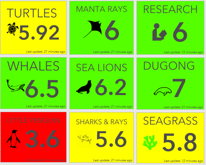
Below is an example of the type of indicators and the traffic light system.
Thanks for the help!
- Mark as New
- Bookmark
- Subscribe
- Mute
- Subscribe to RSS Feed
- Permalink
Hi Tom,
Good question. Yes, it is possible to do what you are describing. I suggest you check out the following blog article. It describes how to do this.
https://www.esri.com/arcgis-blog/products/ops-dashboard/real-time/provide-context-to-indicators/
The documentation on Indicators also provides information about conditional formatting.
https://doc.arcgis.com/en/operations-dashboard/help/indicator.htm
- Mark as New
- Bookmark
- Subscribe
- Mute
- Subscribe to RSS Feed
- Permalink
Hi David,
Thanks for the reply. I was able to add a fixed value reference and conditionally format it so that the background colour changed. However, I am trying to create a threshold for a range of values rather than an individual value.
I want to apply a threshold to each Indicator where below 3 is to be coloured red, between 4 and 5 is to be yellow and between 6 and 8 is to be green. Is there any way I can apply more than one fixed value reference to each Indicator in the dashboard (a range of values)? Or can you only apply one?
Thanks,
Tom
- Mark as New
- Bookmark
- Subscribe
- Mute
- Subscribe to RSS Feed
- Permalink
Hi Tom,
At this time the conditional formatting only allows for two styles (1. at/above and 2. below the reference value). I have recorded this enhancement request and use case. Thank you for the details.
- Mark as New
- Bookmark
- Subscribe
- Mute
- Subscribe to RSS Feed
- Permalink
David and Tom,
I have the same issue. I am trying to create an Indicator widget that would show Pollen levels, for ex.: 0-4 (low) Green, 5-49 (moderate) Yellow, 50-89(high) Orange, and 90+(very high) Red.
So if would be nice if the indicator widget allow for adding an unlimited number of reference values, and conditions. (Just like to can add more filters!)
- Mark as New
- Bookmark
- Subscribe
- Mute
- Subscribe to RSS Feed
- Permalink
Hi Nataliya,
> So it would be nice if the indicator widget allow for adding an unlimited number of reference values, and conditions.
Please submit an enhancement in the ArcGIS Ideas for Ops Dashboard site.
Hope this helps,
- Mark as New
- Bookmark
- Subscribe
- Mute
- Subscribe to RSS Feed
- Permalink
Thanks everyone for your comments on this question.
I hope someone has submitted the separate style for value at reference in the ArcGIS Ideas for Ops Dashboard.
What I am trying to do show a different style (color) for a percentage value:
The default color would be if the rate is below 50%; the next color would be for a rate that is at or above 50% but below the rate from a previous time frame; and a final color would be for the rate when it is at or above the rate from the previous time frame.
I have around 250 different areas being tracked, and each areas' rate from the previous time frame are populated in one field. Their range of values are from 55 to 85. I will receive new rate for each area every week day over a four month time period. The rate will grow over the course of this time period. Most will reach the 50% threshold, and some may even pass the area's rate from the previous time frame.
My plan is similar to Nataliya's, but has the caveat that each area will have a different previous rate. Thoughts?
- Mark as New
- Bookmark
- Subscribe
- Mute
- Subscribe to RSS Feed
- Permalink
Not sure if you have solved this question yet, but if not I hope this helps. With the integration of arcade to the indicator widget it is possible to create a threshold.
- First, I created a variable, "var c" that references my value from the table in which I base my color.
- Next is an empty array, "var clr" that will hold the color from the if statement.
- Write your if statement and set the array variable equal to the hex color for each logic criteria.
- Finally I set the "backgroundColor" as the array variable.
var c = $datapoint.riskValue
var clr = []

if(c >= 0.00001 && c < 10){
    clr = "#1d8aff"
}else if (c >= 10 && c < 30){
    clr = "#fff70e"
}else if (c >= 30 && c < 100){
    clr = "#ff7134"
}else if (c >= 100){
    clr = "#ff0000"
}else {
    clr = "#ebebeb"
}

return {
    //textColor:'',
    backgroundColor: clr,
    topText: 'Tranmission Rate',
    //topTextColor: '',
    //topTextOutlineColor: '',
    topTextMaxSize: 'x-small',
    middleText: $datapoint["riskValue"],
    middleTextColor: '',
    middleTextOutlineColor: '',
    middleTextMaxSize: 'large',
    //bottomText: '',
    //bottomTextColor: '',
    //bottomTextOutlineColor: '',
    //bottomTextMaxSize: 'medium',
    //iconName:'',
    //iconAlign:'left',
    //iconColor:'',
    //iconOutlineColor:'',
    //noValue:false,
    //attributes: {
      // attribute1: '',
      // attribute2: ''
    // }
  }

See website for great examples
Cheers,
Heath
- Mark as New
- Bookmark
- Subscribe
- Mute
- Subscribe to RSS Feed
- Permalink
Awesome tip thanks @HeathAnderson ! Helped me colours rows in a table depending on value.
- Mark as New
- Bookmark
- Subscribe
- Mute
- Subscribe to RSS Feed
- Permalink
Is it possible to apply something similar to filters in dashboards?