- Home
- :
- All Communities
- :
- Products
- :
- ArcGIS Dashboards
- :
- ArcGIS Dashboards Questions
- :
- Re: GroupBy-ish lists in a dashboard
- Subscribe to RSS Feed
- Mark Topic as New
- Mark Topic as Read
- Float this Topic for Current User
- Bookmark
- Subscribe
- Mute
- Printer Friendly Page
- Mark as New
- Bookmark
- Subscribe
- Mute
- Subscribe to RSS Feed
- Permalink
I think the answer is that it can't be done, but I wanted to check before I wrote it off and moved on.
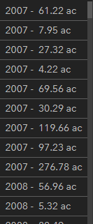
Ok, so I am building a dashboard with several lists that respond to the selection on a map. I am trying to replicate an offline workflow for displaying data to a client (think Pivot table but more complex). In this list, I really would like to get those acre values summarized by the years to the left. As far as I know, only HTML can be used to format these lists in the RTE, and I know HTML cannot do a groupby like this. Is there any other way to do it? Is there another tool to use to do it within AGO? Currently it is displaying a line per record.
Solved! Go to Solution.
Accepted Solutions
- Mark as New
- Bookmark
- Subscribe
- Mute
- Subscribe to RSS Feed
- Permalink
You think right, it can't be done. The List element is for record-by-record data access, and there's no way for it to consider more than one row at a time.
Working solely within a Dashboard, you can get this sort of thing to work in a Serial Chart, or in a series of Indicators. To truly get a plain list with aggregated data, you'd need to go into some custom development. The actual process of submitting a query to a Feature Service and getting back grouped values is quite simple, but working that into a web app or dashboard-like webpage takes a bit more work.
For an alternate approach, you can also accomplish this by introducing another layer. I've got a couple dashboards where I have a separate standalone table for the aggregated data that automatically re-calculates every hour.
Kendall County GIS
- Mark as New
- Bookmark
- Subscribe
- Mute
- Subscribe to RSS Feed
- Permalink
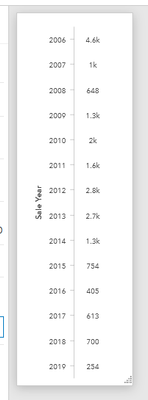
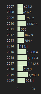
Working off of the series chart, there might actually be a halfway-decent solution here, if you don't mind making a useless field.
- Create a new field in the layer and set every row to have the same value.
- Call it "chart_field" if you like, something like that. Set the default value to 1, in case new rows will be added in the future.
- Field calculate all the current rows to have the value 1 in this field.
- In your dashboard, on the chart settings:
- In the Data tab, set Split By Field to the new chart_field
- In the Series tab, set Stacking to Stacked 100%
- Still on the Series tab, set both the Fill and Line Opacity to 0.
Since we only have a single value in chart_field, you've essentially tricked the chart into centering your labels, and without the bars displayed, you get what you want.
If we could have more options for label placement, maybe an excel-style "inside base", you wouldn't even need the fake split-by. I'll post an Idea about it, if you want to upvote it later.
Kendall County GIS
- Mark as New
- Bookmark
- Subscribe
- Mute
- Subscribe to RSS Feed
- Permalink
I think the recently released Data Expressions in Dashboards will probably let you pivot the feature table as you are looking for.
- Mark as New
- Bookmark
- Subscribe
- Mute
- Subscribe to RSS Feed
- Permalink
You think right, it can't be done. The List element is for record-by-record data access, and there's no way for it to consider more than one row at a time.
Working solely within a Dashboard, you can get this sort of thing to work in a Serial Chart, or in a series of Indicators. To truly get a plain list with aggregated data, you'd need to go into some custom development. The actual process of submitting a query to a Feature Service and getting back grouped values is quite simple, but working that into a web app or dashboard-like webpage takes a bit more work.
For an alternate approach, you can also accomplish this by introducing another layer. I've got a couple dashboards where I have a separate standalone table for the aggregated data that automatically re-calculates every hour.
Kendall County GIS
- Mark as New
- Bookmark
- Subscribe
- Mute
- Subscribe to RSS Feed
- Permalink
Thanks for the response, Josh. Yeah, I ended up doing a time series, but I suspect the client will not like the look. What's strange is, the time series chart with labels has the exact information and formatting just with the bar in between. Seems like it should be easy to do. I have built a copy in dashboards beta as well so I can test out what's possible there. I know Arcade has a groupby function, but for some reason it is listed as unavailable in the Arcade function list in this case.
Thanks again
- Mark as New
- Bookmark
- Subscribe
- Mute
- Subscribe to RSS Feed
- Permalink
Working off of the series chart, there might actually be a halfway-decent solution here, if you don't mind making a useless field.
- Create a new field in the layer and set every row to have the same value.
- Call it "chart_field" if you like, something like that. Set the default value to 1, in case new rows will be added in the future.
- Field calculate all the current rows to have the value 1 in this field.
- In your dashboard, on the chart settings:
- In the Data tab, set Split By Field to the new chart_field
- In the Series tab, set Stacking to Stacked 100%
- Still on the Series tab, set both the Fill and Line Opacity to 0.
Since we only have a single value in chart_field, you've essentially tricked the chart into centering your labels, and without the bars displayed, you get what you want.
If we could have more options for label placement, maybe an excel-style "inside base", you wouldn't even need the fake split-by. I'll post an Idea about it, if you want to upvote it later.
Kendall County GIS
- Mark as New
- Bookmark
- Subscribe
- Mute
- Subscribe to RSS Feed
- Permalink
That's an awesome workaround! I appreciate it. Definitely post the idea, and I will upvote it.
- Mark as New
- Bookmark
- Subscribe
- Mute
- Subscribe to RSS Feed
- Permalink
Kendall County GIS
- Mark as New
- Bookmark
- Subscribe
- Mute
- Subscribe to RSS Feed
- Permalink
I think the recently released Data Expressions in Dashboards will probably let you pivot the feature table as you are looking for.
- Mark as New
- Bookmark
- Subscribe
- Mute
- Subscribe to RSS Feed
- Permalink
Kevin, thanks so much for this. This is exactly what I was looking for. The workaround has served me well, but this will allow for many more robust formatting options. Just out of curiosity, how did you become aware of the Data Expressions release? I follow new features fairly closely, but this one seemed to have slipped by me.
Thanks again!
- Mark as New
- Bookmark
- Subscribe
- Mute
- Subscribe to RSS Feed
- Permalink
You're welcome! I'm not sure how I heard of it, but it probably came up in my twitter feeds. It is on my list to dive deep into because it seems like a game changer.


