- Home
- :
- All Communities
- :
- Products
- :
- ArcGIS Dashboards
- :
- ArcGIS Dashboards Questions
- :
- Display bug with a Gauge Chart
- Subscribe to RSS Feed
- Mark Topic as New
- Mark Topic as Read
- Float this Topic for Current User
- Bookmark
- Subscribe
- Mute
- Printer Friendly Page
Display bug with a Gauge Chart
- Mark as New
- Bookmark
- Subscribe
- Mute
- Subscribe to RSS Feed
- Permalink
Hi everyone!
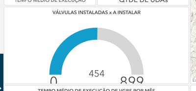
I'm encountering a frustrating display bug with a Gauge Chart element in ArcGIS Dashboards, and I'm hoping someone here has experienced something similar or has a solution.
I have configured a Gauge Chart which displays perfectly and as expected when viewing the dashboard in the editor/configuration mode.
However, when I save and view the final dashboard (or view it outside of the editor), the bottom portion of the Gauge Chart is consistently cut off/clipped.
Has anyone encountered this specific issue with the Gauge Chart being clipped in the final published view, despite looking fine in the editor?
Any suggestions or workarounds would be greatly appreciated!
Thank you!
- Mark as New
- Bookmark
- Subscribe
- Mute
- Subscribe to RSS Feed
- Permalink
You're not alone, I've faced this issue with indicators as well. This is a related thread: https://community.esri.com/t5/arcgis-experience-builder-questions/category-axis-issue/td-p/1192310
It sounds like you have to keep playing with text and gauge box size until it looks good on your final screen.
- Mark as New
- Bookmark
- Subscribe
- Mute
- Subscribe to RSS Feed
- Permalink
At first, I was completely frustrated when I encountered a similar gauge problem. No matter what I did, the display simply didn't look right, even though the data was fine. After an update, it turned out to be a scale and refresh issue for me. The chart finally behaved after I rebuilt it and applied the settings again from the beginning. These bugs don't always feel like user error; sometimes they feel random.

