- Home
- :
- All Communities
- :
- Products
- :
- ArcGIS Dashboards
- :
- ArcGIS Dashboards Questions
- :
- Customizing serial chart value axis minimum values
- Subscribe to RSS Feed
- Mark Topic as New
- Mark Topic as Read
- Float this Topic for Current User
- Bookmark
- Subscribe
- Mute
- Printer Friendly Page
Customizing serial chart value axis minimum values
- Mark as New
- Bookmark
- Subscribe
- Mute
- Subscribe to RSS Feed
- Permalink
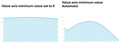
I have a dashboard with a serial chart (line), controlled by a selector action, to show state and county populations over several decades. Most rates of change are small, but not insignificant.
If I set the value axis' minimum value to 0, the resulting line chart looks flat for many counties. Any growth or decrease in population can be difficult to see. But if I set the minimum value to "Automatic," the line chart begins at the lowest value in a series. That can make relatively small changes seem large.
I would like to find a middle spot. What I would like to do is to set the Minimum Value as a percentage of the lowest value in the series. For example, 50%. So, if the lowest value in the series is 100,000, the value axis would begin at 50,000.
I'd appreciate any guidance on if this is possible in the chart settings, through a data expression, or something else, and if there are any suggestions for a workaround.
