- Home
- :
- All Communities
- :
- Products
- :
- ArcGIS Dashboards
- :
- ArcGIS Dashboards Questions
- :
- Create Progress Bar for Stages in ArcGIS Dashboard...
- Subscribe to RSS Feed
- Mark Topic as New
- Mark Topic as Read
- Float this Topic for Current User
- Bookmark
- Subscribe
- Mute
- Printer Friendly Page
Create Progress Bar for Stages in ArcGIS Dashboards via Arcade
- Mark as New
- Bookmark
- Subscribe
- Mute
- Subscribe to RSS Feed
- Permalink
Hi there,
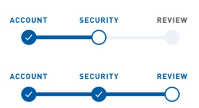
I have a feature layer that I'm preparing for Survey123 with four different domains in one field called "Status" (Stage 1, Stage 2, Stage 3 and Stage 4). I'd like to show progress in a dashboard list as surveys get submitted and change from one stage to another, ideally like something the screenshots below.
Has anyone encountered similiar formatting before or know if this is possible via arcade in dashboard lists?
- Mark as New
- Bookmark
- Subscribe
- Mute
- Subscribe to RSS Feed
- Permalink
You definitely could! I suspect it would involve a bit of Advanced Formatting with Arcade, as well as some SVG elements. I wrote up a post about using Arcade and SVGs to create analog clocks, which you can find here: https://community.esri.com/t5/arcgis-dashboards-blog/make-your-own-analog-clock-widget/ba-p/1135573
SVGs will probably look the best, and scale nicely as you adjust the container or view it on other devices. An alternate approach, though, would be to store images for the different progress steps, then use the advanced formatting to pipe in the appropriate image.
Kendall County GIS

