- Home
- :
- All Communities
- :
- Products
- :
- ArcGIS Dashboards
- :
- ArcGIS Dashboards Ideas
- :
- Option to "show both positive/negative values" whe...
- Subscribe to RSS Feed
- Mark as New
- Mark as Read
- Bookmark
- Follow this Idea
- Printer Friendly Page
- Report Inappropriate Content
Option to "show both positive/negative values" when the minimum value on the y-axis is set to zero
- Mark as New
- Bookmark
- Subscribe
- Mute
- Subscribe to RSS Feed
- Permalink
- Report Inappropriate Content
A basic principal of bar/column charts is that the y-axis should generally show zero. ArcGIS Dashboard allows a minimum value to be set. In theory, you can set the minimum value of the y-axis (value axis) and and adhere to this principle.
That works well if all of the values are positive or all the values are negative. But when charts are generated dynamically and there is a mix of positive and negative values then this option does not work. The next three chart show the current limitation.
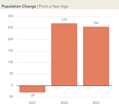
Here is data for a county where there are a mix of positive and negative integers. This looks fantastic. Note that in this example, the y-axis (value axis) minimum value of zero is not set.
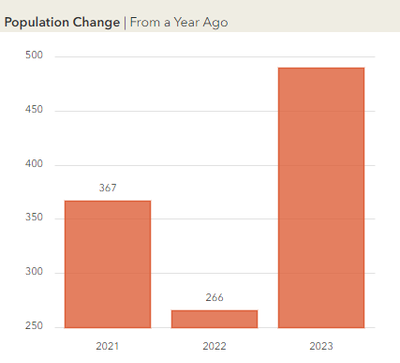
Here is another county where all the values are positive. Unfortunately now the zero on the y-axis is no longer shown. That's a violates the rule of equal area in bar charts that we should adhere to. To fix this problem, I can set the minimum value of the y-axis (value axis) to zero to solve this problem.
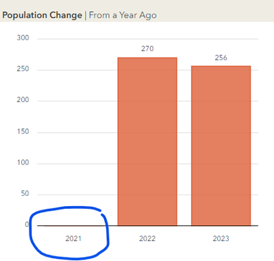
If I set the minimum value to zero, that will fix the second visualization. But what happens to the first county? With the minimum value set to zero, the y-axis is now truncated at zero (maybe as expected/designed) and no data is shown for the first year in the series. Note is should be -28 as is shown above.
I submit we need an option to "show both positive/negative values" when the minimum value on the y-axis is zero. This option should be placed on the Value axis configurations tab near the "minimum value" setting. This solution would permit a configuration that is currently mutually excluded.
- Enable a series with all positive or negative values to show zero on the y-axis; and
- Prevent a series with a mix of positive and negative values from being truncated.
Some would probably argue for the using a line chart to get around this problem but I think the bar/column charts are easier for the casual viewer to interpret, especially when there are values above and below zero. To me, this is borderline a "bug" and not a feature enhancement. Either way, to adhere to good principles of data visualization, we need an option to "show both positive/negative values" if the minimum series value is set to zero.
Live link for this dashboard is here: https://tiny.utk.edu/co_est_202x_dash. Examples shown are from Cannon and Cheatham County.
Thanks,
Tim
Note: Edited to change the name of the idea from "Always show zero" to "show both positive/negative values" when the minimum value on the y-axis is set to zero
You must be a registered user to add a comment. If you've already registered, sign in. Otherwise, register and sign in.


