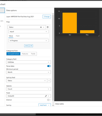
When adding a serial chart, the category axis labels look fine when the bars are vertical:

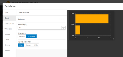
Flipping it to horizontal causes the labels to move from under/next to the bar to the breaks between them, resulting in something that's really confusing:

The labels should sit centred with the bar, not above them, as they represent data within a month, not between them.