- Home
- :
- All Communities
- :
- Products
- :
- ArcGIS Dashboards
- :
- ArcGIS Dashboards Ideas
- :
- Change Category Selector Button colors
- Subscribe to RSS Feed
- Mark as New
- Mark as Read
- Bookmark
- Follow this Idea
- Printer Friendly Page
Change Category Selector Button colors
- Mark as New
- Bookmark
- Subscribe
- Mute
- Subscribe to RSS Feed
- Permalink
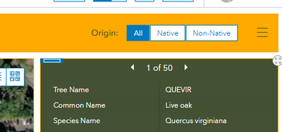
The button colours for the category selector seem to be hardwired to blue? Can these be changed to match the rest of the theme?
- « Previous
-
- 1
- 2
- Next »
Been waiting on this one for a while now. If allowing the user to choose a specific color is difficult for whatever reason, I'd even be okay with the option to choose something neutral like black or white from a list, instead of it always being blue. For certain themed dashboards, the blue can really stick out like a sore thumb.
I totally agree with what has been said above. We can customize most of the theme but this blue color really stick out.
I agree this is a problem, especially considering ESRI themselves say in the below article that "you can select colors to match your organization's branding." This only works if you can change ALL of the colors. I would rather stick with the default look than implement my organization's colors incompletely. Please add this setting.
https://doc.arcgis.com/en/dashboards/create-and-share/dashboard-settings.htm
2.5 years later and still no movement???
We can control the color of everything except the selector???
Throwing my hat in here as well; button bar is the clear option for my use cash, but the default blue is clashing very poorly with organizational colours.
Commenting on this again as I've been working in Experience Builder the last few days and have found this problem rampant there as well. It seens built-in widgets like category selector, map tools, table viewer, etc. can't be customized at all beyond switching between the light and dark themes. This completely defeats the purpose of having customizable colors elsewhere, because you're forced to use ESRI's default color scheme anyway to ensure continuity across the app.
An incredibly massive yet simple milestone with this issue would be to completely get rid of the ESRI blue in all widgets and replace it with a neutral color. You would still be stuck using ESRI's neutral colors, but those at least look decent with any brand's color scheme, unlike the blue.
Full customization of the colors on all built-in widgets would be great, but I imagine even this small change would hugely increase the usage of ArcGIS custom apps. Not being able to implement branding is likely a huge barrier to most organizations.
Wow, still no movement on this. Disappointing.
Dashboard themes had significant improvements made in the June 2024 update of ArcGIS Online. Each theme now includes its own 'accent color' (which is the color of the button bar outlines, amongst other things). If the built in theme colors won't do, changing things like the accent color can be accomplished by creating a custom theme. Related blog post here.
You must be a registered user to add a comment. If you've already registered, sign in. Otherwise, register and sign in.


