- Home
- :
- All Communities
- :
- Products
- :
- ArcGIS Dashboards
- :
- ArcGIS Dashboards Ideas
- :
- Ability for Indicator card to show text string dat...
- Subscribe to RSS Feed
- Mark as New
- Mark as Read
- Bookmark
- Follow this Idea
- Printer Friendly Page
Ability for Indicator card to show text string data
- Mark as New
- Bookmark
- Subscribe
- Mute
- Subscribe to RSS Feed
- Permalink
I would like to be able to show dynamic text data in a Dashboard. When I create dashboards in PowerBI I use the "Card" visualisation:
A single number, such as total sales, market share year over year, or total opportunities, is sometimes the most important thing you want to track. A type of visualization in Power BI called a card may be the best way to view that number.
https://learn.microsoft.com/en-us/power-bi/visuals/power-bi-visualization-card?tabs=powerbi-desktop
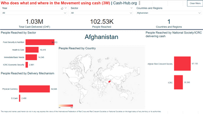
Microsoft's summary suggests this is only available to use with numerical data, but it isn't. I use "Cards" as big, obvious labels that tell end-users what data is being shown on the visualisation. Below is an example of using a "Card" with text data. The card is the Country name, which changes based on the data selection:
The closest comparable visualisation widget in ArcGIS Dashboards is, as far as I can see, the "Indicator", however this only accepts numerical values:
An indicator is a card that you can add to your dashboard to show the numeric attributes of individual features or display a summary statistic. Indicators can also be used to compare the calculated value to a reference value.
https://doc.arcgis.com/en/dashboards/latest/get-started/indicator.htm
Thus, I am unable to create a similar label in ArcGIS Dashboards. I would really like to be able to do so!
In some cases I think you could use a list to create this kind of label. Just limit it to show only one record and work with the layout options to make it look like a label. But it depends on your data model.
Inidcators are not limited to numeric data. You can set an indicator to feature mode, where it can show any attributes of an individual feature, such as a county name. The indicator can be filtered by other selections in the dashboard, thus giving you the dynamic text "card" you're looking for.
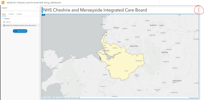
Thank you @AndreasHall , I tried your suggestion and was able to make a label-like item. I notice there is some unfortunate default minimum padding that makes the single item list have it's own scrollbar when the list is sized to appear as a single label (highlighted in red on screenshot below).
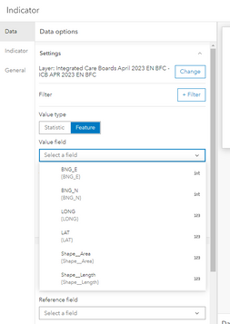
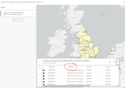
Thank you too @jcarlson , however I wasn't able to produce your suggestion. The single feature layer I am testing this with has a field called "ICB23NM", which holds a string value for the name of the local health authority. I am unable to select this field using the "Feature" mode in the Indicator card. Only numerical fields are available:
Can you make any suggestions to troubleshoot?
(The feature layer I'm using is publicly accessible at https://services1.arcgis.com/ESMARspQHYMw9BZ9/arcgis/rest/services/Integrated_Care_Boards_April_2023... for reference)
I still find this to be a blocker to using ArcGIS Dashboards as a product.
If anyone is able to provide any solutions, I'd be grateful.
I was able to trick the widget to show text. I selected Feature under Value Type and just selected any field, and then under the indicator tab, I selected the text field I wanted to display for the middle text. They should just let you select text fields under the Value Type.
You must be a registered user to add a comment. If you've already registered, sign in. Otherwise, register and sign in.


