- Home
- :
- All Communities
- :
- Products
- :
- ArcGIS Business Analyst
- :
- ArcGIS Business Analyst Ideas
- :
- Template Themes should have better/different colou...
- Subscribe to RSS Feed
- Mark as New
- Mark as Read
- Bookmark
- Follow this Idea
- Printer Friendly Page
Template Themes should have better/different colour allocation
- Mark as New
- Bookmark
- Subscribe
- Mute
- Subscribe to RSS Feed
- Permalink
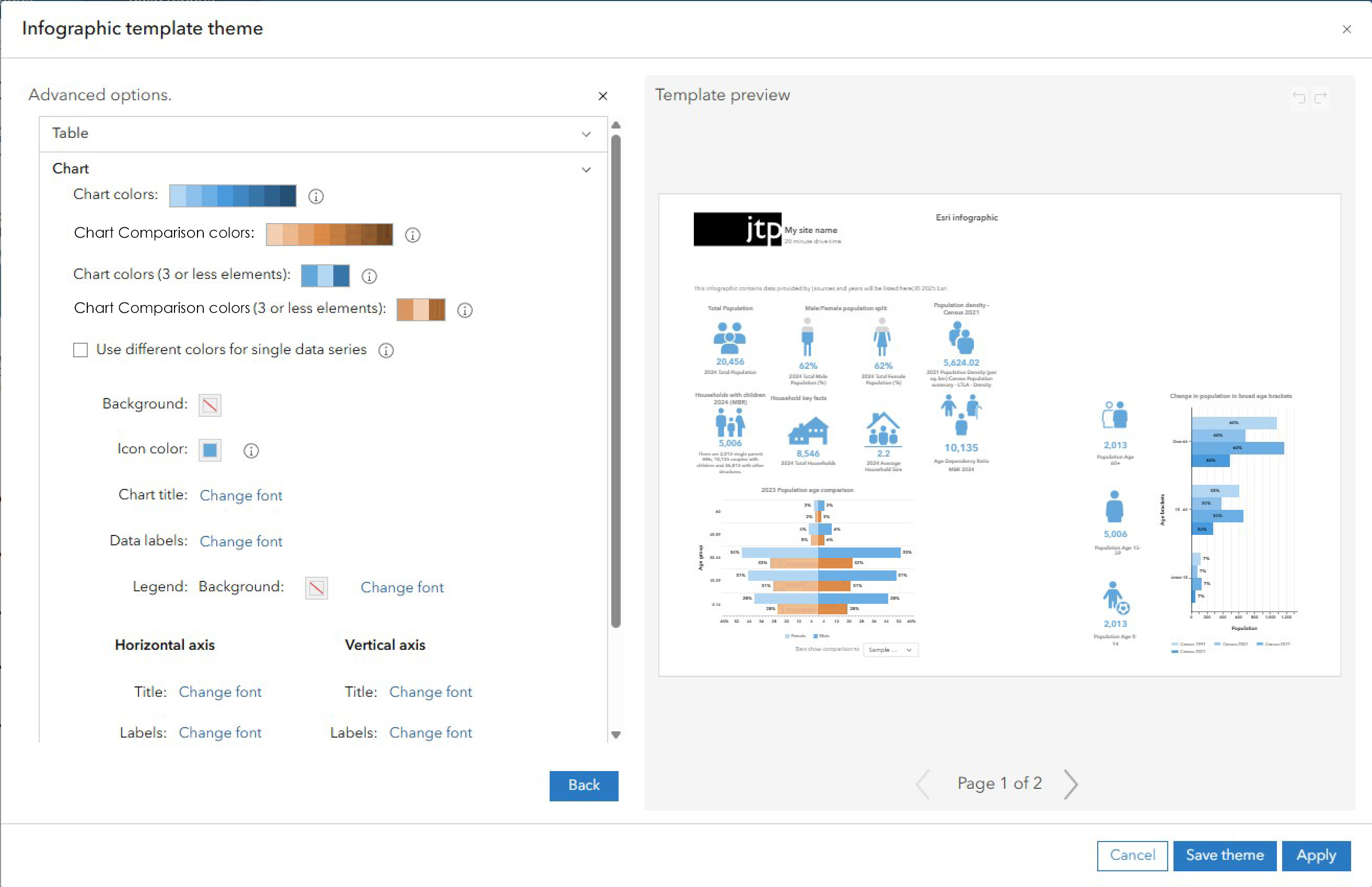
When trying to edit the custom infographics template themes, the colour allocation in what appears to be a gradient, seems to be very bizarre. I've attached some images to help explain.
Current Chart colours application_1.jpg (below) - This shows the current set up with the advanced colour palette. I've numbered the colours so you can see where they are applied. In this image, there seems to be a sort of logic to the application.

Current Chart colours application_2.jpg (below) - However, this screenshot shows how trying to change the comparison data colours affects the colour palette and the other bar charts. To me, this is very illogical. It appears that the colours are applied in illogical places. If I have a comparison colour, I don't want it to apply to another chart that actually has no comparison on it. This gives a false impression that there is comparison data, which is incorrect for the chart on the right in the example.

Proposed Chart colours application.jpg (below) - This shows my solution. There should be separate colour pickers for the comparison data, so that they are always differentiated against any other data in the infographics.

Hi Bill,
Thank you for your thoughtful suggestion regarding improvements to the template themes. We completely agree that enhancing the visual and functional quality of report themes is important, and this is part of our mid to long-term roadmap.
We’ll definitely take your feedback into consideration as we continue to refine and update the experience. Please keep the ideas coming — your input helps us build a better product for everyone.
Cheers,
Linwei
You must be a registered user to add a comment. If you've already registered, sign in. Otherwise, register and sign in.