.NET Style library available for use in apps Calcite .NET Toolkit preview version has been released. In this article, we introduce this Calcite .NET Toolkit ,Esri Community Blog 's "Announcing Calcite .NET Toolkit" translated for you.
ArcGIS Maps SDK for .NET team often needs not only to showcase the features of the API but also to create visually appealing samples and demos, so a simple styling library providing standard styles and icons was needed. Also, many users have asked, "ArcGIS Maps SDKs for Native Apps how can I use Calcite ?"
Calcite Design System provides many components, styles, icons, etc., for the JavaScript developer community, and we have been working to build similar ones for ArcGIS Maps SDKs for Native Apps . Using the powerful XAML styling capabilities and markup extensions of WPF, WinUI, and .NET MAUI, we built a library to achieve this. We plan to use this library extensively in demos and samples and hope it will be useful to you as well. Included in the SDK:
:
Implicit or explicit styles matching the Calcite Design SystemMarkup extensions providing easy access to over 2,500 Calcite UI icons
- , not included in the current SDK::
- Component set of Calcite (some may be added in the future upon request) This library is fully built by the ArcGIS Maps SDK for .NET team with approval from the Calcite team but is not maintained by the Calcite team. Therefore, issue reports and discussions are handled in this GitHub
repository (
https://github.com/Esri/calcite-dotnet-toolkit).This library is provided by the team that developed ArcGIS Maps SDK for .NET but has no dependency on ArcGIS Maps SDK for .NET. It can be used in WPF, WinUI, and .NET MAUI applications under development.For available brushes, markup extensions, usage in each framework, please check the documentation on GitHub. Please try it out and share your feedback on this effort.
- Getting StartedFirst, using NuGet Package Manager, enable [Include prerelease] in search and add one of the following NuGet packages.Esri.Calcite.WPFEsri.Calcite.MauiEsri.Calcite.WinUI
After adding a package, steps required to register the package and include styles will be shown in the readme.
WPF requires adding CalciteResources to the resource dictionary in App.xaml.<ResourceDictionary> <ResourceDictionary.MergedDictionaries> <CalciteResources xmlns="http://schemas.esri.com/calcite/2024" /> </ResourceDictionary.MergedDictionaries></ResourceDictionary>
パッケージを追加すると、パッケージを登録してスタイルを含めるために必要な手順が readme に表示されます。
WPF
WPF では、App.xaml のリソース ディクショナリに CalciteResources を追加する必要があります。
<ResourceDictionary>
    <ResourceDictionary.MergedDictionaries>
        <CalciteResources xmlns="http://schemas.esri.com/calcite/2024" />
    </ResourceDictionary.MergedDictionaries>
</ResourceDictionary>
WPF の追加プロパティを使用すると、ダーク モードを設定したり、暗黙的なスタイル設定をオフにしたりできます。
WinUI
WinUI の場合、CalciteResources を XamlControlsResources エントリに追加する必要があります。暗黙的なスタイリングが不要な場合は、代わりに XamlControlsResources の前にエントリを挿入することもできます。
<XamlControlsResources xmlns="using:Microsoft.UI.Xaml.Controls" >
  <XamlControlsResources.MergedDictionaries>
    <CalciteResources xmlns="using:Esri.Calcite.WinUI" />
  </XamlControlsResources.MergedDictionaries>
</XamlControlsResources>
.NET MAUI
.NET MAUI では、リソースをデフォルトのスタイル エントリの後に挿入して暗黙的なものにするか、その前に挿入してスタイルだけを明示的に利用できるようにします。
<ResourceDictionary>
    <ResourceDictionary.MergedDictionaries>
        <ResourceDictionary Source="Resources/Styles/Colors.xaml" />
        <ResourceDictionary Source="Resources/Styles/Styles.xaml" />
        <CalciteResources xmlns="http://schemas.esri.com/calcite/2024"/>
    </ResourceDictionary.MergedDictionaries>
</ResourceDictionary>
.NET MAUI では、MauiProgram.cs の AppBuilder に Calcite ツールキットを登録する必要があります。
using Esri.Calcite.Maui; // 以降で使用される UseCalcite 拡張メソッドにアクセスします

namespace MauiTests
{
    public static class MauiProgram
    {
        public static MauiApp CreateMauiApp()
        {
            var builder = MauiApp.CreateBuilder();
            builder
                .UseMauiApp<App>()
                .ConfigureFonts(fonts =>
                {
                    fonts.AddFont("OpenSans-Regular.ttf", "OpenSansRegular");
                    fonts.AddFont("OpenSans-Semibold.ttf", "OpenSansSemibold");
                }).UseCalcite(); // Calcite を登録する
            return builder.Build();
        }
    }
}
使用方法
リソースを含めると、さまざまなカラー、ブラシ、スタイル、およびアイコンにアクセスできるようになり、Calcite Design System ガイドラインに従ってアプリケーションをスタイル設定できます。Calcite デザイン トークンに精通している場合、XAML で使用される命名パターンにわずかに適応するだけで、多くの同等性と命名の類似性を見つけることができます。たとえば、プライマリとセカンダリの Calcite ボタンを作成する場合は、次のようにスタイルを適用します。
<Button Content="OK" Style="{StaticResource CalcitePrimaryButtonStyle}" />
<Button Content="Cancel" Style="{StaticResource CalciteSecondaryButtonStyle}" />
スタイルの命名は一般的に、プラットフォームが提供する他の XAML スタイルの命名パターンに一致する Calcite[Kind][ControlType]Style のパターンに従います。最後の単語は常にリソースのタイプで、この場合は Style です。同様に、CalciteBrandBrush や CalciteBrandColor のような場合は、それぞれ Brush と Color タイプです。MAUI では、カラーはテーマ設定をサポートしないため、カラーにはさらに 'Light' または 'Dark' が追加されます(例: CalciteBrandLightColor)。これらの詳細については、下記を参照してください。
アイコン
2,500 以上の Calcite UI アイコン全てに 3 つの詳細レベルを用意し、どのサイズでも鮮明なアイコンを表示することができます。これらは、汎用的なアイコンから GIS に関連したアイコンまで多岐にわたります。
これらには、フォントと文字コードを介して、またはライブラリによって提供されるマークアップ拡張機能を使用してアクセスできます。XAML でどのように表示されるかの例を示します。
WPF:
<TextBlock Text="{StaticResource CalciteUIIcons_Glyph_Map}"
           FontFamily="{StaticResource CalciteUIIconsMediumFontFamily}" />
<Path Data="{calcite:CalciteIconGeometry Icon=ChevronLeft, Scale=Small}" Fill="Green" Width="32" Height="32" Stretch="Uniform" />
<Image Source="{calcite:CalciteIconImage Icon=AddLayer, Scale=Large, SymbolSize=32, Brush=Blue}" Width="32" Height="32" />
WinUI:
<TextBlock Text="{StaticResource CalciteUIIcons_Glyph_Map}"

           FontFamily="{StaticResource CalciteUIIconsMediumFontFamily}" />


<IconSourceElement Width="32" Height="32" >
    <IconSourceElement.IconSource>
        <calcite:CalciteFontIconSource Icon="Map" FontSize="32" Scale="Large" />
    </IconSourceElement.IconSource>
</IconSourceElement>

<AppBarButton Label="Zoom Out">
    <AppBarButton.Icon>
        <IconSourceElement IconSource="{calcite:CalciteIconSource Icon=ZoomOutFixed, Scale=Small}" />
    </AppBarButton.Icon>
</AppBarButton>
.NET MAUI:
<Label Text="{StaticResource CalciteUIIcons_Glyph_Map}"
                 FontFamily="CalciteUIIconsMediumFontFamily" />
<Image>
    <Image.Source>
        <calcite:CalciteIconImageSource Color="Blue" Icon="MagnifyingGlass" Size="40" Scale="Large" />
    </Image.Source>
</Image>
<Image Source="{calcite:CalciteIconImage Color=Blue, Icon=MagnifyingGlass,Size=40, Scale=Large}" />
Dark Mode
WinUI と .NET MAUI は、ダーク モードとライト モードを完全にサポートしています。ただし、この機能は WPF 自体には完全に実装されていないため、Calcite Toolkit for .NET では独自の方法でこれを処理しています。CalciteResources で DarkMode と LightMode You can explicitly set it or leave it as default so the mode follows the system settings. However, if you are using hardcoded brushes that do not update when switching to dark mode, they will be automatically updated when the mode changes.Calcitebrush needs to be switched to.
Sample
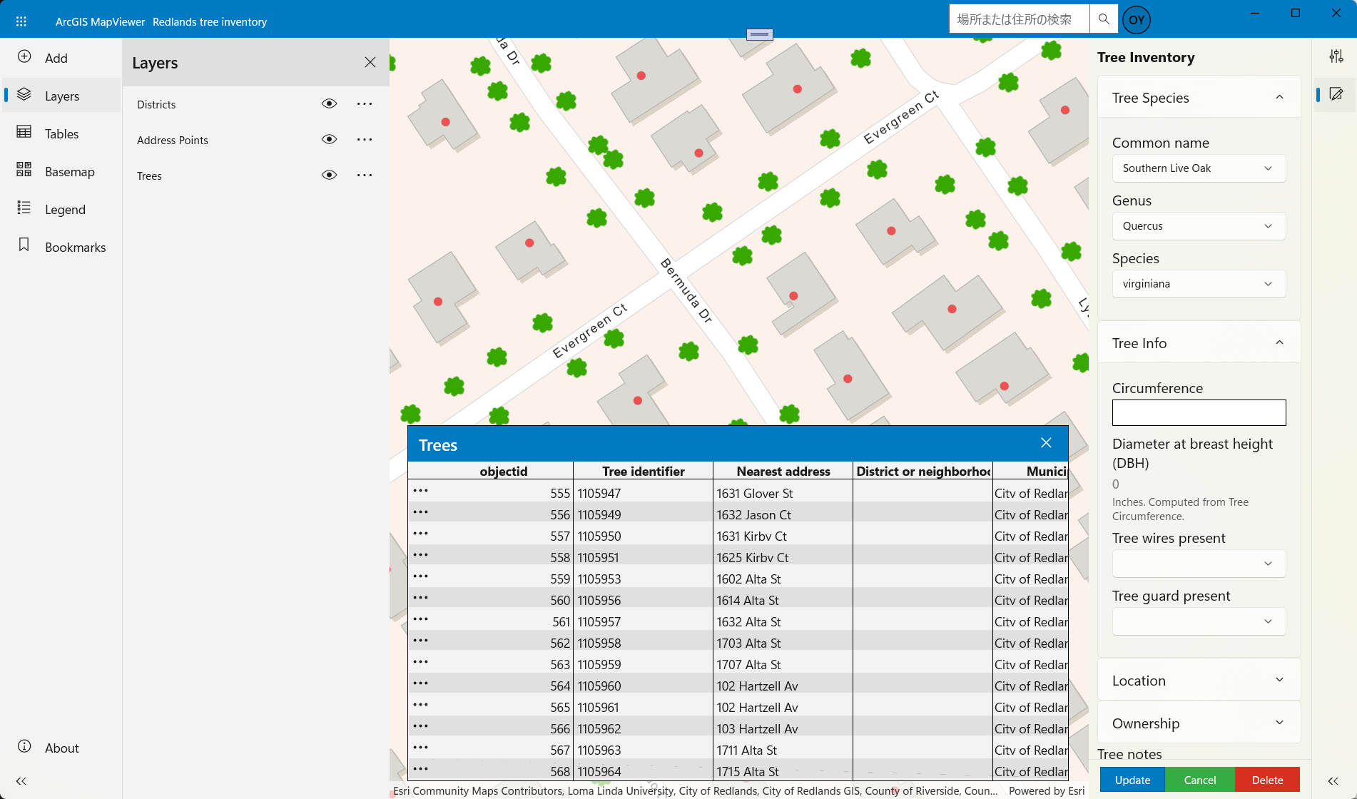
Demo Samplemost have been updated to use the library,SDKmany features andCalcitestyles combined to create a full-fledged application.A new map viewer samplehas also been added. Please check out this sample.https://github.com/Esri/arcgis-runtime-demos-dotnet/
Future Plans
The Calcite .NET Toolkit introduced in this article is the first preview of an exciting new product. We look forward to your feedback on what’s missing, what should be improved, and how you use it.XAMLdeveloper community will continue to build this feature to help create visually appealing applications.