- Home
- :
- All Communities
- :
- Products
- :
- ArcGIS Collector
- :
- ArcGIS Collector Questions
- :
- Re: How can I hide the Update Point button?
- Subscribe to RSS Feed
- Mark Topic as New
- Mark Topic as Read
- Float this Topic for Current User
- Bookmark
- Subscribe
- Mute
- Printer Friendly Page
How can I hide the Update Point button?
- Mark as New
- Bookmark
- Subscribe
- Mute
- Subscribe to RSS Feed
- Permalink
- Report Inappropriate Content
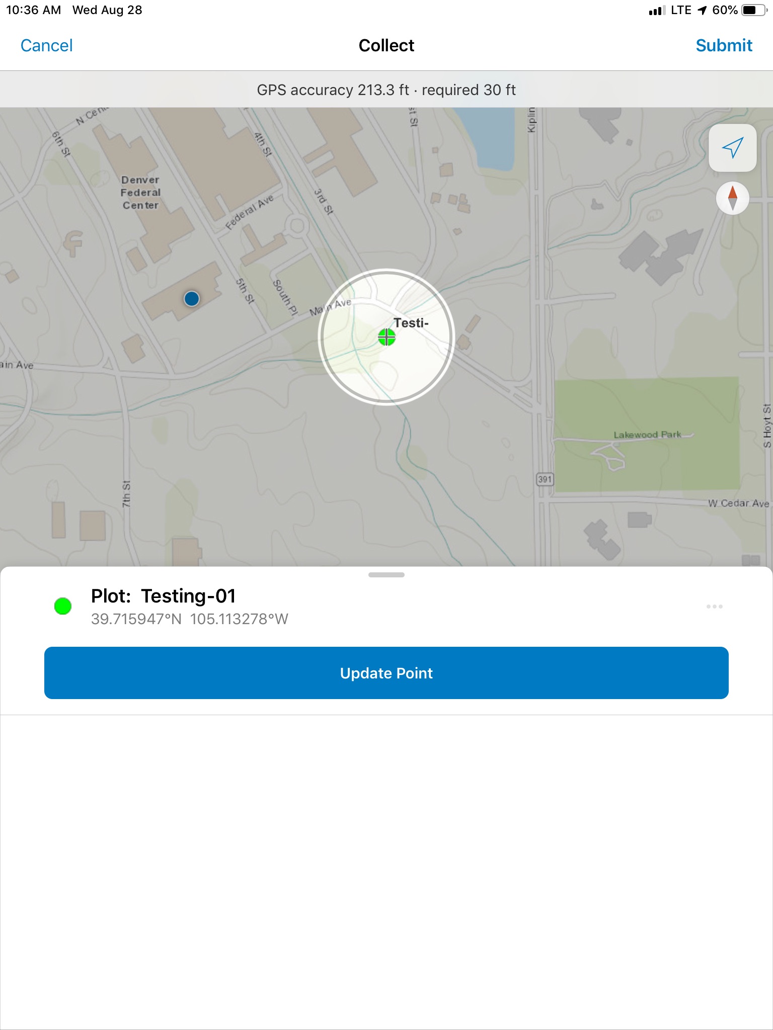
Is there a way to remove the giant center Update Point button?
Our users update attributes only. It is VERY confusing to the user that they do not hit the big center Update Point button and instead have to go look for for the tiny Submit button way at the top corner. This causes pretty much all of our users to change the point location all the time.
Not really sure why this layout was chosen. I wish it at least said Update GPS location or something like that. Update Point is just so vague.
I would like the button gone completely.
See attached
Thanks
- Mark as New
- Bookmark
- Subscribe
- Mute
- Subscribe to RSS Feed
- Permalink
- Report Inappropriate Content
I have this issue as well. Has there been an update on the topic?
- Mark as New
- Bookmark
- Subscribe
- Mute
- Subscribe to RSS Feed
- Permalink
- Report Inappropriate Content
I did find that in Portal there is a setting in the feature service to Not allow Geometry updates. Maybe this will help you. But this setting is not in AGOL for some reason.
We still have people moving points all the time. Even after training that big Update Point button right in the middle is just plain too tempting. Esp with the Submit button hidden way up on the top corner. And since it does not say Update GPS point or something like that. If anything I wish they flipped them. Moving a point is more rare then updating attributes so i just do not get the UI here. In fact I wish we could hide the map completely on an edit like in the old days. Just a waste of space.
Thanks for considering team!
- Mark as New
- Bookmark
- Subscribe
- Mute
- Subscribe to RSS Feed
- Permalink
- Report Inappropriate Content
We have had issues with the "Update Point" button as well. Many users have inadvertently moved a point when all they wanted to do was edit attributes. Even changing the button text to "Update Point Location" would help, and making the button less prominent relative to the "Submit" button. I see you also brought this issue up in another thread at Editing experience in "new" ArcGIS Collector (iOS)
Thanks.