- Home
- :
- All Communities
- :
- Products
- :
- ArcGIS Spatial Analyst
- :
- ArcGIS Spatial Analyst Questions
- :
- Re: Population Density with graduated colors isn't...
- Subscribe to RSS Feed
- Mark Topic as New
- Mark Topic as Read
- Float this Topic for Current User
- Bookmark
- Subscribe
- Mute
- Printer Friendly Page
Population Density with graduated colors isn't reflected in map
- Mark as New
- Bookmark
- Subscribe
- Mute
- Subscribe to RSS Feed
- Permalink
- Report Inappropriate Content
Hi,
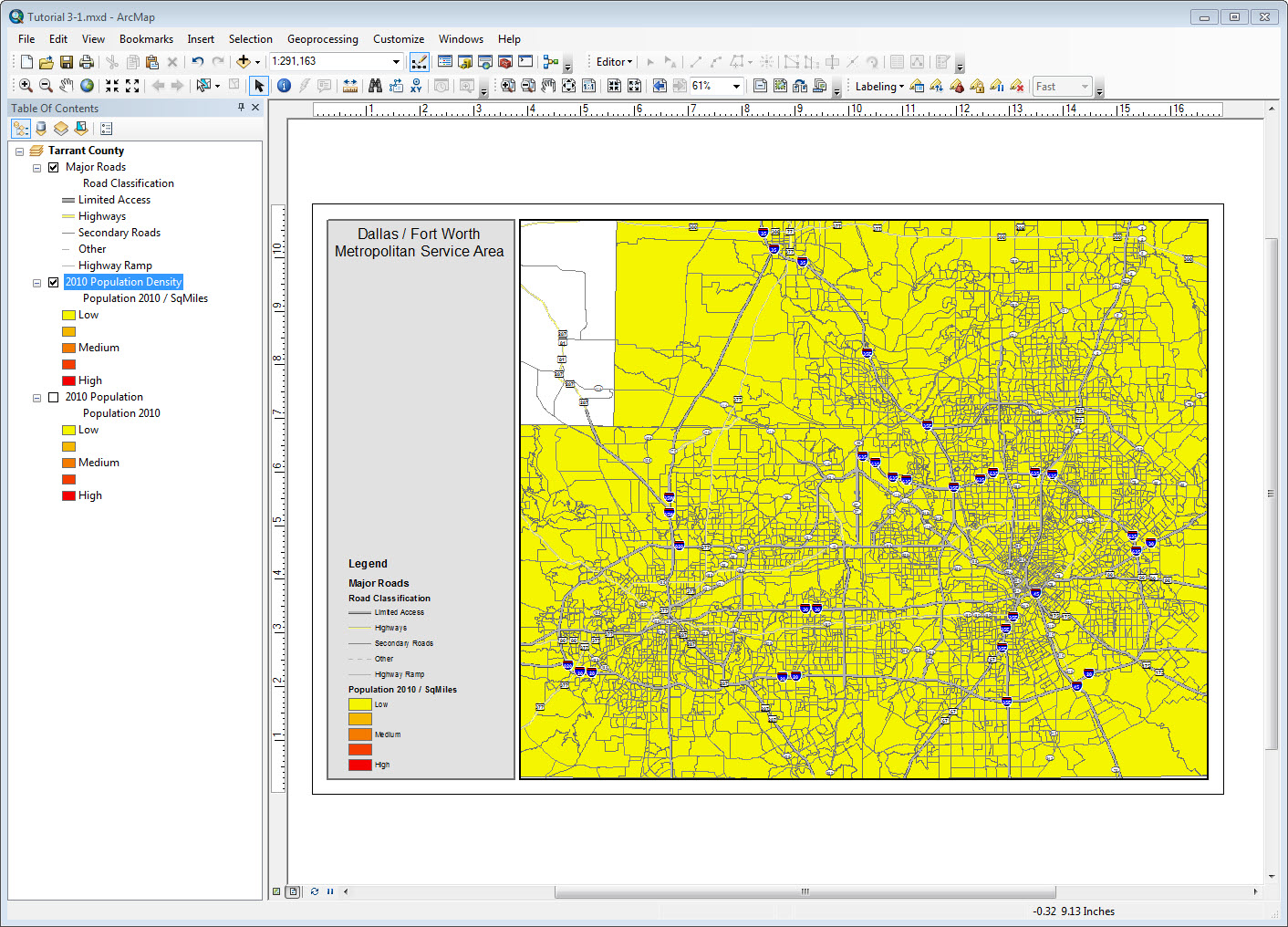
I'm using ArcMap 10.3.1, 180-day trial version, to do a population density per square mile map with graduated colors but instead of getting a map with different colors for the different classes, my entire map is all one color and it's the color for the lowest value class. I checked the histogram and there are values for the other break points but it's not reflected in the map.
- Using Census Block Group data, I added a column to the layer's attribute table, called it "SqMiles" and set the type to Float.
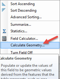
- On the attribute table, for the new column, I right-clicked and selected "Calculate Geometry", set Property to "Area" and Units to "Square Miles".
- For Layer Properties, Symbology tab, Quantities > Graduated Colors, I set the value field to "Population 2010" and Normalization field to "SqMiles" (the column that Calculate Geometry populated).
Many thanks!
- Mark as New
- Bookmark
- Subscribe
- Mute
- Subscribe to RSS Feed
- Permalink
- Report Inappropriate Content
Those population density numbers look off. Maybe the area didn't calculate correctly. What do your population and area numbers look like?
- Mark as New
- Bookmark
- Subscribe
- Mute
- Subscribe to RSS Feed
- Permalink
- Report Inappropriate Content
Hi,
Forgive my delay in responding. I had family in town this past weekend.
I used ArcMap's "Calculate Geometry" feature so it calculated the area for me. Attached are the first 22 rows of the table. Age and household columns are not displayed but the rest of the columns are displayed.

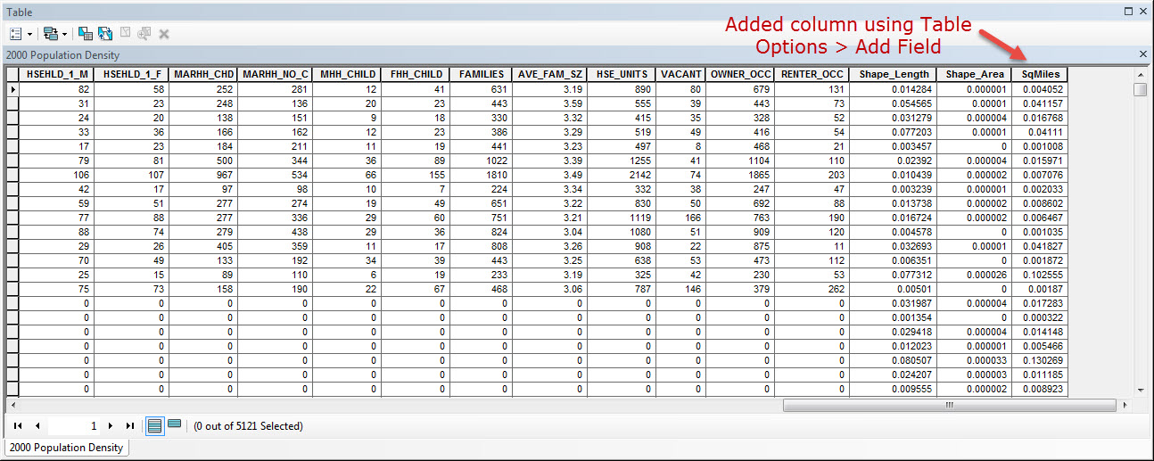

I don't know how ArcMap calculates Square Miles and what it uses for inputs from the attribute table. I just assumed that since I was using "Calculate Geometry" that it was calculating correctly. Many thanks for any suggestions or solutions you can offer.
- Mark as New
- Bookmark
- Subscribe
- Mute
- Subscribe to RSS Feed
- Permalink
- Report Inappropriate Content
That's the correct way to calculate geometry. Those areas definitely look too small though. Block group 481210202024 (the top one in your attribute table) looks like it should be around 48.26 square miles (based on Esri's USA Block Groups ArcGIS Online layer).
You might try making sure the projections are all set up correctly. Someone in this thread had a similar issue:
- Mark as New
- Bookmark
- Subscribe
- Mute
- Subscribe to RSS Feed
- Permalink
- Report Inappropriate Content
To follow along with using the top row in the attribute table, block group 481210202024, I selected "Identify" and flashed it, found the block group on the map and zoomed in. It's a little sliver and used the measure tool to measure the length (north-south direction) and came up with 0.489728 Miles (I don't know what happened to the second toolbar with the "insert pictures" command on the reply editor window).
The projection is State Plane NAD 1983 and the coordinates are in feet.
Data Frame Properties - NAD_1983_StatePlane_Texas_North_Central_FIPS_4202_Feet
Layer Properties > Source - Feature Class - CensusBlkGrp; Geographic Coordinate System - GCS_North_American_1983; Datum - D_North_American_1983
It looks like it's set up correctly.
- Mark as New
- Bookmark
- Subscribe
- Mute
- Subscribe to RSS Feed
- Permalink
- Report Inappropriate Content
CensusBlkGrp; Geographic Coordinate System - GCS_North_American_1983; Datum - D_North_American_1983 has the units decimal degrees, you either need to project the file or follow the procedure to get area units into a projected coordinate system (in a new column), then calculate density from there
- Mark as New
- Bookmark
- Subscribe
- Mute
- Subscribe to RSS Feed
- Permalink
- Report Inappropriate Content
Oh okay, got it. I'll try that. Many thanks!
- Mark as New
- Bookmark
- Subscribe
- Mute
- Subscribe to RSS Feed
- Permalink
- Report Inappropriate Content
Hi Stephen, thanks for your help. I'll try Dan's solution.
- Mark as New
- Bookmark
- Subscribe
- Mute
- Subscribe to RSS Feed
- Permalink
- Report Inappropriate Content
I think your geometry is in decimal degrees
You can either project the file to a projected coordinate system, then calculate the values or
Calculate Geometry Attributes—Data Management toolbox | ArcGIS Desktop
you can calculate geometry in a projected coordinate system, IF you specify one (ie like a suitable UTM or Albers)