- Home
- :
- All Communities
- :
- User Groups
- :
- Cartography and Maps
- :
- Questions
- :
- Re: Symbolizing median household income appropriat...
- Subscribe to RSS Feed
- Mark Topic as New
- Mark Topic as Read
- Float this Topic for Current User
- Bookmark
- Subscribe
- Mute
- Printer Friendly Page
Symbolizing median household income appropriately
- Mark as New
- Bookmark
- Subscribe
- Mute
- Subscribe to RSS Feed
- Permalink
- Report Inappropriate Content
I have median household income income data for my locality by block group. I was trying to figure out the best way to symbolize this data and came across a fantastic ESRI blog:
Make Maps That Get Value from Data
In Figure 4 the author presents a map of the same data for DC where standard deviation classification is used to make the data more meaningful. He states that "This example anchors the map using the US median household income of $46,533." How does one anchor data to a specific figure? I think the example illustrated in the blog is a fantastic way to show my data, but I am unsure how to specify an anchor. The software automatically calculates the mean and the deviation is based on that. Can anyone help with this? Thanks so much!
- Mark as New
- Bookmark
- Subscribe
- Mute
- Subscribe to RSS Feed
- Permalink
- Report Inappropriate Content
Annie, thanks for asking about this.
Short answer:
I recorded this video a while back to demonstrate how to anchor a map around a meaningful value. Check it out at about the 8 minute mark to see an example of how to anchor a map in a specific value.
Slightly longer answer:
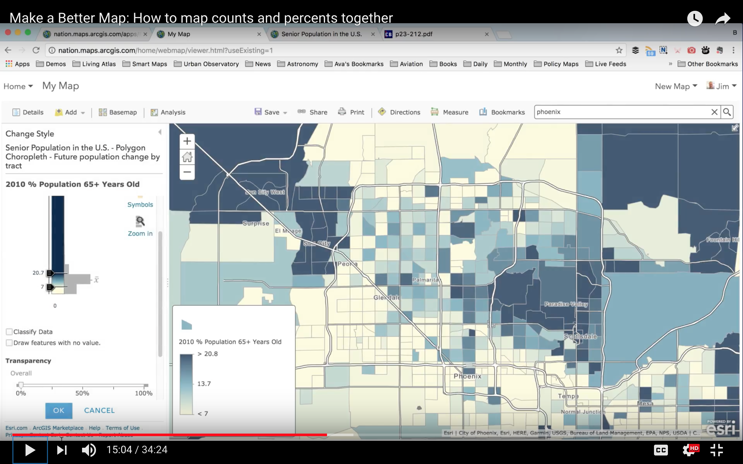
We have definitely noticed that many GIS users will make a thematic map and simply accept the software's default suggestions, for classification approach, classification breaks, and even colors. Yet, we noticed the thematic maps that are successful, popular, well-received tend to be the ones where the map's author considered what the audience actually knows about the subject. When the colors or sizes on the map mean something, people tend to understand the map instantly.
So how do we move beyond software defaults and inject meaning in the work?
In that blog, I talk about "anchoring" the map in a meaningful value. If you are using Natural Breaks as a classification method, apply color to specific classes, whose breaks each have meaning. The US median income is $46,533, so that needs to be one of the class breaks, somehow. The standard deviation method is a big help in that it tells you what breaks look like at 1 standard deviation from the dataset's average value... but the average of the data is most certainly not equal to $46,533, so use your judgement in how you apply the next breaks. Rounding up the break points is a nice way to make the map more friendly too.
Class breaks are great when each break has meaning, but they are horrible at allowing the data to "breathe" so that your eye can detect the subtle variations in median income around the country or city. For many map subjects, a five class map is like reducing an image of the Mona Lisa to 5 colors. Some things get lost.

An unclassed, continuous color ramp does an incredible job showing all the detail that classifications obscure. Using a continuous color ramp, you apply color across a range of values with 2 or 3 values that have specific meaning. In ArcGIS Online, it automatically sets one end of the color ramp you choose to the value found at 1 standard deviation above the mean of the data, and the other end of the color ramp to the value found at 1 standard deviation below the mean of the data. You can then adjust from there.
I always recommend choosing the "Above and Below" theme in ArcGIS Online to see immediate benefits from this approach.
Here's an example of classed vs unclassed on the same subject:
Classed: 3 classes shown

Unclassed: dark blue means significantly high % of seniors age 65+, yellow means significantly low
Senior Principal GIS Engineer, GIS Engineering Lead
ArcGIS Living Atlas
- Mark as New
- Bookmark
- Subscribe
- Mute
- Subscribe to RSS Feed
- Permalink
- Report Inappropriate Content
Hi Jim,
Thank you so much for sharing the video, and for your reply. I think you have some excellent points. I use ArcGIS Online in a limited capacity, and most of my GISing still takes place on the ArcGIS Desktop side. I think that's why I was getting confused about setting an anchor value because I didn't see that option while using standard deviation classification in Desktop. I am going to re-try this in ArcGIS Online and see if I have better results. Do you have any suggestions for achieving the same thing using Desktop?
Thank you again for your reply!