- Home
- :
- All Communities
- :
- Industries
- :
- Transportation
- :
- Roads and Highways
- :
- Roads and Highways Blog
- :
- Crash Analysis with Insights
Crash Analysis with Insights
- Subscribe to RSS Feed
- Mark as New
- Mark as Read
- Bookmark
- Subscribe
- Printer Friendly Page
New spatial analysis capabilities in Insights for ArcGIS are helping Departments of Transportation make roads safer. Here, I will illustrate a workflow for analyzing vehicle collision data near schools in Portland, Oregon. Since Insights for ArcGIS is all about helping you ask and answer questions of your data, I posed a safety question. I wanted to see where severe crashes have occurred near schools in Portland. I was particularly interested in understanding how the day of the week or posted speed limit may have been a factor in the crash.
To answer this question, I started by adding Oregon crashes, Schools, and Metropolitan Planning Organization (MPO) boundaries to a Workbook in Insights for ArcGIS. This gives me three cards (data display areas) in Insights for ArcGIS.
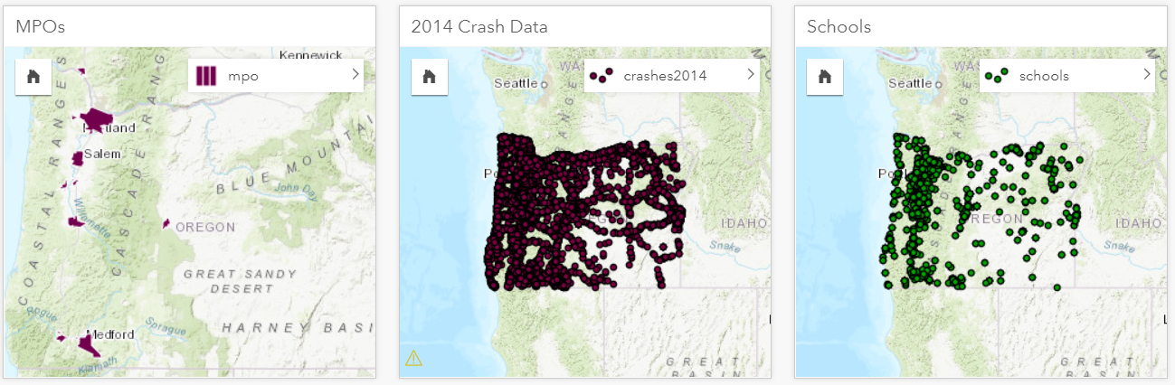
To focus on the Portland area, I drag the Portland MPO feature from the MPO card into each of the other two cards and choose to filter by the selected feature.

Unlike tabular tools for data analysis, Insights for ArcGIS makes it easy to perform spatial operations, such as filtering, with the geography of your data. From here, I open the attribute table of the crashes and create a new column to store CrashSeverity.
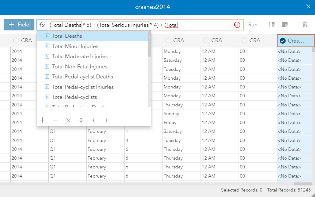
My crash severity formula is (Total Deaths * 5) + (Total Serious Injuries * 4) + (Total Moderate Injuries * 3) + (Total Minor Injuries * 2). This is a formula that I made up to weight crashes based on the severity of the injuries. These calculated fields are powerful because they don’t change the underlying data. The formula exists within the context of the Workbook so you are free to put in any calculations you want to help you analyze your data.
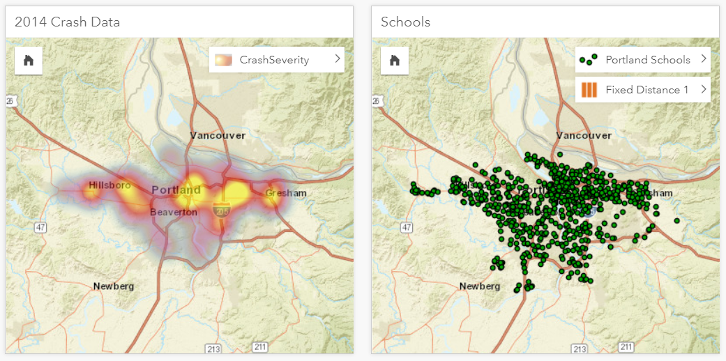
At this point, I can filter my crashes to only those that have a CrashSeverity of 10 or greater and I can display those crashes as a heatmap.

Since streets are where crashes occur, I can make the street more prominent by changing to the Streets basemap.
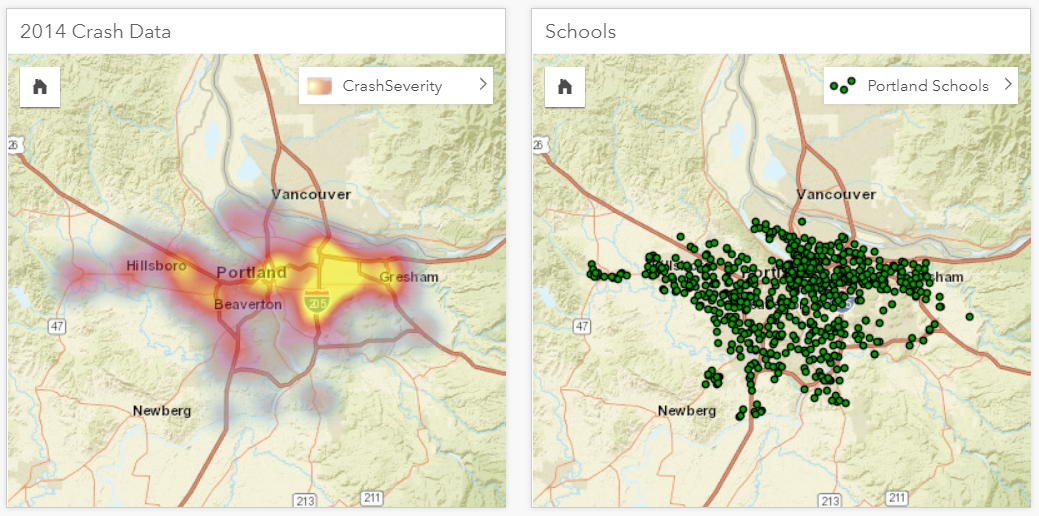
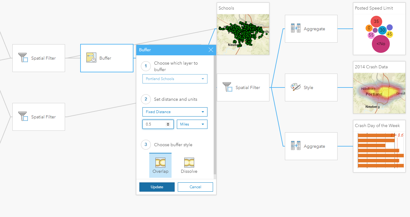
Since I am only interested in the severe crashes near schools, the next step is to buffer the schools.
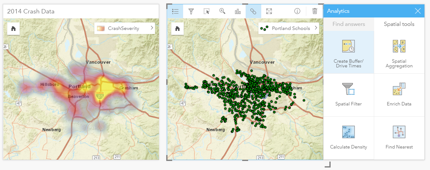
With Insights for ArcGIS, you have access to some of the most common spatial analysis tools such as buffer. With a buffer, you can also enrich your data using all the demographic data from Esri. For example, you could find information like which areas have the most children that might be walking to school.
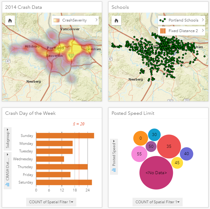
After I create a quarter-mile buffer around the schools, I can drag the buffer layer into the crash card to filter the crashes by the areas near schools. (I could have also used drive or walking time buffers.)
Notice how the heatmap now changes to show a different spatial pattern. Simply seeing these results while you are working can help you understand what the data is trying to tell you. To see the day of the week or posted speed limit, I drag those columns from the dataset into the page and create new charting cards.

As I work on building this analysis page, Insights for ArcGIS is tracking all of my work. At any time, I can switch to an Analysis view that shows a model of all tasks. With some of those tasks you can even change their properties. For example, With the buffer tool, I might decide to change the distance of the buffer to a half mile.
Once I make the change, all downstream processes trigger and update my cards showing a different spatial distribution.
Now I can click on the charts to understand how the location of the crashes change based on the day of the week or the posted speed. For example, I clicked the bar for Thursday and the map updates to show me where those crashes occurred.
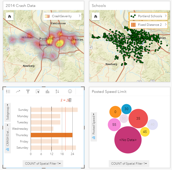
At this point, I can interact with this page to get a better understanding of this crash data. As you can see there are some very specific hot spots in the map that were not evident when looking at the original crash points on their own. From here, different business units in a DOT could apply their expertise to interpreting the results. Safety engineers could use this to focus their efforts in those areas where a safety counter measures, like guard rails, will have the biggest impact. Or planners might use this analysis for more long-term corridor improvements. That is why, sharing these pages is so important. I can take this page and share it with others inside or out of my organization. One great way to share Insights for ArcGIS pages is with a story map. Here is an example of the Portland crash analysis inside a story map.
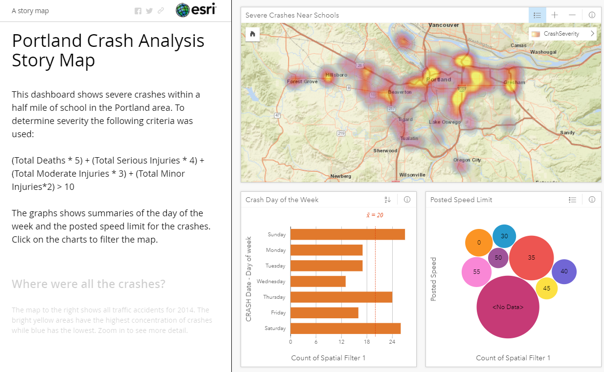
You can access this story map here: http://esridot.maps.arcgis.com/apps/MapJournal/index.html?appid=3541bbad9465437bbf22118a0051321d
Now my stakeholders have all the results of my analysis along with supporting data and the processes that I used to achieve those results.
I hope this example gives you some ideas for how you could use Insights for ArcGIS to better understand your data and use that data to make better decisions. If you want to try this out yourself, the MPO boundary and Crash location data I used for this demo came from the Oregon DOT ftp site: ftp://ftp.odot.state.or.us/tdb/trandata/GIS_data/. The school locations can be found in ArcGIS Online here: http://geo.maps.arcgis.com/home/item.html?id=e6dac82b2dbc4cbabebe0778d57efe6e.
You must be a registered user to add a comment. If you've already registered, sign in. Otherwise, register and sign in.