I am trying to create a serial chart in a dashboard using data from a survey 123 form that I use to track drone missions. My goal is to create a chart that looks over all of the surveys and give me the total mission numbers of departments divisions, then grouped by department that I fly for. Often a flight has more than one department that it is being flown for so in survey123 the current serial chart will look like this:
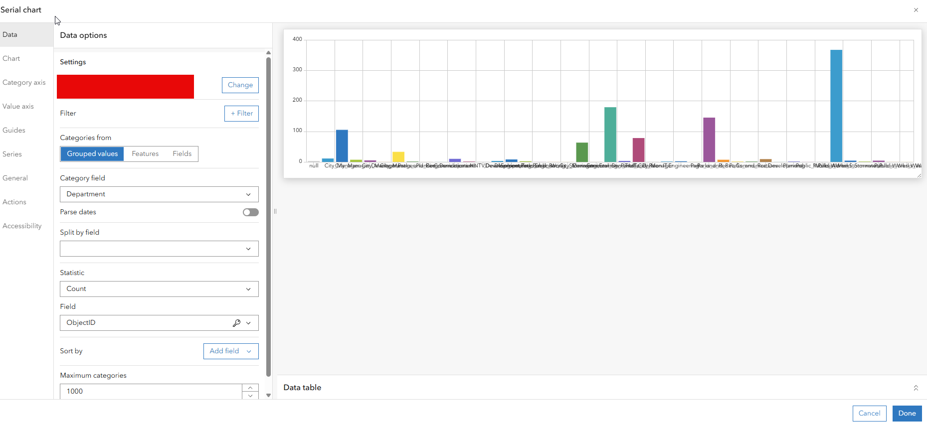
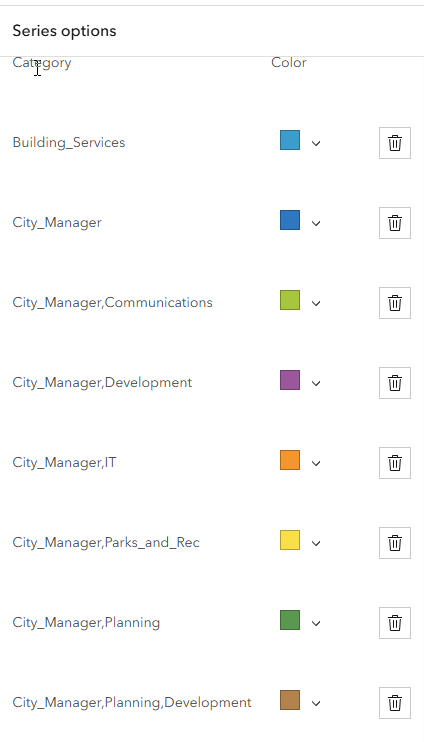
What I want is a chart that groups the departments so I a want a bar for Public Works, a bar Engineering, etc
I think arcade is going to be the way I must do this or would business analyst or experience builder be a better way to go?

