- Home
- :
- All Communities
- :
- Industries
- :
- Education
- :
- Education Blog
- :
- Displaying field survey results on maps
Displaying field survey results on maps
- Subscribe to RSS Feed
- Mark as New
- Mark as Read
- Bookmark
- Subscribe
- Printer Friendly Page
- Report Inappropriate Content
The means by which the results of your field investigations can be displayed in maps and story maps continues to expand. How can you guide people through the results of your investigations on tree species, water quality, weather, historic homes, and others so that your audience may learn about what you collected and why what you are studying matters?
ArcGIS Online Maps
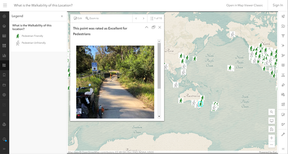
In my work with educators and students, I often use the most straightforward and easiest method of all--making an ArcGIS Online map from a feature service. The feature service, or "map layer", can be generated from a field investigation from ArcGIS Field Maps, ArcGIS Survey123, or ArcGIS QuickCapture, or even from manual input methods from a CSV or from a non-ArcGIS tool such as iNaturalist. This involves simply accessing the feature service item page in ArcGIS Online, and in the upper right, specifying "open in map viewer". Once in the map viewer, you can symbolize and classify the data, create popups, labels, and do other work designed to increase the engagement and readability of the map, and when done, save the results in an ArcGIS Online map. This map can then be shared with your researchers, students, or even with those who are not a part of your project. For example, here is a web map from one of my surveys, on walkability:
https://www.arcgis.com/apps/mapviewer/index.html?webmap=fd54348d6d784d6f9179fd7342e6b8f1
A portion of a web map in ArcGIS Online showing the results of a field investigation.
Dashboards
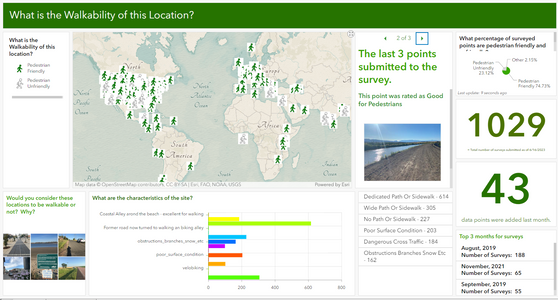
One of the most intriguing and again easily-implementable ways to display your field survey results is in a dashboard. I frequently use dashboards to display field results with the added benefit of interactive maps, graphs, charts, a legend, graphics, and other elements that show the real-time status of the field investigation. Below is an example of one of these from the same walkability survey that I mentioned:
https://www.arcgis.com/apps/dashboards/501bfe8b835745d4bd29a857a2bf32ba
A dashboard showing the results of a field investigation.
Instant Apps
However, there are other intriguing ways to display your results that are powerful and yet straightforward to implement. Try, for example, a few of the many choices available to you via the ArcGIS Instant Apps. In education I make frequent use of the Exhibit app, because it most closely emulates a standard slide deck yet offers the interactivity of web GIS as manifest in ArcGIS Online.
Story Maps
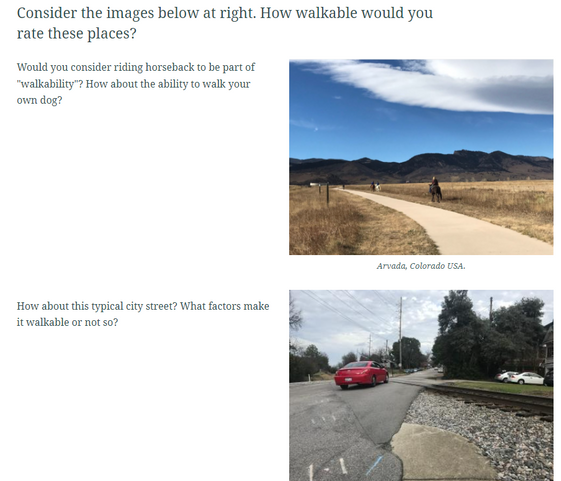
Another way to display your results is in a story map. Since a story map can contain multiple multimedia elements, you could easily include not only an interactive map in it, but also your field survey and a dashboard. Thus, the story map could serve as a one-stop shop for collecting, displaying, and assessing the results of your field investigation. Again taking my walking example, the resulting story map is here:
https://storymaps.arcgis.com/stories/1e4847f78ec94fd89e960adfabb5ac5c
A section of a story map showing the results of a field investigation.
Besides simply embedding a web map from ArcGIS Online into a story map, story maps feature other capabilities - map types - that can also be effectively used to display your field work results. See the next section's discussion for a few of these--and give them a try!
Map Tours
A map tour inside a Story Map, for example, can effectively "step the map reader through" your investigation by displaying each of your collected points, with its attributes, location, and photograph. Perhaps best of all, if your field sites are constantly updating as new data points are being added via crowdsourcing, you don't have to edit and republish your story every time there is an update. Rather, as the survey points are collected, the feature service updates, and the map tour in your story map automatically updates.
Once you have created your field survey, and have some data in the survey, the next steps are: 1. Create a story map: In your story map > insert map tour block > select feature service. 2. Configure your attribute fields to display, where the media is coming from, the sort order, the layout, and other aesthetic enhancements.
An example I created for a campus litter survey is here:
https://storymaps.arcgis.com/stories/6bc3e1bb09a74a2d813d5cdee9548674
Another example I created for mapping vegetation is below. You will note that for added interest I used a 3D scene instead of a 2D web map:
https://storymaps.arcgis.com/stories/02228d6f7ea04eaebe33276e334387dd
Notes: 1. These techniques only work for point data (not line or polygon) at the moment. 2. The descriptions in your tours work best for text and numeric data (tree type, tree height, and so on), and not for multiple-choice survey questions.
Sometimes the field data is simply a photograph. Many ways exist to get those photographs into a map. The photo with locations tool is one of the easiest ways to do so, explained by my colleague Bern Szukalski, here
and also by me with additional examples in 2D and 3D, here.
My photo layer which resulted from the .zip photo folder upload, is here, for a trip I took to the European Association of Geographers conference. The resulting web mapping application is here. Ah - Greece!
Which of these methods that I have described here is best? It depends on your educational goals, your audience, the experience for the audience that you desire, the structure of your survey and your data, and other factors. All of these methods have their place. The Map Tour is a wonderful new capability that really helps your audience move through each point in your data in a guided fashion.
For full step-by-step information about how to set up the Map Tours in this way, see my colleagues' tutorial in story map form, here. I encourage you to try these techniques, including the map tours (a review in video form is here).
I look forward to hearing about your thoughts on these methods, and to seeing your results!
--Joseph Kerski
You must be a registered user to add a comment. If you've already registered, sign in. Otherwise, register and sign in.
-
Administration
39 -
Announcements
45 -
Career & Tech Ed
1 -
Curriculum-Learning Resources
180 -
Education Facilities
24 -
Events
47 -
GeoInquiries
1 -
Higher Education
520 -
Informal Education
266 -
Licensing Best Practices
47 -
National Geographic MapMaker
17 -
Pedagogy and Education Theory
187 -
Schools (K - 12)
282 -
Schools (K-12)
185 -
Spatial data
24 -
STEM
3 -
Students - Higher Education
232 -
Students - K-12 Schools
86 -
Success Stories
22 -
TeacherDesk
1 -
Tech Tips
83
- « Previous
- Next »


