- Home
- :
- All Communities
- :
- Products
- :
- Data Management
- :
- Data Management Questions
- :
- Using Points To Line (Data Management) Tool to mak...
- Subscribe to RSS Feed
- Mark Topic as New
- Mark Topic as Read
- Float this Topic for Current User
- Bookmark
- Subscribe
- Mute
- Printer Friendly Page
Using Points To Line (Data Management) Tool to make migration routes
- Mark as New
- Bookmark
- Subscribe
- Mute
- Subscribe to RSS Feed
- Permalink
I have a data from obituaries which my students have created currently in csv format. In each feature there is a city of birth and a city of death. I plan to geocode the points when I add them to ArcGIS based upon these two attributes. I would like to crate a polyline from these points which will demonstrate the path from birth to death for each person. In the end I would like to have a polyline for each person that illustrates, essentially the path of their life. Is there a better way to accomplish this than to use the Points To Line (Data Management) tool? If not, what is the best workflow for this?
- Mark as New
- Bookmark
- Subscribe
- Mute
- Subscribe to RSS Feed
- Permalink
Not sure if you are still watching this thread, but I just responded to a similar post:
Re: Creating Polylines to track migration
The script creates curves like these.
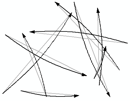
Will probably convert into script and include taking the attributes of the table with it. Then you can symbolize the lines using values from the input.
- Mark as New
- Bookmark
- Subscribe
- Mute
- Subscribe to RSS Feed
- Permalink
I added the toolbox at the other thread: Re: Creating Polylines to track migration