- Home
- :
- All Communities
- :
- User Groups
- :
- Cartography and Maps
- :
- Questions
- :
- Table Frame Text Aligment in Pro
- Subscribe to RSS Feed
- Mark Topic as New
- Mark Topic as Read
- Float this Topic for Current User
- Bookmark
- Subscribe
- Mute
- Printer Friendly Page
Table Frame Text Aligment in Pro
- Mark as New
- Bookmark
- Subscribe
- Mute
- Subscribe to RSS Feed
- Permalink
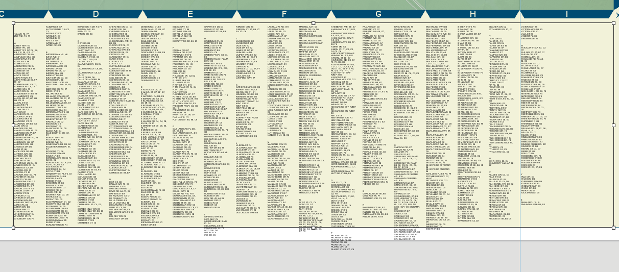
I am finding it impossible to align my text properly in a table frame in Pro. As you can see in the image below, the text on certain columns extends below the bottom extent of the table frame. This looks terrible. Ideally, the text should line up precisely at the bottom as it does at the top. However, given that I have periodic blank cells inserted in order to break up the text into alphabetical groupings, I would accept a close approximation of even. I have tried all three options under the fitting strategy menu on the arrangement tab, but none have solved this problem. I have also tried adjusting the vertical text and border spacing, the number of columns, and the dimensions of the frame. I either end up with alignment at the bottom but dropped columns at the end, or all the columns are maintained but the bottom is wonky. Unfortunately, the text is already at 6 pt, so I cannot reasonably go lower and the horizontal spacing between columns is pretty tight.
Is there a method for ensuring the text in each column does not extend beyond the bottom of the bounding box?

- Mark as New
- Bookmark
- Subscribe
- Mute
- Subscribe to RSS Feed
- Permalink
Unfortunately, Esri tech support has yet to come up with a solution to the problem. I have since figured out that the column height is determined by the size of the bounding box, but only in terms of the number of records shown. So if the text in some cells wrap to a new line, the affected column containing that text will grow longer instead of breaking to the next column at the same location as before. In other words, once the bounding box is set, each column maintains the same number of records but may have vastly different line counts due to word wrapping. This makes for a very messy looking index table!