- Home
- :
- All Communities
- :
- Learning
- :
- ArcGIS Tutorials
- :
- ArcGIS Tutorials Blog
- :
- What's new in ArcGIS tutorials February 2024
What's new in ArcGIS tutorials February 2024
- Subscribe to RSS Feed
- Mark as New
- Mark as Read
- Bookmark
- Subscribe
- Printer Friendly Page
- Report Inappropriate Content
Build a community asset map
The goal of community asset mapping is to gain a baseline understanding of the strengths and weaknesses in a neighborhood. An asset is anything that builds up a community, like a resource, such as schools and green space, or a strengthening characteristic like community cohesion and resilience. By taking stock of existing opportunities and areas of need, you can visualize and prioritize what and where solutions would best serve the community. This exercise is often used in youth participatory action projects in which youth are engaged in critically assessing their neighborhoods and come up with innovative solutions to meet the challenges they uncover.
Create a community walkability survey
A walkability assessment, or walk audit, is a well-documented community engagement tool to evaluate the built environment for pedestrian safety, accessibility, and ease of use. It is a widely used exercise that brings members of a community together—from different ages, abilities, and experiences—to take action to improve their community's walkability. These assessments involve going out in pairs or small groups and walking along a route in a neighborhood while making observations of the walking experience. The findings are gathered and assessed to determine the types of improvements needed and where they should be implemented to encourage walking.
A survey can help facilitate this activity, organize the responses, and allows you to visualize the results using charts and maps. It is important to find ways to share survey findings with participants so they are included in every step of the project.
Using ArcGIS Survey123 web designer, you will build an online survey to answer the project question—what encourages or discourages walking to local parks in my community? You will build a survey with a variety of question types, demonstrating both qualitative and quantitative data collection. One of the advantages of building questions and collecting data with Survey123 is the ability to visualize the survey results in a web map. The map is a compelling and interactive way for the community and other key stakeholders to engage with the findings.
Get started with ArcGIS Excalibur
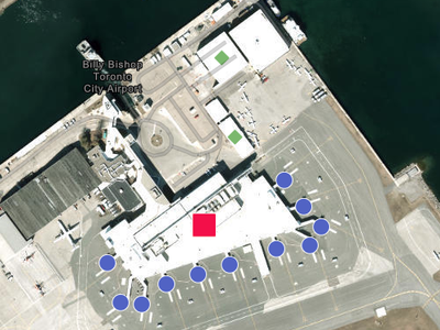
You will learn how to search for and connect to imagery in ArcGIS Excalibur, create a project, and create an observation layer. You will then conduct analysis to compare current and older imagery. You'll create observations and annotations on the map, and export the map to share your results with your organization.
Engage the community with a feedback survey
When working on a project related to racial equity and social justice, it is important to get and integrate the perspectives of the community that has been impacted by inequity in your project. Surveys are effective tools for better understanding community experiences, opinions, and perspectives from lived experiences. The scenario in this tutorial is around determining where to place a new park, but the workflow can be applied to many other interventions to meet a local community's priorities.
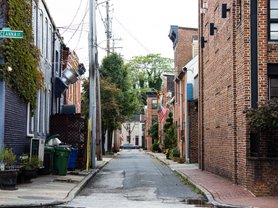
In this tutorial, you have determined a few areas in your community that would most benefit from a new park and green space in Baltimore, Maryland. Research shows that there continues to be inequity in the access and quality of green spaces by race, place, and income. You will incorporate an equity approach to engaging the community through this survey.
Tell the story of your equity plan
In this tutorial, you will use ArcGIS StoryMaps to build a story of your equity project to identify which areas in Baltimore would most benefit from a new park and green space. Historically underserved neighborhoods experience inequity in the access and quality of green spaces by race, place, and income. Parks and greenspace are valuable community spaces for people to find relief from extreme heat, increase likelihood of improved health outcomes, and build community.
Track and visualize equity goals
The third step in applying the Racial Equity and Social Justice workflow to GIS is to monitor the performance of equity goals. In this tutorial, you conducted a survey to find out which area participants want a new park in. You will compare the race and ethnicity of those who participated in a feedback survey to the makeup of the local community. Comparing this data will help you determine how well those who participated in your survey reflect the community where the new park will be built.
You will use analysis tools and create charts to visualize the race and ethnicity data and create a web app to share your findings with the community. As more survey entries are completed, the data will automatically update in both the map and app, increasing transparency and participation in the project.
Use map analysis tools to develop parks equitably
Previously, you have assessed the strengths and needs of your community. You now want to make an equity action plan to address a community need given what you have learned. In the Racial Equity and Social Justice workflow, after you have completed the map and analyze inequities step, the next step is to operationalize, or put into action, a solution to address the challenges you identified. The step is called the operationalize positive practices step. In this tutorial, you will determine which areas in the city would most benefit from a new park space, with consideration for areas that have historically experienced unequal access to benefits and opportunities for green space.
New ArcGIS tutorial series
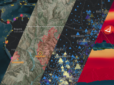
A tutorial series delivers multiple onboarding resources in a single-page experience. Here's a roundup of some new series in the ArcGIS tutorial Gallery that have appeared in the last month.
The power of interactive maps and apps
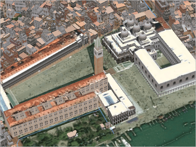
Map Venice in 2D and 3D
Learn how to create detailed maps and scenes of Venice, Italy, in ArcGIS Pro.
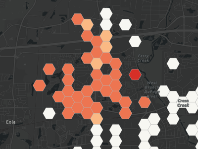
Map, analyze, and share fire incident data
Transform a spreadsheet of fire incident data into informative, analytical, and interactive online maps and apps
You must be a registered user to add a comment. If you've already registered, sign in. Otherwise, register and sign in.

