- Home
- :
- All Communities
- :
- Products
- :
- ArcGIS Pro
- :
- ArcGIS Pro Questions
- :
- Suitability Model Transformation Plots
- Subscribe to RSS Feed
- Mark Topic as New
- Mark Topic as Read
- Float this Topic for Current User
- Bookmark
- Subscribe
- Mute
- Printer Friendly Page
Suitability Model Transformation Plots
- Mark as New
- Bookmark
- Subscribe
- Mute
- Subscribe to RSS Feed
- Permalink
Hi everyone,
I am using the ArcGIS Pro Version 9.1 and I am trying to understand the plots in the transformation pane.
Plot on the left side:
- What uni is the count (y-axis)? Is it the amount of pixel?
Plot on the right side:
- Does the colour of the bars represent the suitability?
- Does the length of the bars represent the number of values (e.g. input raster has more pixels with a higher temperature, therefore the bar is higher)?
I thought that the length of the bars represents the suitability but within one criterion (e.g temperature) the lengths do not change even when using a different function, only the colour of the bars changes. I am attaching two screenshots that show the same criterion but with different functions.
Cheers,
Eva
Solved! Go to Solution.
Accepted Solutions
- Mark as New
- Bookmark
- Subscribe
- Mute
- Subscribe to RSS Feed
- Permalink
In addition to the documentation that Dan refers to, I will answer your questions directly:
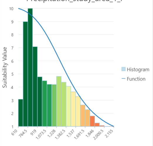
Plot on the left side:
- What uni is the count (y-axis)? Is it the amount of pixel? Answer: This is a basic histogram of the resulting suitability map. The suitability values are on the x-axis and the count (number of cells) are on the y-axis
Plot on the right side:
- Does the colour of the bars represent the suitability? Answer: The color of the bars correspond to what the suitability of the input criterion values (identified on the x-axis) will become once the transformation is applied. Bars representing input criterion values that are colored in green, identify the criterion values that will be assigned to a higher suitability; red bars represent input values that will be assigned to lower suitability. The bar colors correspond to the colors in the resulting transformation map.
- Does the length of the bars represent the number of values (e.g. input raster has more pixels with a higher temperature, therefore the bar is higher)? Answer: In the Continuous method, the height of the bars are the relative count of the input criterion values represented on the x-axis. The heights of the bars are only relative to one another and do not correspond to the y-axis. For the Continuous method, the y-axis corresponds to the suitability of the function being applied (the blue line) and how the input criterion values (x-axis) will be transformed to the suitability scale as a result of the function.Since the heights of the bars are based on the relative count of the input criterion values, the heights will not change based on the selected transformation function (the distribution of the input values remains constant). What will change when you change the function is the color of the bars because the colors identify how the input values will be transformed. For example, if MSSmall is being applied, the bars representing the lower input values (to the left in the plot) will be green and the larger input values will be red. If you then apply the Large function, the heights of the bars do not change because the count of the input criterion values does not change, however, the color of the bars will change. The lower input criterion value bars will become red and the larger input criterion value bars will become green.For Unique Categories and Range of Classes methods, the heights are the bars correspond to the number of cells in each category or class and the y-axis represents that count.
- Mark as New
- Bookmark
- Subscribe
- Mute
- Subscribe to RSS Feed
- Permalink
Have you seen the base documentation in the help files/
Transformation pane in Suitability Modeler—ArcGIS Pro | Documentation
... sort of retired...
- Mark as New
- Bookmark
- Subscribe
- Mute
- Subscribe to RSS Feed
- Permalink
Yes, I have read that documentation but it doesn't answer my specific question.
- Mark as New
- Bookmark
- Subscribe
- Mute
- Subscribe to RSS Feed
- Permalink
In addition to the documentation that Dan refers to, I will answer your questions directly:
Plot on the left side:
- What uni is the count (y-axis)? Is it the amount of pixel? Answer: This is a basic histogram of the resulting suitability map. The suitability values are on the x-axis and the count (number of cells) are on the y-axis
Plot on the right side:
- Does the colour of the bars represent the suitability? Answer: The color of the bars correspond to what the suitability of the input criterion values (identified on the x-axis) will become once the transformation is applied. Bars representing input criterion values that are colored in green, identify the criterion values that will be assigned to a higher suitability; red bars represent input values that will be assigned to lower suitability. The bar colors correspond to the colors in the resulting transformation map.
- Does the length of the bars represent the number of values (e.g. input raster has more pixels with a higher temperature, therefore the bar is higher)? Answer: In the Continuous method, the height of the bars are the relative count of the input criterion values represented on the x-axis. The heights of the bars are only relative to one another and do not correspond to the y-axis. For the Continuous method, the y-axis corresponds to the suitability of the function being applied (the blue line) and how the input criterion values (x-axis) will be transformed to the suitability scale as a result of the function.Since the heights of the bars are based on the relative count of the input criterion values, the heights will not change based on the selected transformation function (the distribution of the input values remains constant). What will change when you change the function is the color of the bars because the colors identify how the input values will be transformed. For example, if MSSmall is being applied, the bars representing the lower input values (to the left in the plot) will be green and the larger input values will be red. If you then apply the Large function, the heights of the bars do not change because the count of the input criterion values does not change, however, the color of the bars will change. The lower input criterion value bars will become red and the larger input criterion value bars will become green.For Unique Categories and Range of Classes methods, the heights are the bars correspond to the number of cells in each category or class and the y-axis represents that count.
- Mark as New
- Bookmark
- Subscribe
- Mute
- Subscribe to RSS Feed
- Permalink
Thanks so much for that detailed explanation - now it all makes sense!