- Home
- :
- All Communities
- :
- Products
- :
- ArcGIS Pro
- :
- ArcGIS Pro Questions
- :
- Re: More indepth explanation of 'Radius' for Heat ...
- Subscribe to RSS Feed
- Mark Topic as New
- Mark Topic as Read
- Float this Topic for Current User
- Bookmark
- Subscribe
- Mute
- Printer Friendly Page
More indepth explanation of 'Radius' for Heat Map Symbology
- Mark as New
- Bookmark
- Subscribe
- Mute
- Subscribe to RSS Feed
- Permalink
Hi there,
I am looking to produce several heat maps to display wildlife species survey density, however I am looking to seek further clarification and explanation on how the Radius value is defined for Heat Map Symbology. I have reviewed the ESRI webpage for this, Heat map symbology—ArcGIS Pro | ArcGIS Desktop and read that it says 'set the Radius to control the area searched when calculating the density of features. The radius is measured in points.' Can someone further explain what is meant by the radius being measured in points? Is it a set distance or does it just search the closest set number of points. For example, if the radius is set to 10, does it analyze the 10 surrounding points to each point to determine how dense it is?
Thank you!
Solved! Go to Solution.
Accepted Solutions
- Mark as New
- Bookmark
- Subscribe
- Mute
- Subscribe to RSS Feed
- Permalink
Hi,
For your use case, I would recommend using the Kernal Density geoprocessing tool instead. Heat Map symbology is good for quick and dynamic visualization. But for reliable and defensible density analysis, the tool will give you more control.
In Heat Map symbology, the radius searches a set distance, rather than for a certain number of nearby points. This distance, as Edie described, is in screen units (points), rather than map units (meters, feet, etc). Just as with other symbology methods (Single symbol, graduated colors, etc) when you set the size to 10 points and zoom in and out, that size is relative to the screen, not the ground/map. So you can think of radius as the symbol size.
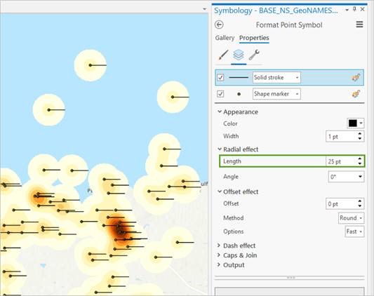
If radius is set to 25, the radius of the heat map "blob" around each point will be 25 points. Here is an image that helps to visualize it. It shows the same point data symbolized twice, first with heat map, and then with point symbols that have 25pt long lines attached to them:

The more points there are within the 25 pt radius, the denser the area, and the darker (depending on the color scheme) the color is drawn.
Unfortunately, I don't know the specifics of how points relate to map units. Since one is tied to the screen and the other to the ground, it would vary at every scale. If this kind of control is needed for your map, I recommend using the Kernal Density tool instead. Heat Map symbology is based on the Kernal Density algorithm.
- Mark as New
- Bookmark
- Subscribe
- Mute
- Subscribe to RSS Feed
- Permalink
Hello,
Sorry for the confusion. "Measured in points" means points as in the map units. Points is a measurement commonly used in typography, but we also use it in symbology. There are approximately 72 points in an inch. So, to cast a wider search area when calculating the heat map symbology, use a larger radius value.
- Mark as New
- Bookmark
- Subscribe
- Mute
- Subscribe to RSS Feed
- Permalink
Hello Edie - I took the Cartography MOOC a year or so ago and really enjoyed it. I feel like an idiot here but I just can't grasp this "points" thing in terms of the radius value for the Symbolize by Density (Heat Map) option in ArcGIS Pro. I understand what points are in terms of typography; I understand there are approximately 72 points per inch. You say the "points" in this case are in terms of the map units - so if I have a map with units in US Survey Feet, is the value I enter in the radius also in US Survey Feet? Do I have to do any kind of mathematical conversion vis-a-vis "points"? Or does "points" simply mean the same thing as "whatever your map units happen to be"?
Thanks in advance for any more clarification you can provide!
- Mark as New
- Bookmark
- Subscribe
- Mute
- Subscribe to RSS Feed
- Permalink
Hi,
For your use case, I would recommend using the Kernal Density geoprocessing tool instead. Heat Map symbology is good for quick and dynamic visualization. But for reliable and defensible density analysis, the tool will give you more control.
In Heat Map symbology, the radius searches a set distance, rather than for a certain number of nearby points. This distance, as Edie described, is in screen units (points), rather than map units (meters, feet, etc). Just as with other symbology methods (Single symbol, graduated colors, etc) when you set the size to 10 points and zoom in and out, that size is relative to the screen, not the ground/map. So you can think of radius as the symbol size.
If radius is set to 25, the radius of the heat map "blob" around each point will be 25 points. Here is an image that helps to visualize it. It shows the same point data symbolized twice, first with heat map, and then with point symbols that have 25pt long lines attached to them:

The more points there are within the 25 pt radius, the denser the area, and the darker (depending on the color scheme) the color is drawn.
Unfortunately, I don't know the specifics of how points relate to map units. Since one is tied to the screen and the other to the ground, it would vary at every scale. If this kind of control is needed for your map, I recommend using the Kernal Density tool instead. Heat Map symbology is based on the Kernal Density algorithm.
- Mark as New
- Bookmark
- Subscribe
- Mute
- Subscribe to RSS Feed
- Permalink
Does anyone have any insights on the option to Lock radius at specified scale?