- Home
- :
- All Communities
- :
- Products
- :
- ArcGIS Pro
- :
- ArcGIS Pro Ideas
- :
- Use column data (variables) as x-axis in Line Char...
- Subscribe to RSS Feed
- Mark as New
- Mark as Read
- Bookmark
- Follow this Idea
- Printer Friendly Page
- Mark as New
- Bookmark
- Subscribe
- Mute
- Subscribe to RSS Feed
- Permalink
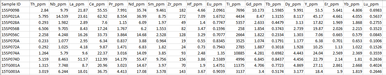
Displaying spatial multi-variate data is often necessary to many scientific disciplines. In this case, using a combination of elemental analyses (geochemistry) per sample is necessary to make a classification/interpretation. The idea is to plot a suite of these elements on the x-axis of a line graph with the y-axis representing their relative amounts per sample. Several statistical/chemical software's make these diagrams (for my specific case they're called Spider Diagrams - not to be confused with desire line charts etc) such as ioGAS, R, etc, but it would be extremely handy to have this within ArcGIS Pro Charts itself.
I have provided an example of the source data and the result. Each line on the chart represents the elemental composition of a single sample.
You must be a registered user to add a comment. If you've already registered, sign in. Otherwise, register and sign in.