- Home
- :
- All Communities
- :
- Products
- :
- ArcGIS Instant Apps
- :
- ArcGIS Instant Apps Questions
- :
- Re: Remove Results Count from Zone Lookup Instant ...
- Subscribe to RSS Feed
- Mark Topic as New
- Mark Topic as Read
- Float this Topic for Current User
- Bookmark
- Subscribe
- Mute
- Printer Friendly Page
Remove Results Count from Zone Lookup Instant App
- Mark as New
- Bookmark
- Subscribe
- Mute
- Subscribe to RSS Feed
- Permalink
- Report Inappropriate Content
Hi Esri Community!
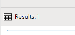
I am working on a zone lookup instant app, and was wondering if there was a way to remove the "Results" count at the top of the popups that appear. I've gone through all of the readily available functionality changes in the app, as well as looked online to see if this is something I can do. Does anyone have any recommendations or know if this is achievable? Any help is appreciated!
Solved! Go to Solution.
Accepted Solutions
- Mark as New
- Bookmark
- Subscribe
- Mute
- Subscribe to RSS Feed
- Permalink
- Report Inappropriate Content
Here try this css instead. Note this assumes that you do not have any export tools enabled that appear in the same space as the result count.
.toggle-panel{
display:none;
}
@media only screen and (max-width: 859px){
.toggle-panel{
display:block;
}
#countDiv{
display:none;
}
.mobile-expand {

    vertical-align: middle;
    justify-content: space-around;
    display: flex;
    width: 100%;
}
}- Mark as New
- Bookmark
- Subscribe
- Mute
- Subscribe to RSS Feed
- Permalink
- Report Inappropriate Content
You can hide it using the custom css option in the theming section. Here's an example of the css you'd use.
 #countDiv{
display:none;
}- Mark as New
- Bookmark
- Subscribe
- Mute
- Subscribe to RSS Feed
- Permalink
- Report Inappropriate Content
Hi Kelly, that works! Thank you. There is now this empty grey space where the results count used to display, however. Would you know how to remove this from appearing once someone completes a search?
- Mark as New
- Bookmark
- Subscribe
- Mute
- Subscribe to RSS Feed
- Permalink
- Report Inappropriate Content
Here try this css instead. Note this assumes that you do not have any export tools enabled that appear in the same space as the result count.
.toggle-panel{
display:none;
}
@media only screen and (max-width: 859px){
.toggle-panel{
display:block;
}
#countDiv{
display:none;
}
.mobile-expand {

    vertical-align: middle;
    justify-content: space-around;
    display: flex;
    width: 100%;
}
}- Mark as New
- Bookmark
- Subscribe
- Mute
- Subscribe to RSS Feed
- Permalink
- Report Inappropriate Content
That is perfect, I do not have any export options enabled so this will be just fine. Thank you for your help!
- Mark as New
- Bookmark
- Subscribe
- Mute
- Subscribe to RSS Feed
- Permalink
- Report Inappropriate Content
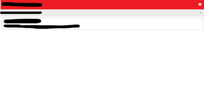
Hi Kelly, thank you again for your help with this custom CSS solution. I showed it to my coworkers and they were very pleased! We were wondering if we could also use this custom CSS to minimize the amount of white space in the app itself, as we only ever have one popup appear and there is a considerable amount of white space under the popup. Please let me know, and I appreciate the help!
- Mark as New
- Bookmark
- Subscribe
- Mute
- Subscribe to RSS Feed
- Permalink
- Report Inappropriate Content
@emoreno technically it would be possible but it would involve quite a bit of css and it would be very brittle and hard to maintain. However we are working on a full map layout option for Zone Lookup for situations just like yours so keep an eye out for it in a future release.
- Mark as New
- Bookmark
- Subscribe
- Mute
- Subscribe to RSS Feed
- Permalink
- Report Inappropriate Content
Awesome, thank you for the information. Is there any instant app roadmap or timeline I can reference for more information on future releases?
- Mark as New
- Bookmark
- Subscribe
- Mute
- Subscribe to RSS Feed
- Permalink
- Report Inappropriate Content


