- Home
- :
- All Communities
- :
- Products
- :
- ArcGIS Instant Apps
- :
- ArcGIS Instant Apps Ideas
- :
- Redesign Portfolio for mobile
- Subscribe to RSS Feed
- Mark as New
- Mark as Read
- Bookmark
- Follow this Idea
- Printer Friendly Page
- Mark as New
- Bookmark
- Subscribe
- Mute
- Subscribe to RSS Feed
- Permalink
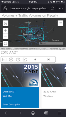
Portfolio wasn't too mobile-friendly to begin with, but the March 2022 update made things a bit worse. Look at how much of the screen is overtaken by the tab selector and navigation:
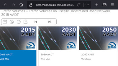
For a builder that professes its apps are designed "mobile-first," I'm a bit baffled. There is no way anyone tested this on a phone. Landscape doesn't even show you a map:
This is a public-facing app that we have and it's now an embarrassment. There's no longer an option to collapse the navigation (not that it collapsed very much before), and the other interface options do not apply to mobile. I'd like to see a larger map (or in the case of landscape - actually see a map) and improved design that can get that navigation stuff out of the way on smaller screens.
Hello,
Thanks for reaching out about Portfolio. Currently, we are looking to this issue with the mobile view of Portfolio apps, we recognize that the main content now does not have much real estate. We are also exploring potential redesigns for future releases.
Thanks again,
Sarah
Hi @wayfaringrob,
Just wanted to reach out to let you know that Portfolio's mobile experience has been updated. We appreciate your initial feedback on this!
Best regards,
Ryan
@RyanLibed I'm actually seeing a worse problem now - there is no map once I click through the cover page. Tried in a few different browsers in both portrait and landscape.
Hi @wayfaringrob,
The team has worked on a solution and this should be resolved now. Apologies for this!
Thanks,
Ryan
You must be a registered user to add a comment. If you've already registered, sign in. Otherwise, register and sign in.


