- Home
- :
- All Communities
- :
- Products
- :
- ArcGIS Instant Apps
- :
- ArcGIS Instant Apps Ideas
- :
- Make legend boxes smaller
- Subscribe to RSS Feed
- Mark as New
- Mark as Read
- Bookmark
- Follow this Idea
- Printer Friendly Page
- Report Inappropriate Content
- Mark as New
- Bookmark
- Subscribe
- Mute
- Subscribe to RSS Feed
- Permalink
- Report Inappropriate Content
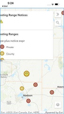
The legend (and other) popup tool box windows don't need to be as large as they are. On mobile devices, they take up most of the screen and are not formatted correctly. That is particularly a problem when the tools are opened by default. For example:
We need all of the Instant App templates to work well on mobile devices. They should be designed mobile-first, and clearly aren't.
- Mark as Read
- Mark as New
- Bookmark
- Permalink
- Report Inappropriate Content
The plot of the game is as follows.
You've always preferred to be alone. You look attractive and polite, but you're still lonely because no one cares for you.
- Mark as Read
- Mark as New
- Bookmark
- Permalink
- Report Inappropriate Content
As a somewhat begrudgingly, "starting to use Pro when I have time which is rare, and I know ArcMap inside and out" person, I support this post. Particularly the part about the application being designed to work for mobile devices. More people are using their cell phones for the apps that we build. Yes, some use tablets but more use cell phones because they are compact (hence not requiring them to deal with larger devices such as tablets in the field), convenient, and easy to quickly fulfill their responsibilities in the field. Most of the apps we are building, are for FIELD people. Dashboards, for example, are typically used by field worker's supervisors so desktop friendly seems fine for those.
Also...when it comes to Pro...and always ending up reverting back to ArcMap because it's faster....
<me> 🤣
You must be a registered user to add a comment. If you've already registered, sign in. Otherwise, register and sign in.

