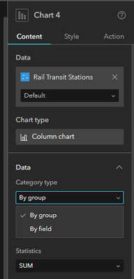
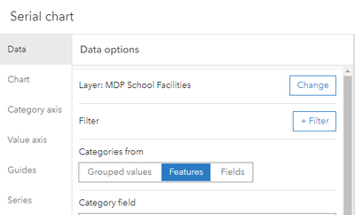
Please provide the option to display chart data by grouped values, features or fields. Currently, the options are by group or by field only.

Since displaying chart data by feature is not available, you are not able to display a single value, and instead are forced to apply statistics (i.e. sum, count, mean, etc.), which is not appropriate when you simply want to display an attribute's value.
FYI, ArcGIS Dashboards provides the ability to display chart data by group values, features or fields, so hopefully this option migrates to Experience Builder in the near future.
